PANTONE Color of the Year: Very Peri
The pick for 2022 is a periwinkle blue with a violet red undertone.
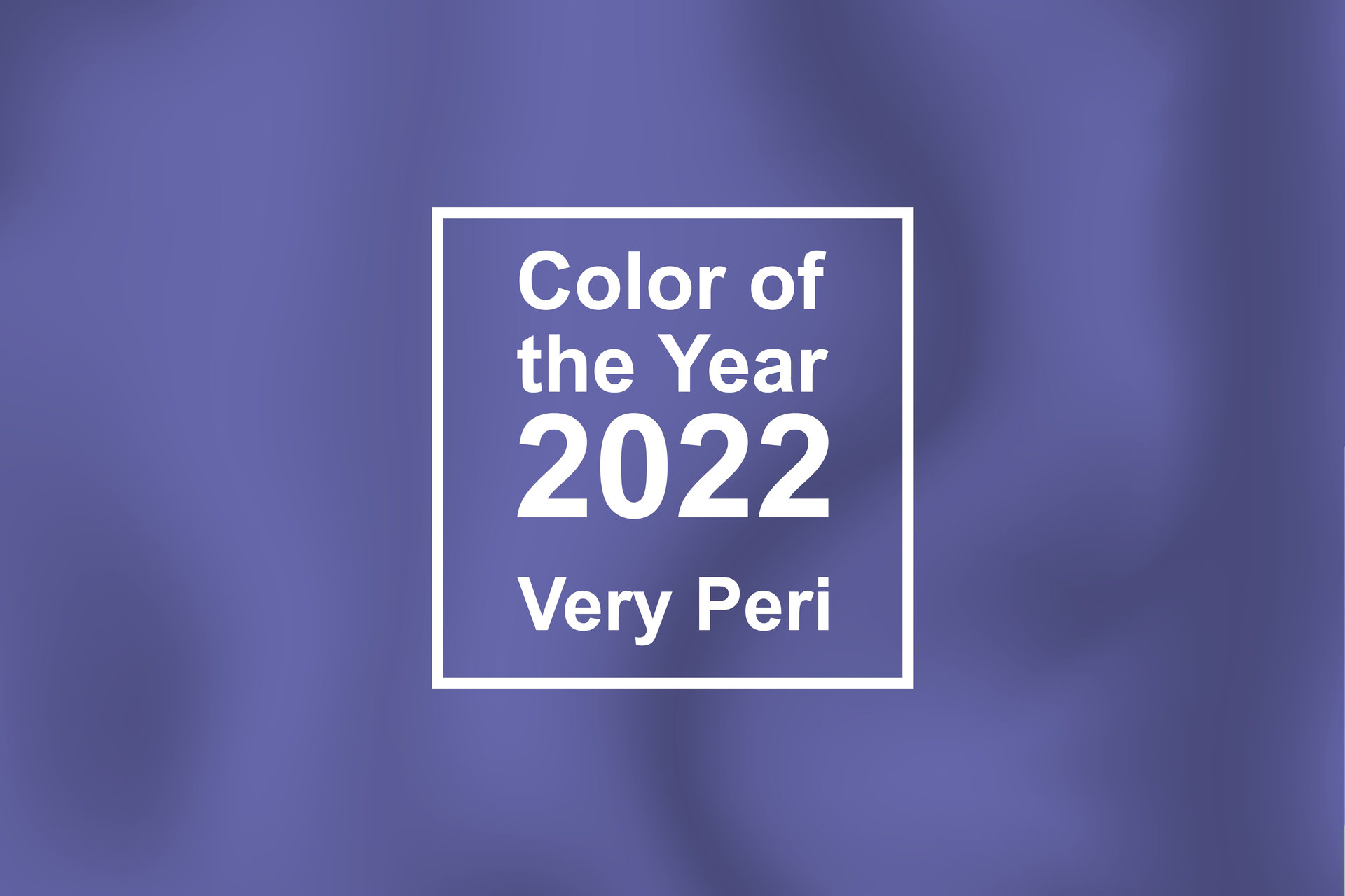
For the first time since it’s been naming its Color of the Year, the color forecasting powerhouse created a new PANTONE Color instead of selecting from an existing color. PANTONE 17-3938 Very Peri is a color based on a familiar periwinkle blue with the addition of a vivid violet-red undertone, making it an exciting and new color that embodies the best of both hues: constancy of blue and the excitement of red.
The pick is also poised to represent modern life—the transitions that have been spurred on by the global pandemic, including an increasingly digital world. With a nod to the metaverse and the digital artistic community, Very Peri, illustrates the blending of color trends our evolving physical world as well as the digital world.
“As we move into a world of unprecedented change, the selection of PANTONE 17-3938 Very Peri brings a novel perspective and vision of the trusted and beloved blue color family, encompassing the qualities of the blues, yet at the same time with its violet red undertone, PANTONE 17-3938 Very Peri displays a spritely, joyous attitude and dynamic presence that encourages courageous creativity and imaginative expressions,” said Leatrice Eiseman, Executive Director of the PANTONE Color Institute.
Refresh Your Home with Very Peri
Every year, PANTONE’s Color of the Year pick finds its way into interior design trends to varying degrees, popping up in furniture showroom floors and home décor stores alike. For instance, PANTONE’s two picks from last year, Ultimate Gray and Illuminating, served as an inspiration for a neutral wall and furniture color in the former with the latter yellow color coming into play through bright accent pieces such as area rugs, throw pillows, wall art and more.
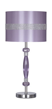
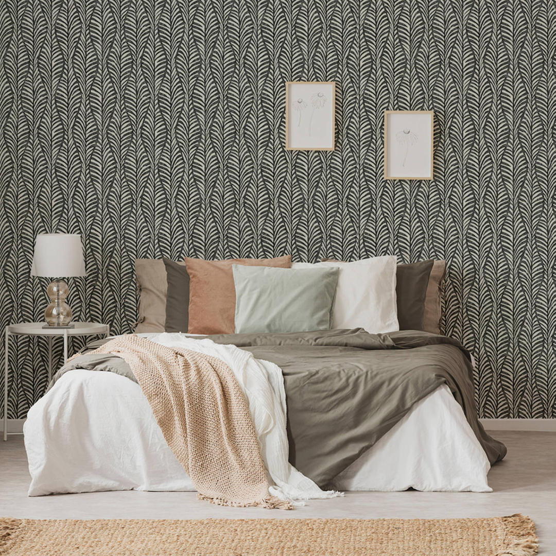
Very Peri, or similar blue shades with warm red undertones, can be featured as either primary colors or accent colors throughout a home. Since it is based in the blue family, Very Peri is incredibly versatile in the realm of home design. Blues are often selected for bedrooms, since they can symbolize peace and tranquility, and can promote a calming feeling that’s ideal for rest and relaxation. Also bringing in the refreshing and reviving feel of nature, including the sea and the sky, blues are popular throughout our living spaces too, from wall colors to furnishings.
With the addition of the warm red undertones, Very Peri can bring these same comforting qualities, with a fresh and creative feel that’s perfect for those looking for an update. It’s well suited to a myriad of materials, textures and finishes. Consider adding Very Peri into your home through some of these ideas:
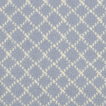
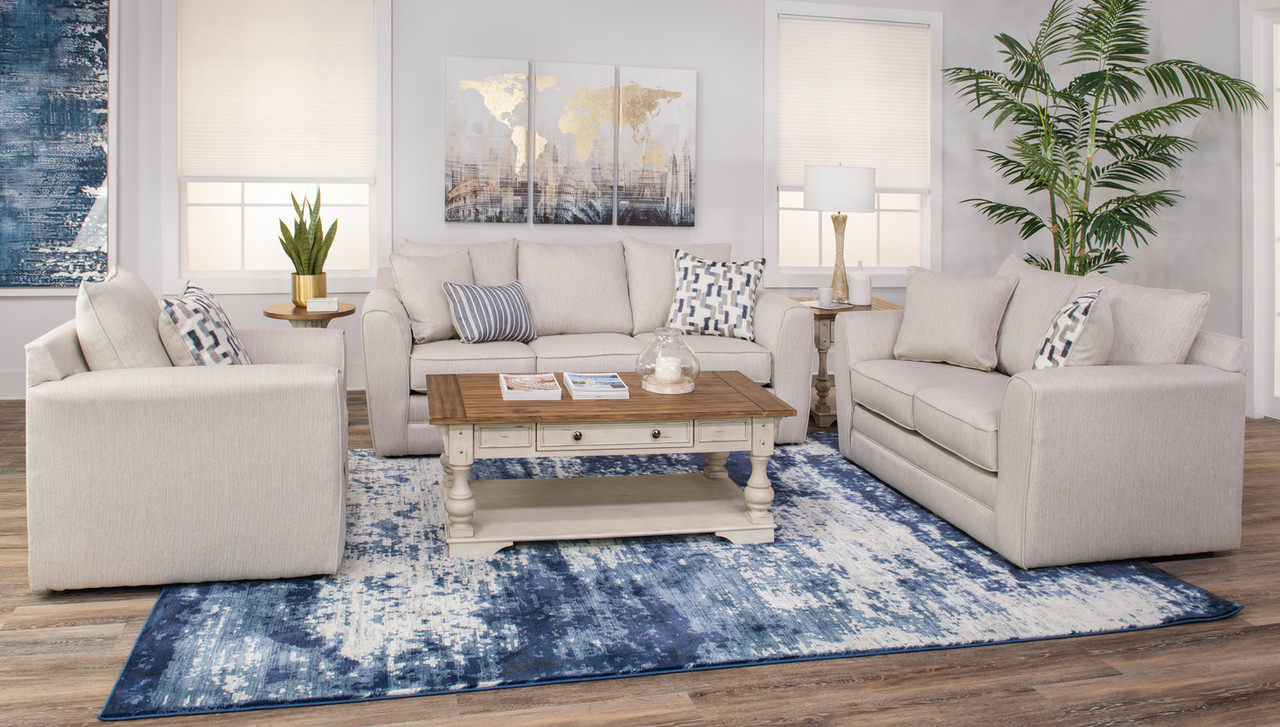
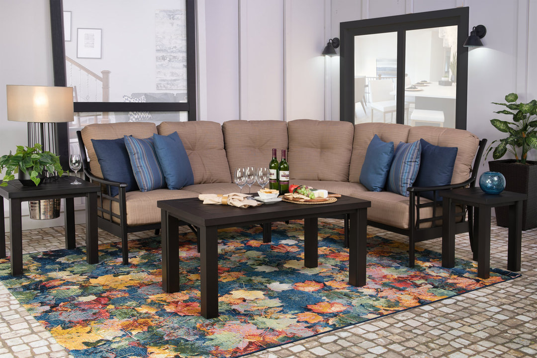
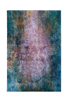
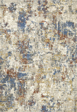
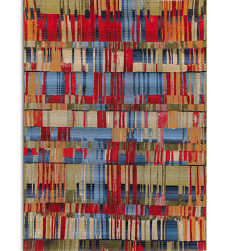
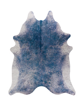
- New carpet or an area rug in a shade like Very Peri can ground your design with its harmonious qualities.
- An accent wall painted Very Peri can enliven your living space, dining room or bedroom.
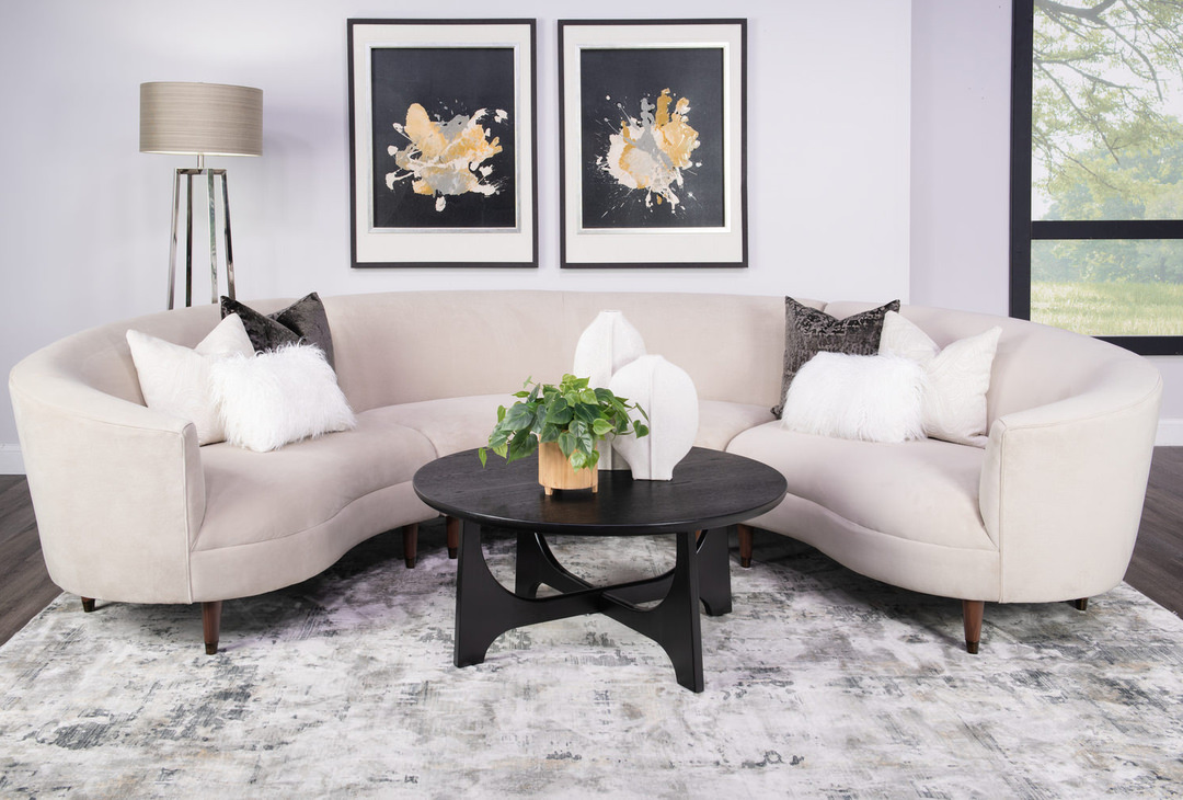
- A periwinkle or similar blue statement sofa is a unique but surprisingly versatile choice, or you can introduce the color in a smaller way through an accent chair.
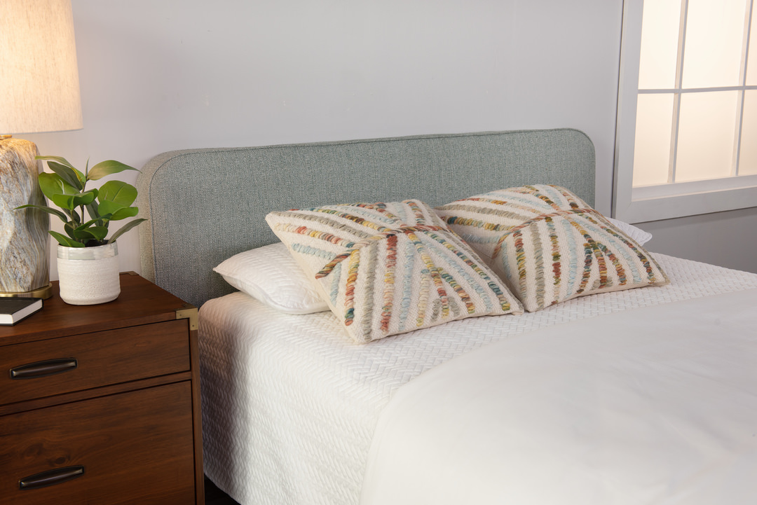
- New accent pillows or a throw blanket serve as an eye-catching accent.
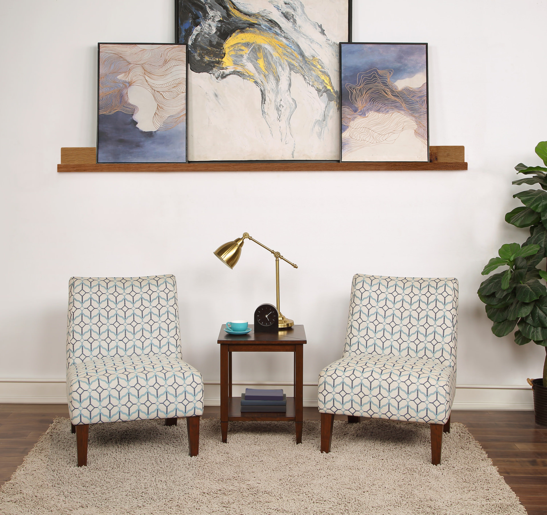
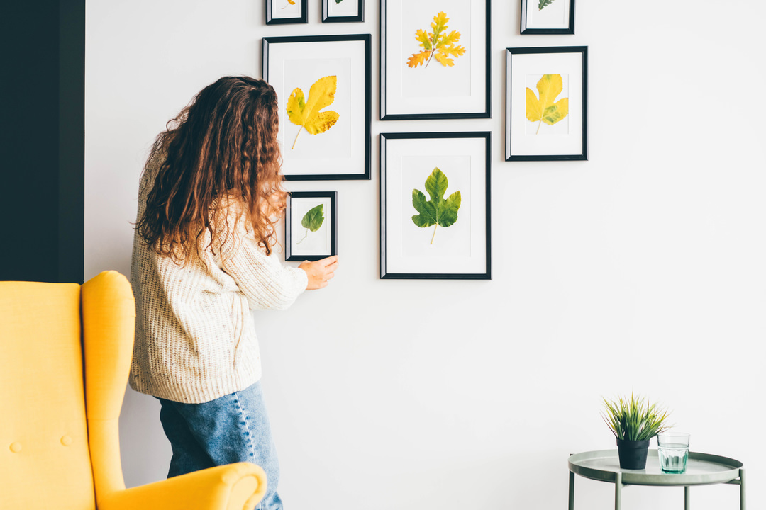
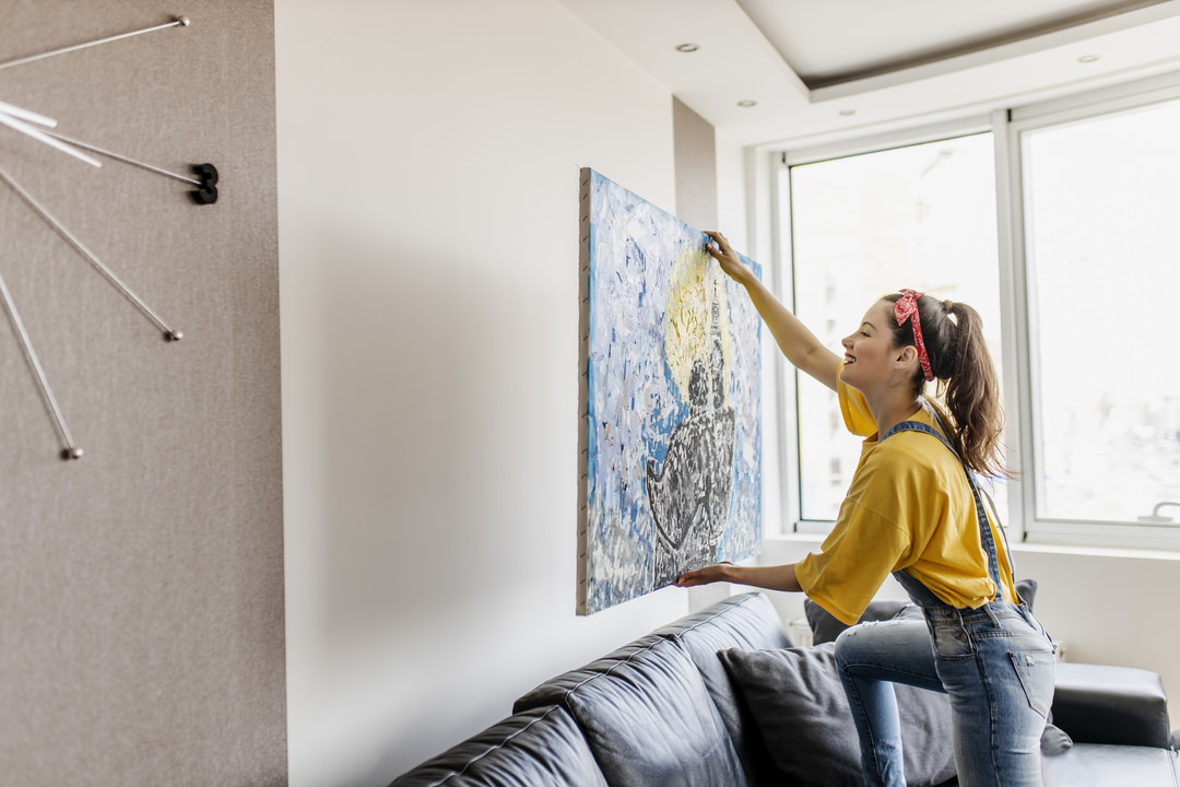
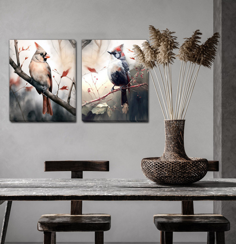
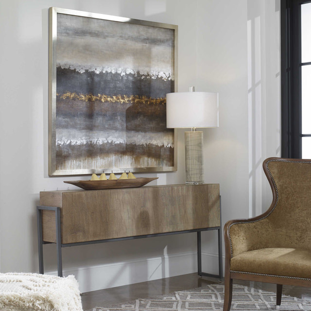
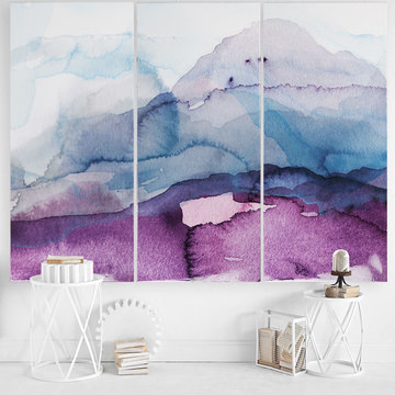
- Wall art featuring the hue and a complementary palette can refresh any room in your home, and is easy to change out down the line.
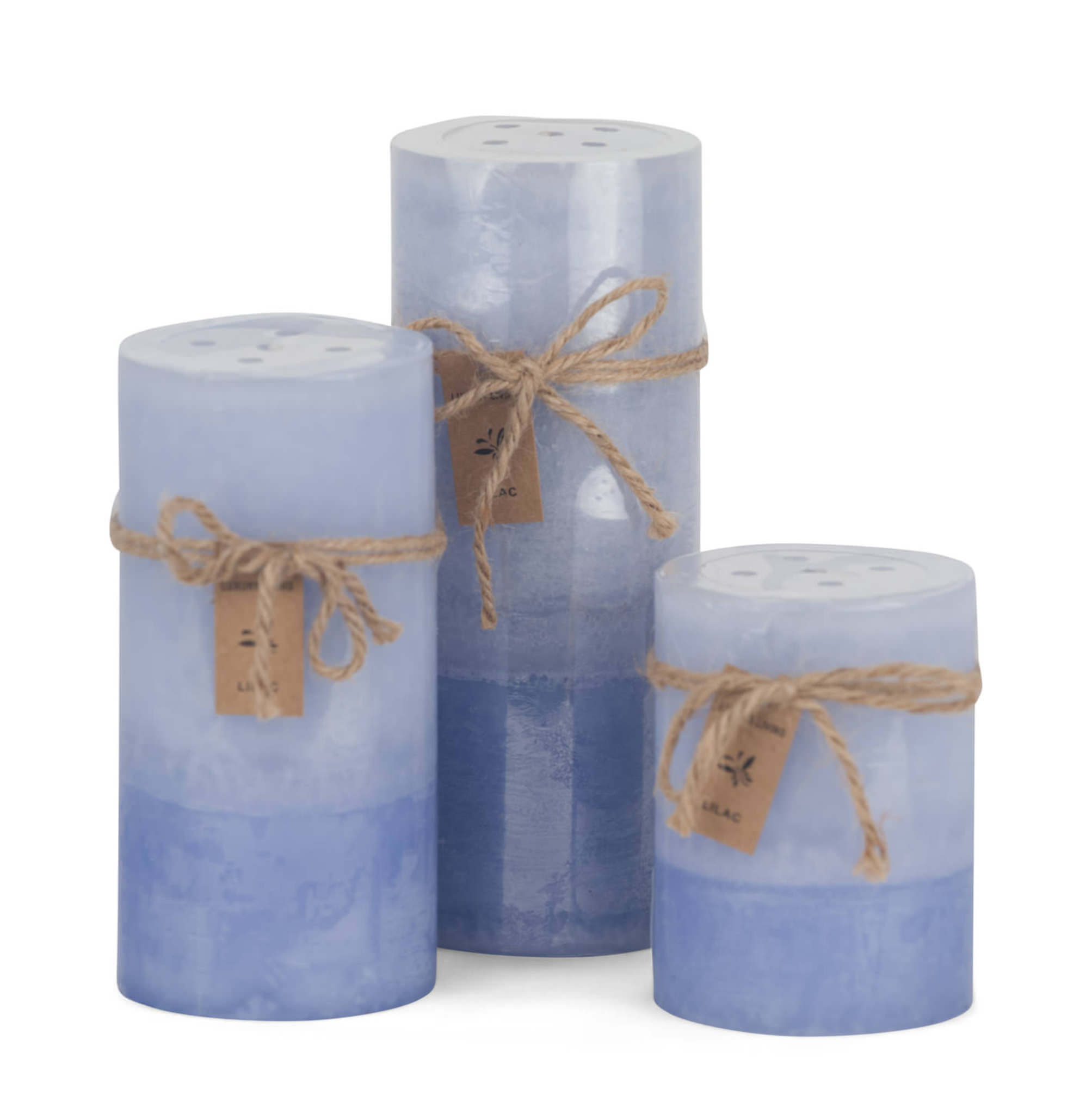
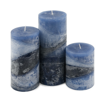
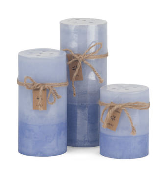
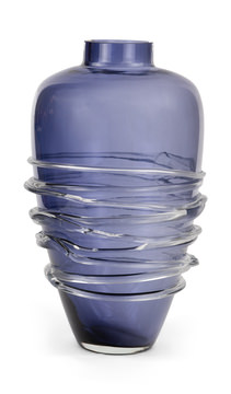
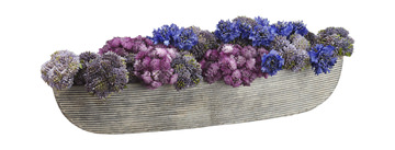
- Very Peri colored candles or vases can lend a feeling of wellness to your home.
Color Palettes with Very Peri
If you like Very Peri, but aren’t sure what colors to pair it with, PANTONE has done the ground work for you. The company provided four different color palettes to convey different moods and show the colors versatility.
- Balancing Act is a complementary palette featuring warm and cool tones, including lilac and lotus.
- Wellspring features nature-infused shades including Greenbriar, Foliage and Treetop.
- Star of the Show includes classics and neutral shades so the dynamic presence of Very Peri can shine.
- Amusements feature joyful and whimsical tones such as Tawny Orange and Pink Flambe to express the fun and excitement of the palette.
Whether you are looking to make a major change in your home interiors in the new year, or simply need a refresh with a few new home accents, PANTONE 17-3938 can provide the inspiration and versatility you need.
