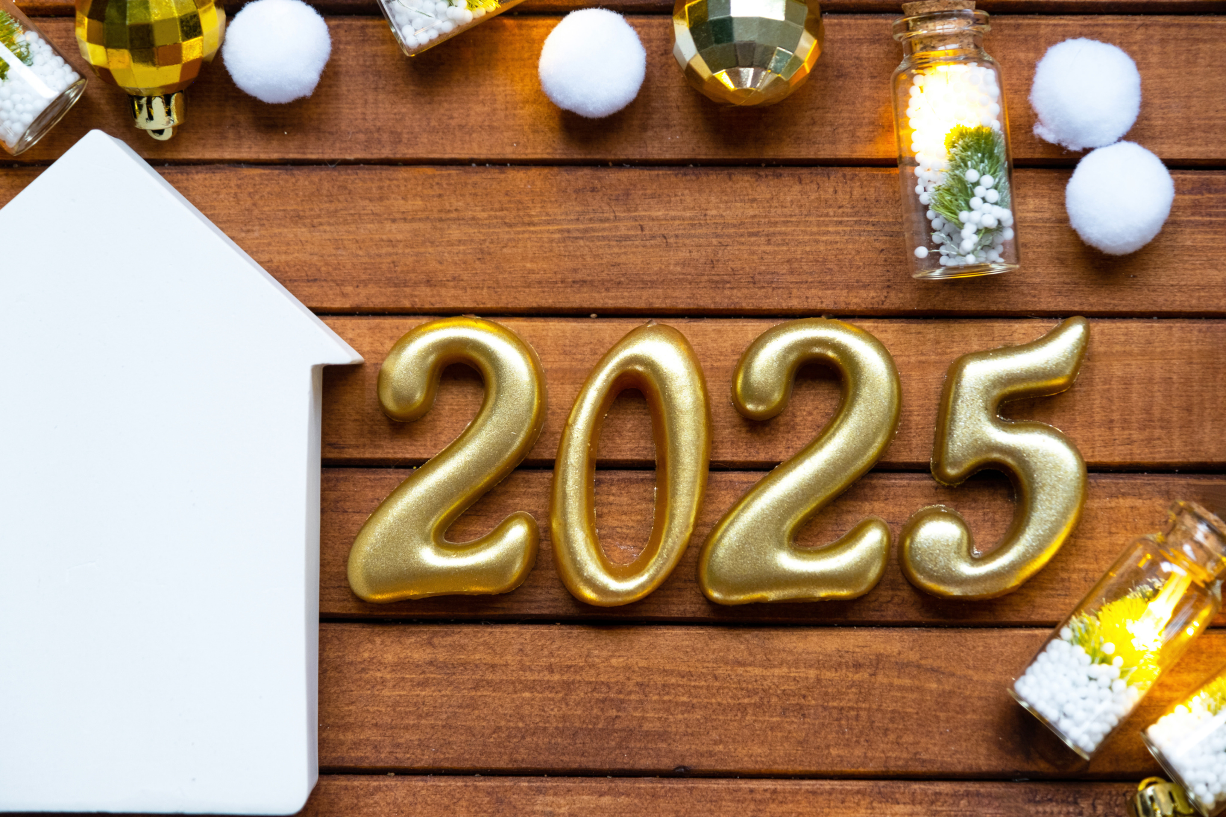
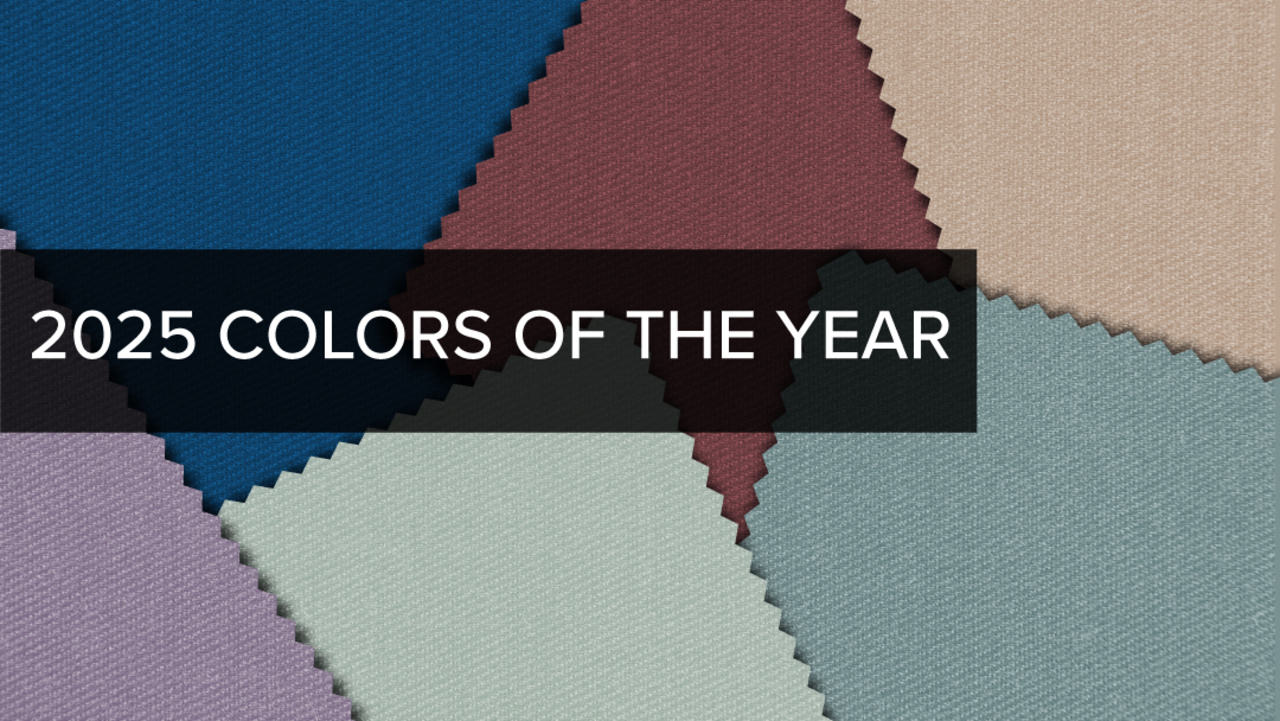
2025 Colors of the Year
These vibrant hues are set to make a design splash.

As we move through 2024, the anticipation for 2025’s Color of the Year selections is already building among interior designers and color enthusiasts alike. Each year, these colors offer a glimpse into upcoming design trends and provide a fresh palette for transforming our living spaces. For 2025, the color predictions promise to invigorate interiors with a blend of bold vibrancy and serene tranquility. Let’s explore the key colors announced by major industry leaders and what they signify for the world of interior design color schemes.
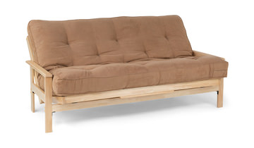
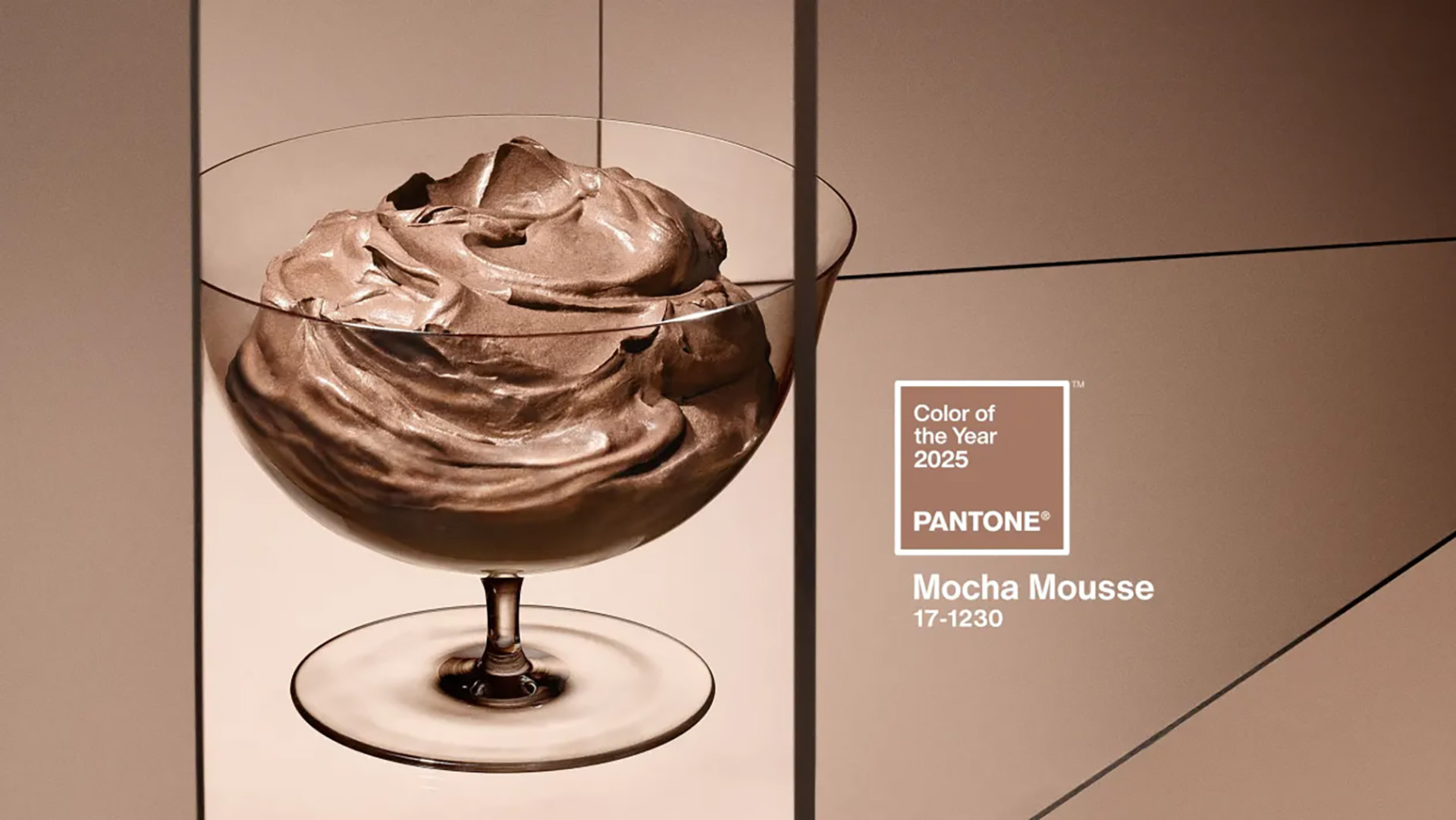
Pantone Color of the Year 2025: Mocha Mousse
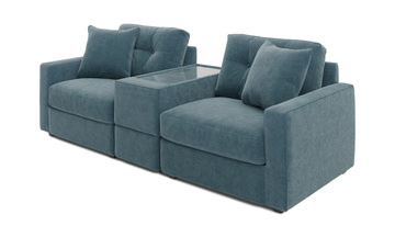
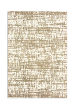
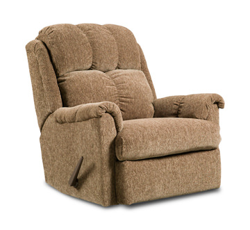
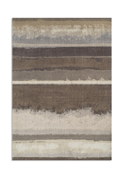
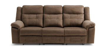
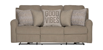
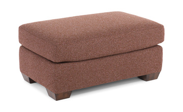
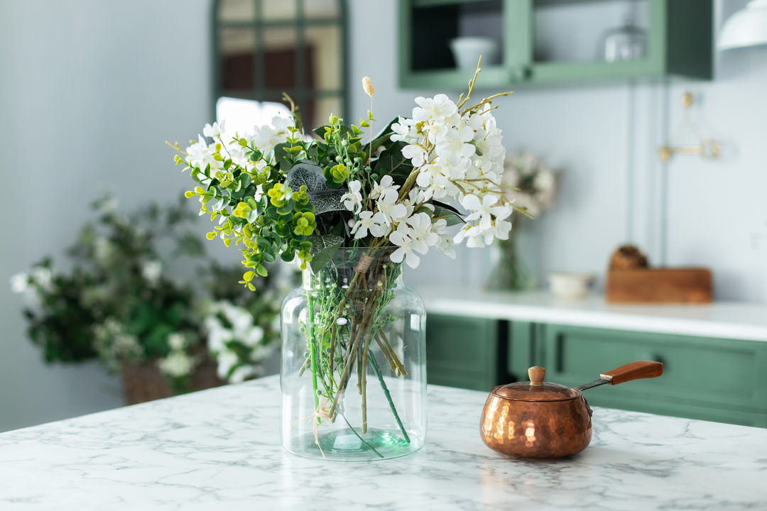
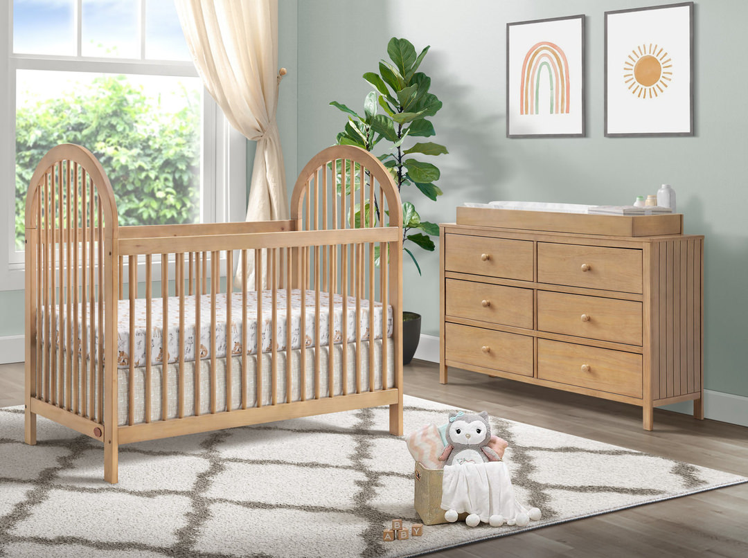
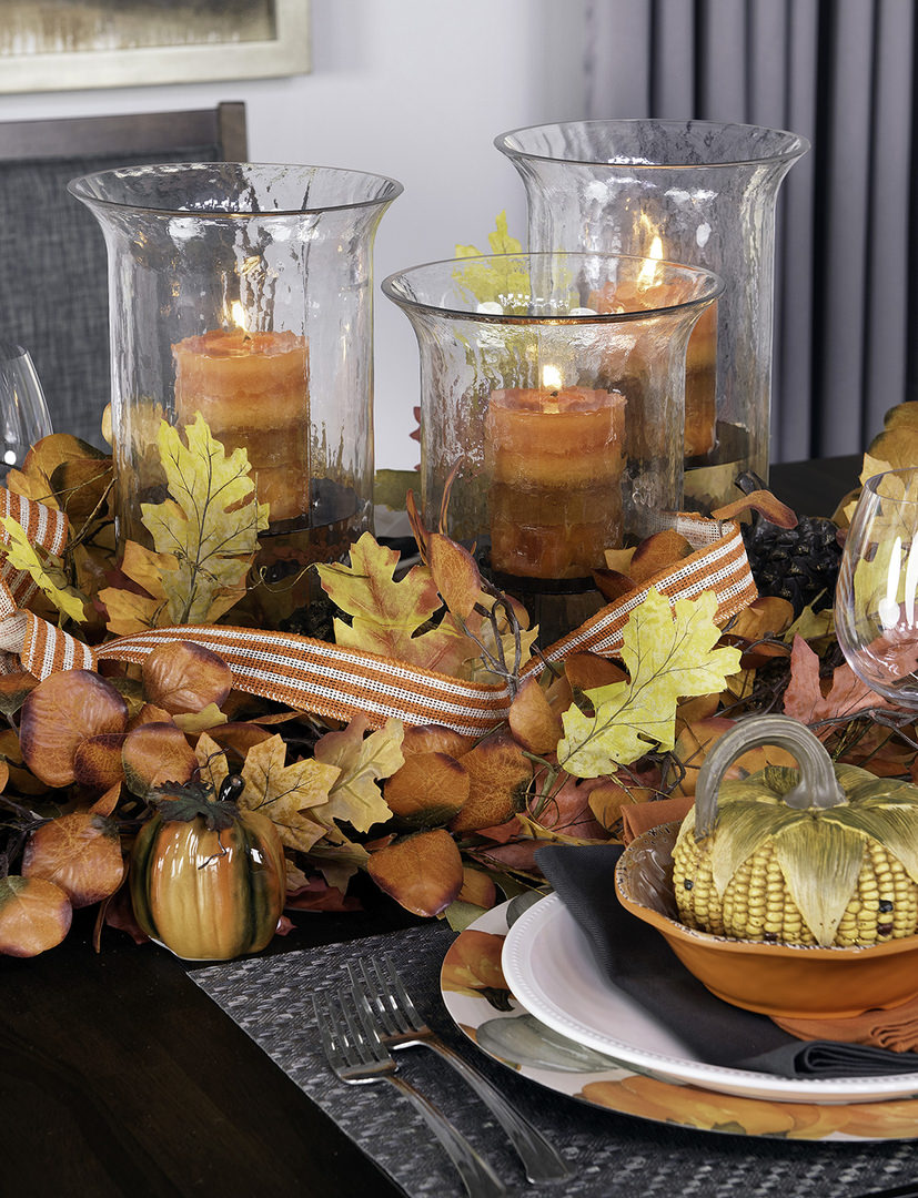
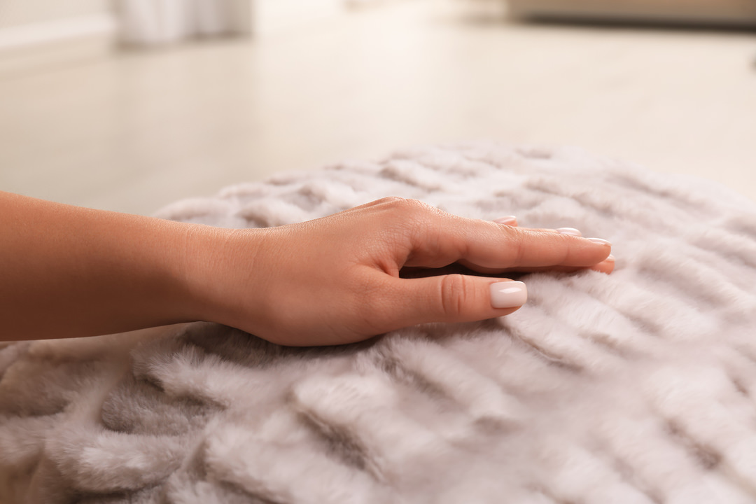
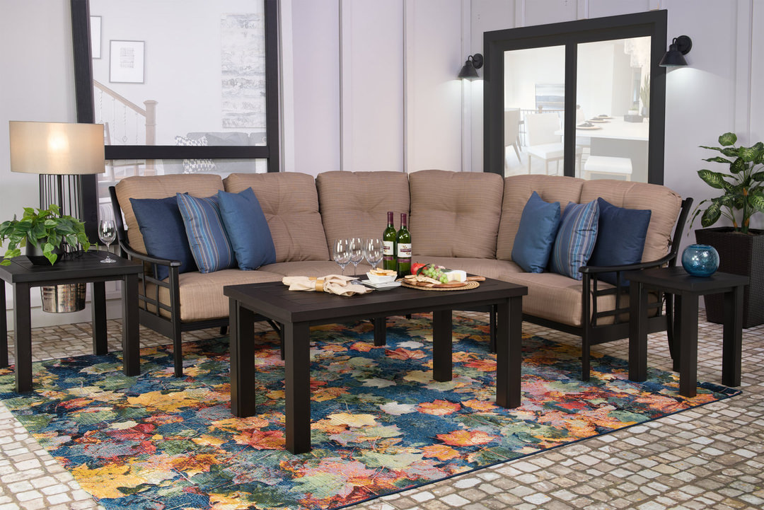
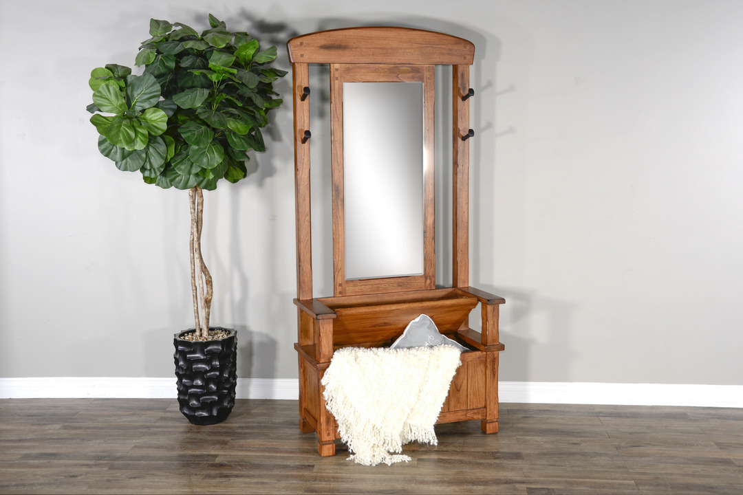
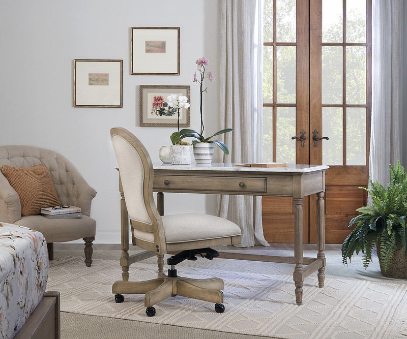
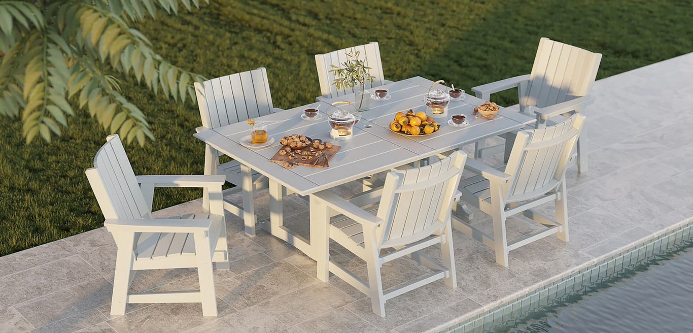
Each year, Pantone selects a color that reflects the cultural mood and influences design trends including furniture and decor. This year, Pantone named Mocha Mousse as their 2025 Color of the Year. The color is a luxurious, yet inviting light brown that offers timeless appeal. With its subtle nods to cocoa and coffee, this versatile brown can work as either a focal point or a neutral in your design scheme.
Here are some tips for bringing Mocha Mousse or similar light brown colors into into your home:
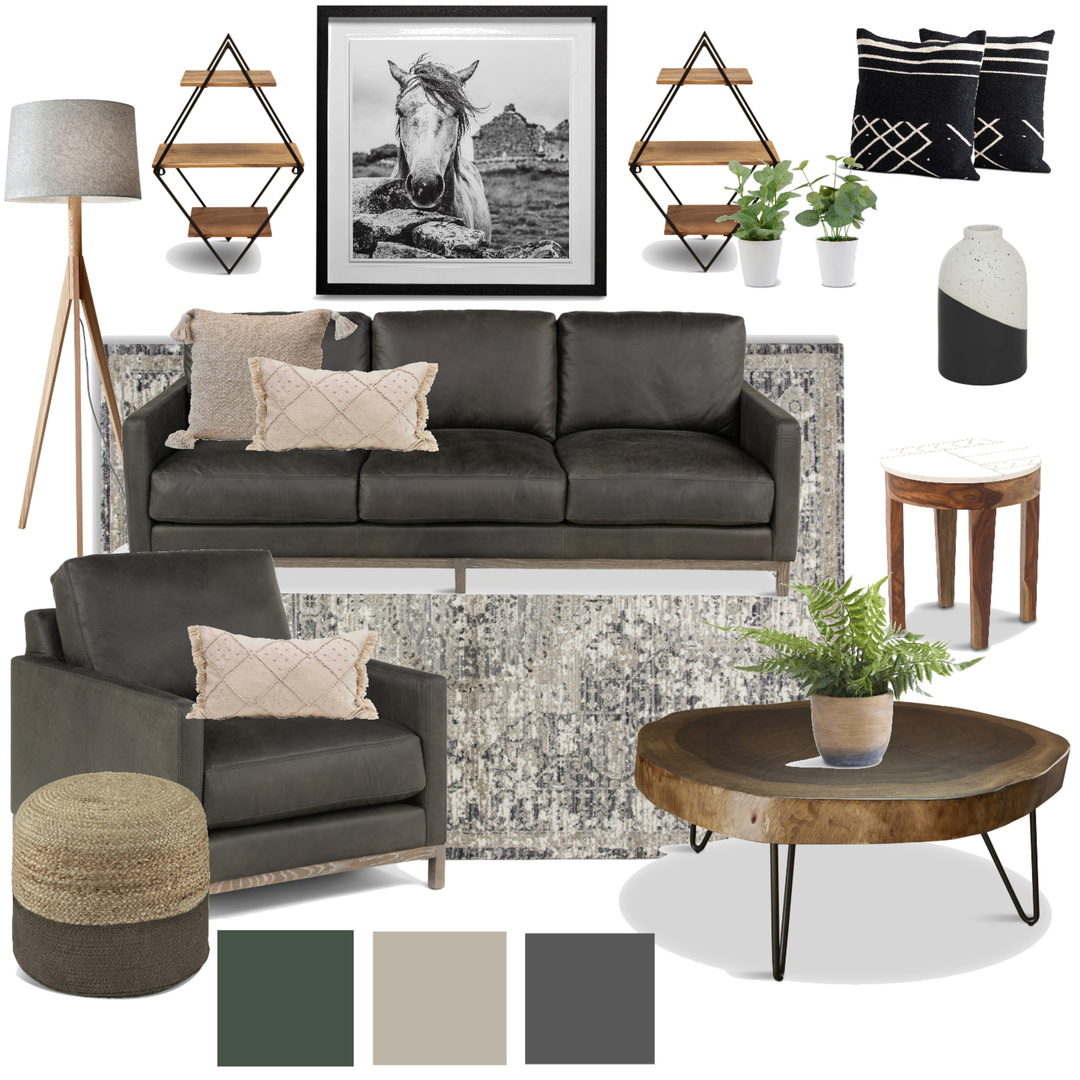
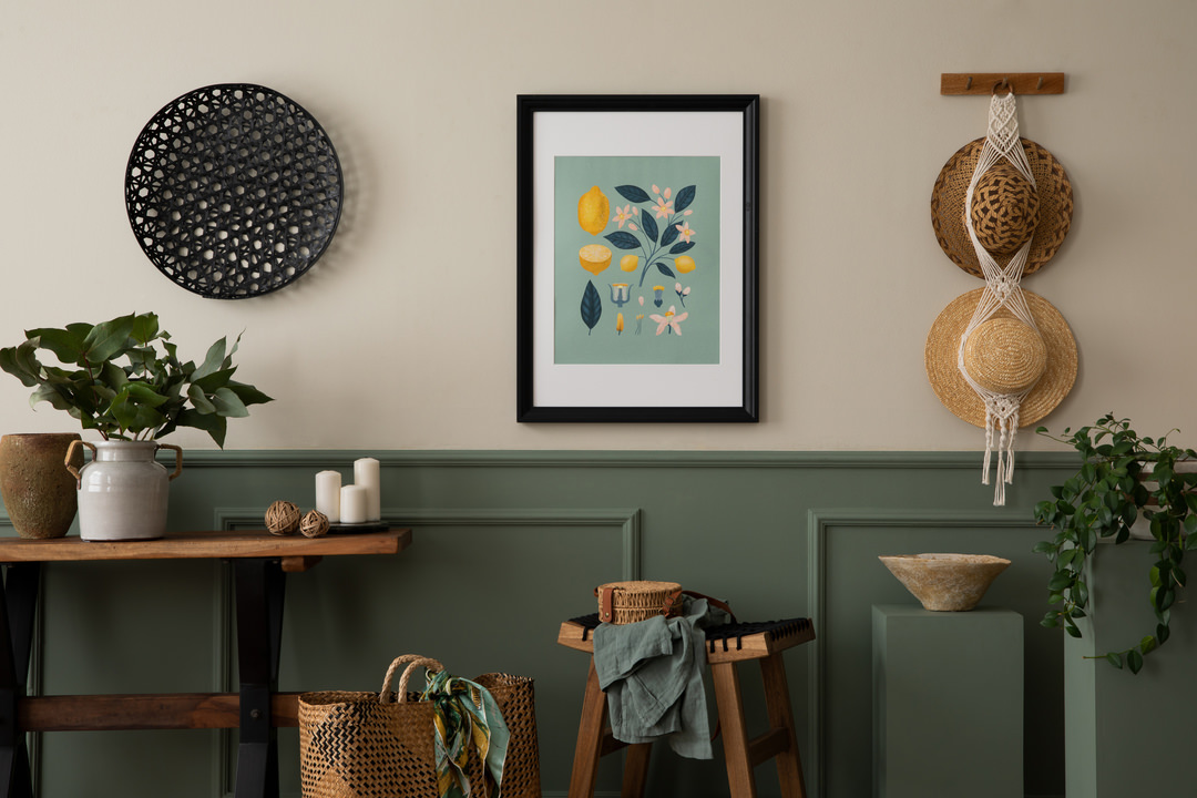
Color Palette: Pair Mocha Mousse with warm neutrals, Earthy greens and pops of your favorite colors.
Rich textures: Incorporate textures and finishes that shine to bring a sensorial appeal to your space.
Furniture: Choose a statement piece like a light brown sectional or sofa.
Decor: Incorporate Mocha Mousse through accent pieces and decor, such as throw pillows and blankets.
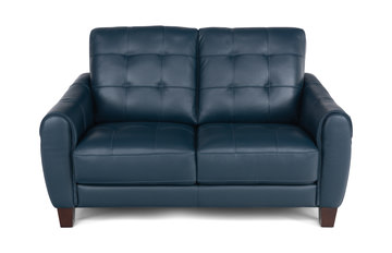
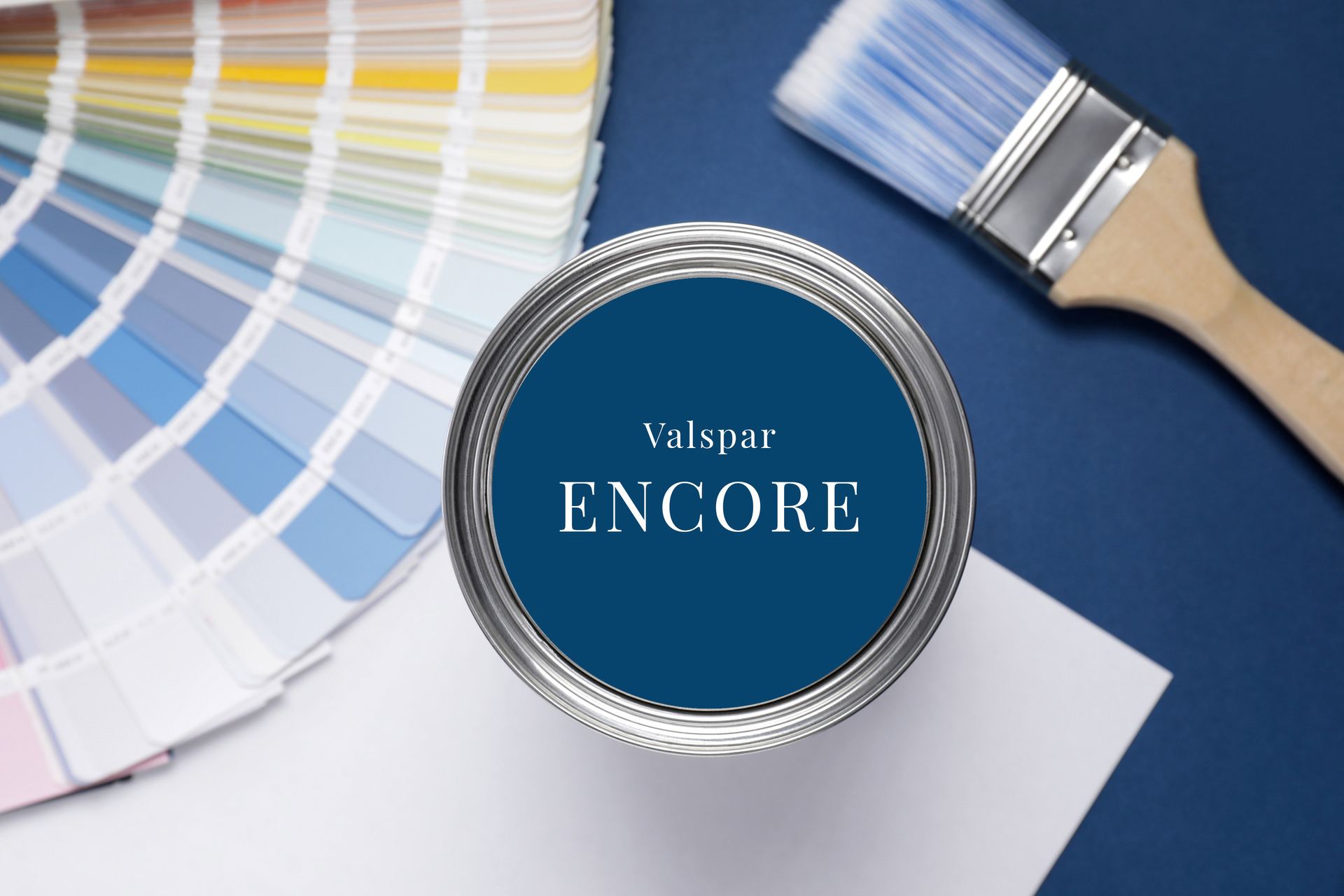
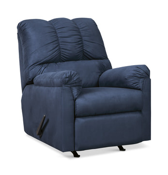
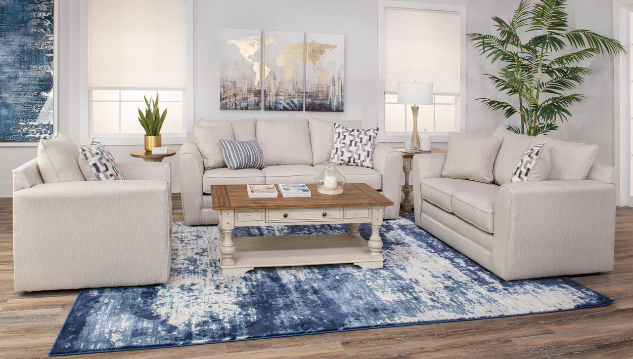
Valspar’s 2025 Color of the Year: "Encore"
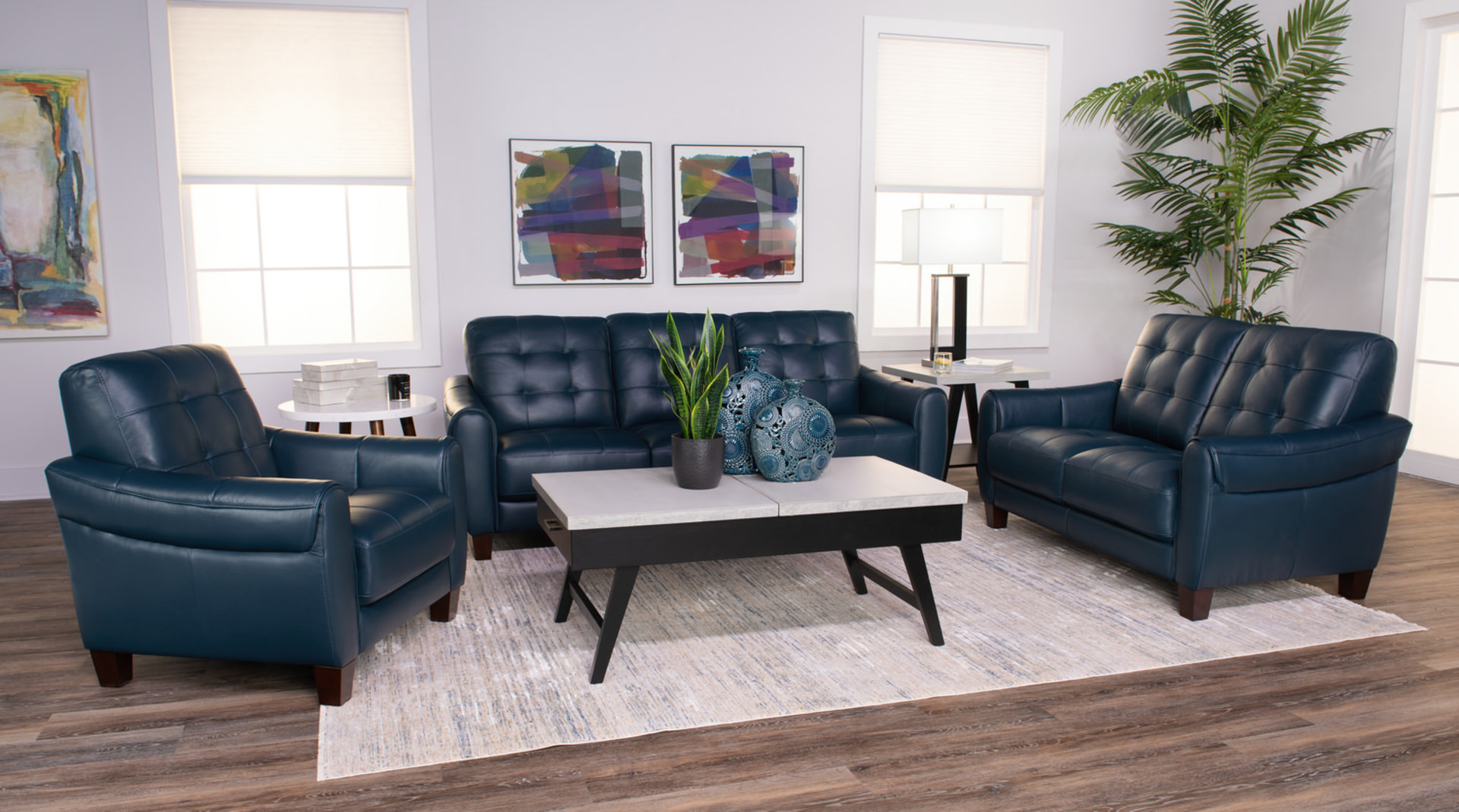
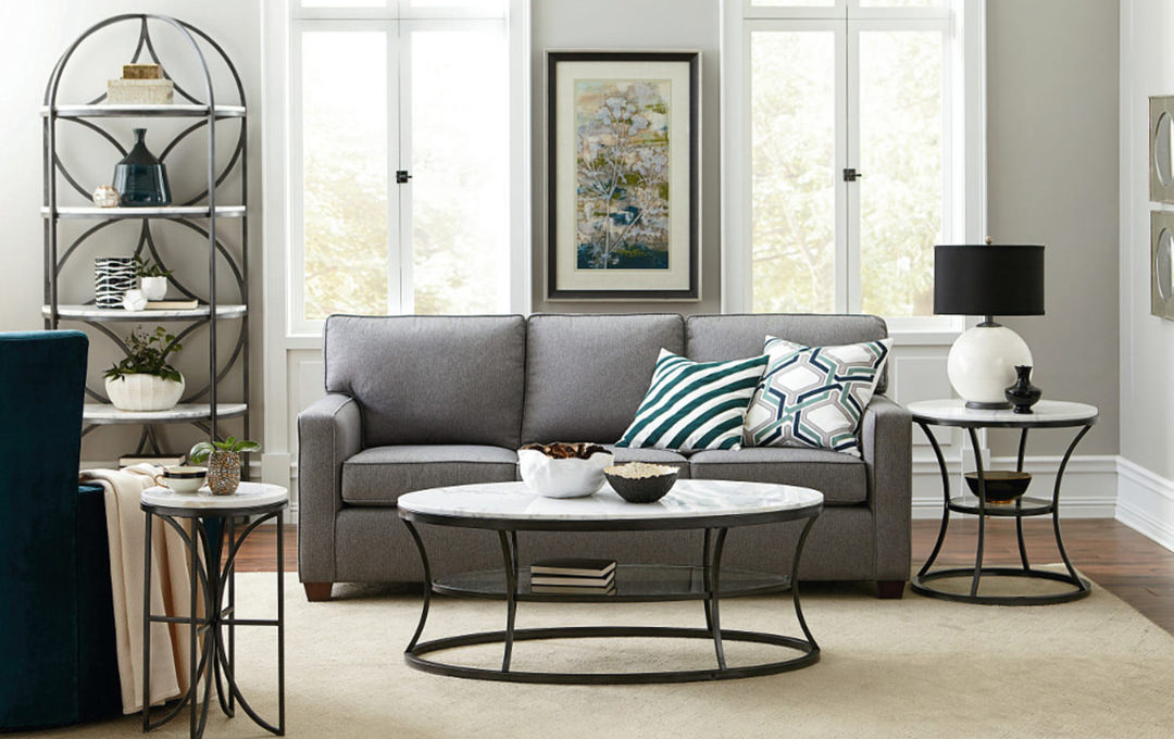
Valspar has unveiled its Color of the Year for 2025, and it’s a captivating choice: Encore. This rich, atmospheric blue has a slight violet undertone. According to Valspar, “Encore is an anchoring shade that embodies constancy and confidence to let you create a joyful respite from the ebbs and flows of life.”
Encore is a versatile color that bridges the gap between bold and subtle, offering a harmonious blend of coastal tones with a hint of vibrant energy. This hue can transform a room by adding depth and character while maintaining a sense of balance and tranquility.
Here are some ways to incorporate Encore into your interior design color schemes:
Accent Walls: Use Encore on an accent wall to create a cool and inviting focal point. This cool color works particularly well in living rooms, dining areas, and bedrooms, where it can create a cozy and welcoming atmosphere.
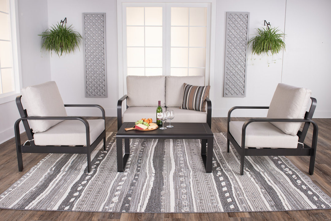
Furniture: Opt for furniture pieces in Encore or a similar vibrant blue shade to add a joyful touch to your space. Sofas, armchairs, and even dining chairs in this color can make a bold yet balanced statement.
Textiles and Decor: Integrate Encore through textiles like throw pillows, rugs, and curtains. These smaller elements can bring cohesion to a room without overwhelming the space, allowing you to experiment with different textures and patterns.
Color Palette Suggestions: Pair it with other colors, such as Valspar’s Lavender Escape and Sprig of Sage to create elegant harmony in your home.
Encore’s grounding quality makes it an excellent choice for creating a space that feels both refreshing and stable, perfect for anyone looking to add a touch of elegance and refinement to their home.
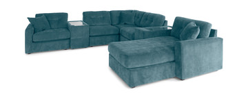
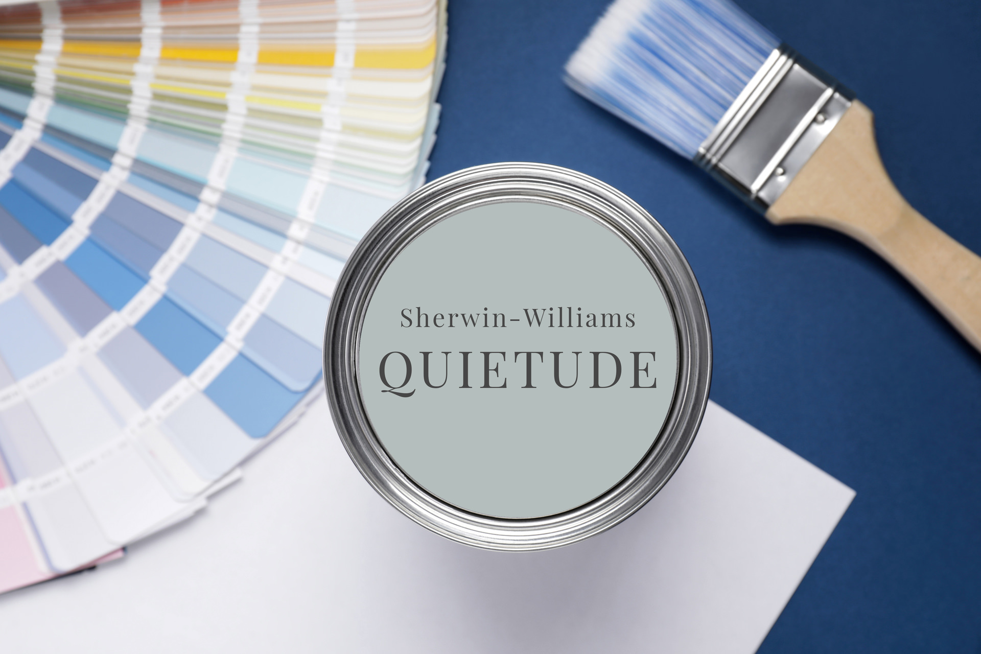
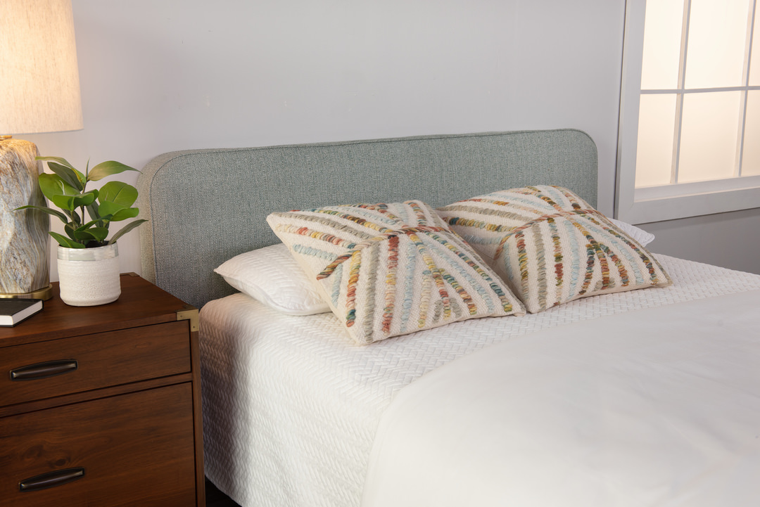
Sherwin-Williams’ 2025 Color of the Year: "Quietude"
Sherwin-Williams has introduced its Color of the Year for 2025: Quietude. This soothing shade of light sage-green with a blue-gray undertone has been chosen to evoke a sense of calm and peacefulness, reflecting a growing desire for tranquility in our increasingly busy lives. Quietude is a serene, muted tone that brings a touch of nature’s serenity indoors, creating a harmonious environment that promotes relaxation and introspection.
Quietude is part of Sherwin-Williams’ broader 2025 Color Forecast, which emphasizes a return to calm and grounding colors that help create restful spaces. This shade is perfect for creating a serene atmosphere in any room and pairs beautifully with a variety of other colors, from soft neutrals to deeper, more vibrant accents.
Here are some ways to incorporate Quietude into your interior design color schemes:
Walls: Paint a room in Quietude to establish a serene backdrop that enhances relaxation and calm. This cool and calming color is ideal for bedrooms, bathrooms, and any space intended for unwinding and self-care. Love monochromatic looks? Consider painting your entire space - walls and ceiling - in this versatile color.
Accent Pieces: Use Quietude in smaller elements like throw blankets, cushions, or curtains to infuse a touch of tranquility into your decor without overwhelming the space.
Mix and Match: Pair Quietude with other colors from Sherwin William’s Color Trends report. Consider Spiced Cider, a warm complimentary color; Sequin a light yellow that adds vibrancy to a space; or Snowbound, a quiet neutral.
Quietude’s calming presence makes it a fantastic choice for those seeking to create a peaceful retreat in their home, offering a tranquil escape from the hustle and bustle of daily life.
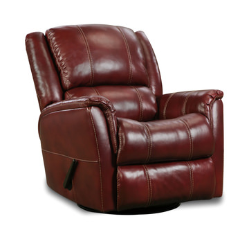
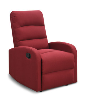
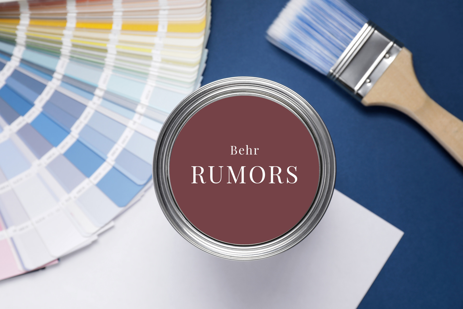
Behr’s 2025 Color of the Year: “Rumors”
Behr has selected their color of the year for 2025: Rumors. This is a deep and rich ruby red that seeks to draw you in and bring about warm and alluring emotions. This color can be paired with other bold colors for a sophisticated look, complemented with golds for a luxurious effect or paired with light and natural colors and textures for a more casual and visual appeal. Rumors can be used in many ways throughout your home and bring about a new and modern feel to your space.
Here are some ways to incorporate Rumors into your interior design color schemes:
Accent Wall: Painting one of your walls in Rumors can add a warm and captivating feel to your room.
Decor Items and Accents: You can still incorporate Rumors into your home without making major design changes. Whether you add an accent chair, an area rug or small tabletop decor items, this color can shine through and still accomplish the same feelings as more ‘major’ changes.
Front Door: Another fun way to incorporate this shade is to paint your front door this color to bring about elegance and vivacity to your home. This would work well with white trim surrounding it, but there is always room for creative freedom.
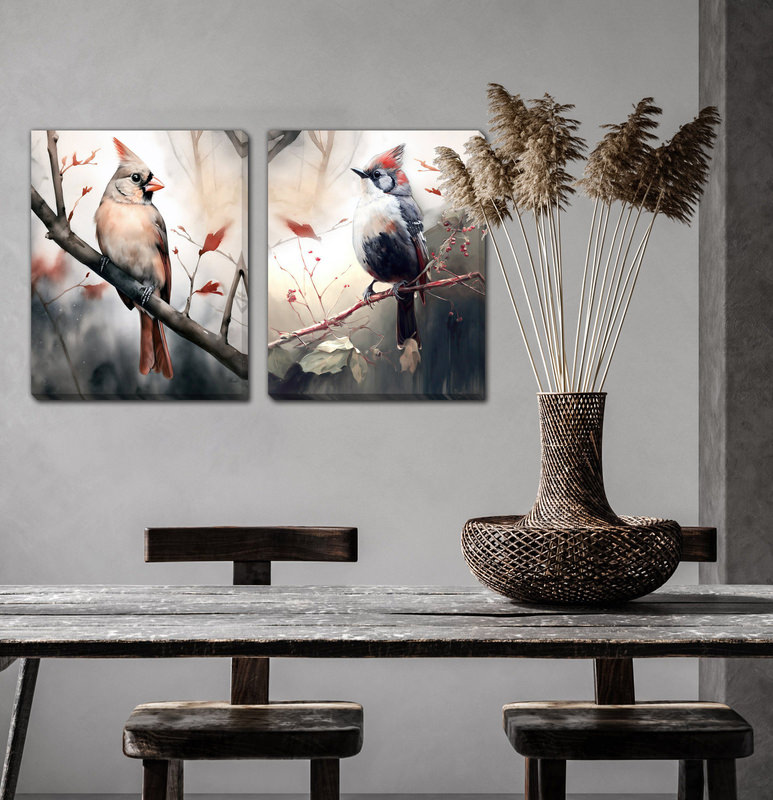
Additional Colors of the Year
Little Greene’s 2025 Color of the Year: "Mochi"
This delightful shade is a soft, warm beige with subtle pink undertones, reminiscent of the traditional Japanese rice cake from which it takes its name. Mochi brings a sense of warmth and comfort to any space, reflecting a trend towards cozy, welcoming interiors that provide a retreat from the outside world. Mochi embodies a refined simplicity and evokes feelings of calm and relaxation. The color’s gentle, neutral tone makes it a versatile choice that can easily blend with a variety of design styles and color schemes.
Dutch Boy Paints’ 2025 Color of the Year: “Mapped Blue”
This versatile blue tone highlights yellow undertones that allow it to complement many other shades within your existing decor. This color is a timeless shade that can work with flowing trends and complement both neutral and bold accents. It brings about a modern and classy charm and is sure to endure through many seasons.
Minwax’ 2025 Color of the Year: “Violet”
This deep and saturated tone is sure to work as an intricate and maximalist addition to your home. This contemporary and elegant shade adds a vintage feel to your home and works best with bold textures to highlight it. This shade is bound to infuse personality into your home and will bring about a compelling and intriguing feel.


2025
April
March
February

January


2024


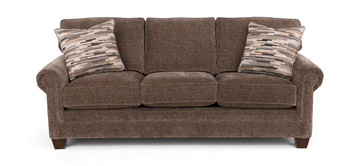
Related Products