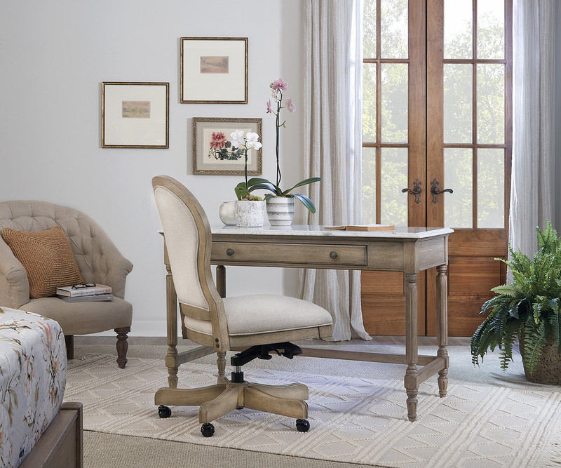
Totally Into Tone on Tone
Utilize the tone on tone trend to add a gorgeous design to your home
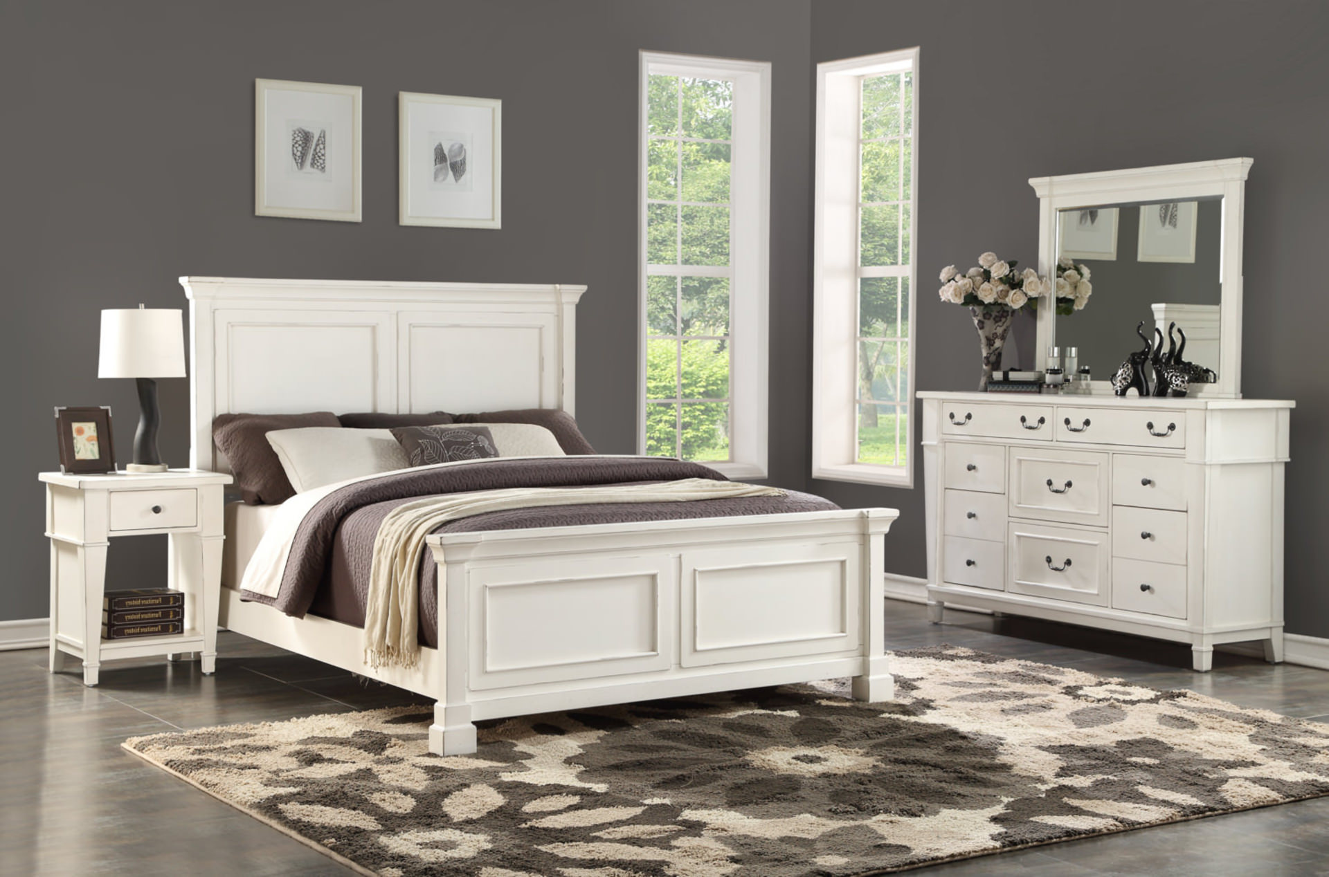
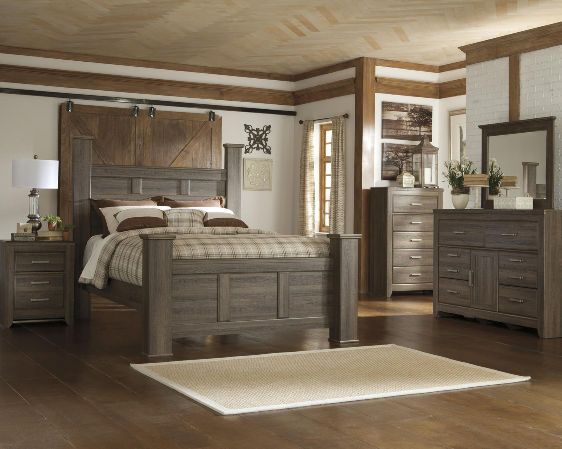
Whether it’s seen with clean, all-white interiors, rich, jewel-tone spaces, or soft brown rooms, we’ve had our eye on tone-on-tone trends for a while. In fact, nothing seems to produce such a sense of cohesion and understated drama as a tone-on-tone room.
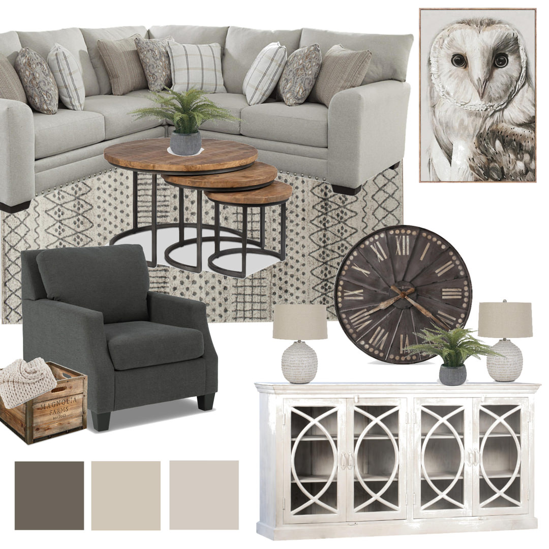
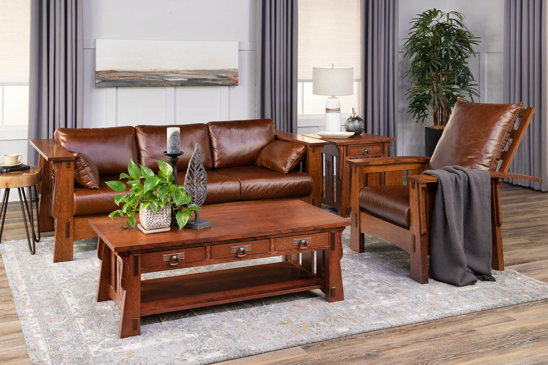
What does this entail, exactly? Tone-on-tone design utilizes one color throughout an entire space. By using several tones or shades of one color, designers can establish a highly styled, dramatic look—and one that feels united.
While your color choices may be close to uniform, this look is anything but boring when done right. By layering different textures, fabrics and sometimes even patterns in a single color (but different saturations), you can create a cohesive, sophisticated and visually interesting space.
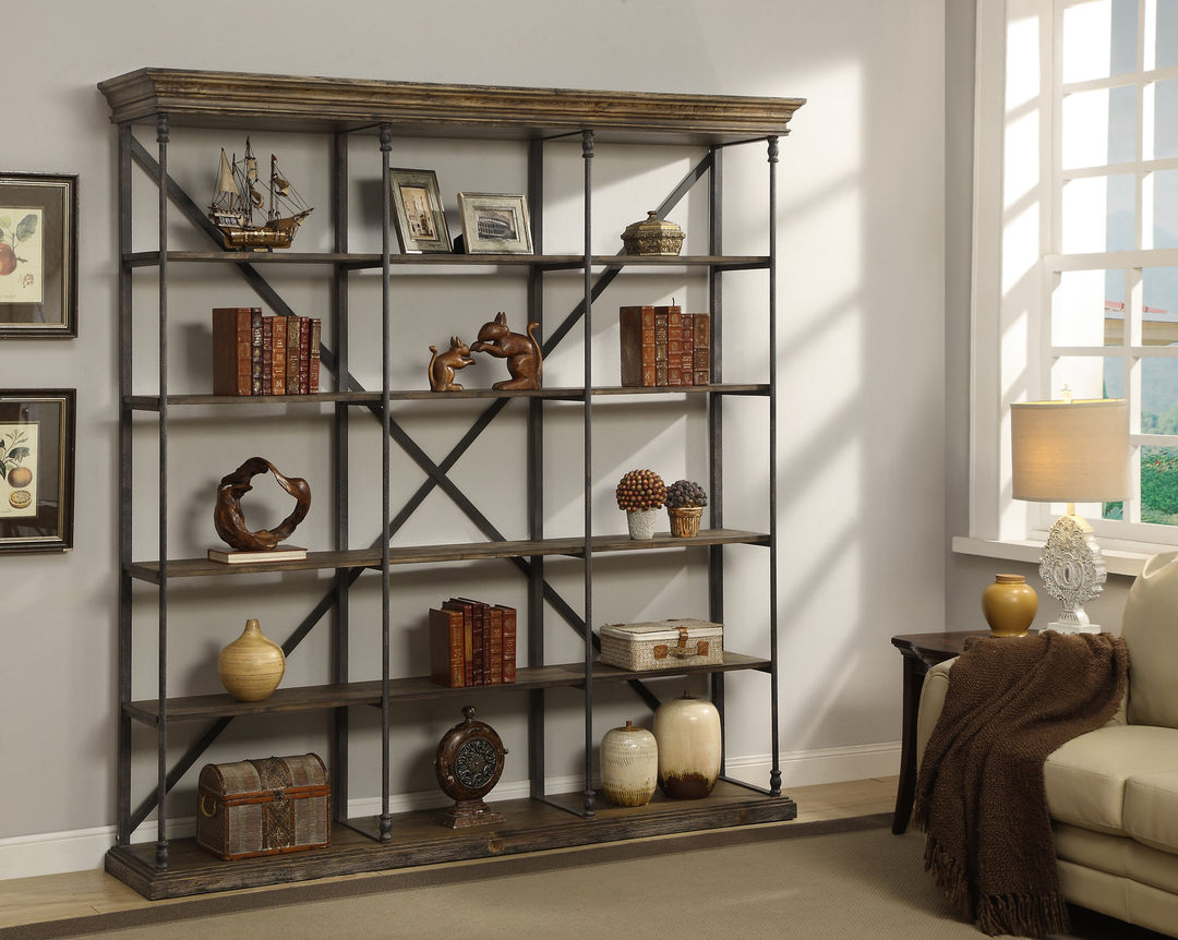
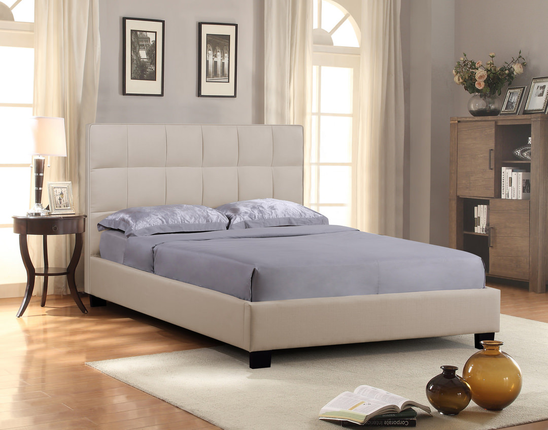
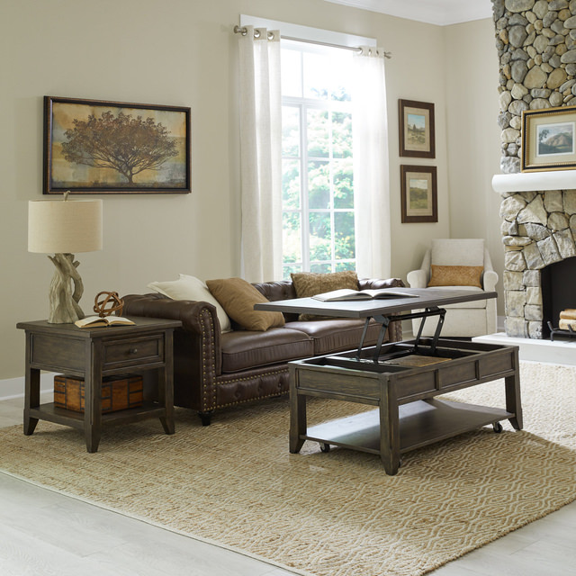
Paint Pieces
A great step into the tone-on-tone look is to purchase or paint a bookshelf, console, dresser, or other large, typically wall-adjacent pieces in the same color as your walls. This looks especially striking when featuring a bold toned color. It creates a design that looks both purposeful and high-end. Another way to achieve the tone-on-tone trend through paint is to utilize a focal wall. Paint one wall (or even a portion of the wall) in your favorite color and then paint the rest of the space different shades of that color.
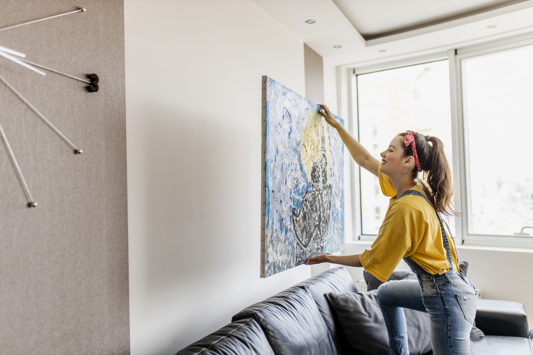
Photo Finish
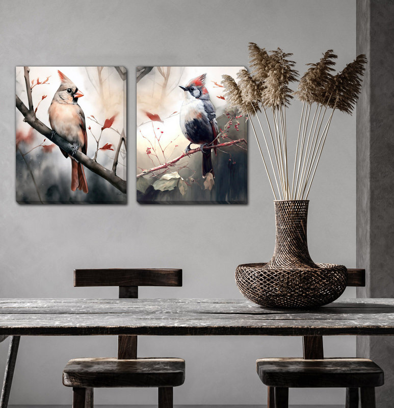
If you already have an art piece or decor piece that you absolutely love, take inspiration from that. Pull a color or palette out of your art that you can bring throughout your home. It will help center your tone-on-tone aesthetic to something beautiful in a palette that you love.
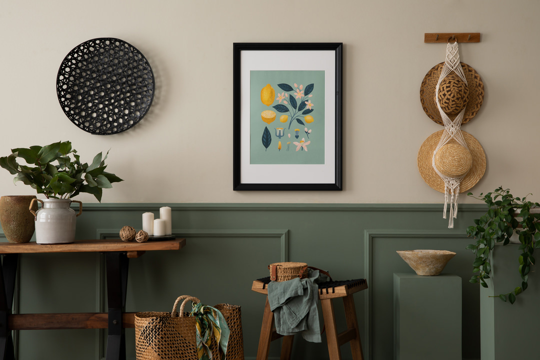
Patterned Plan
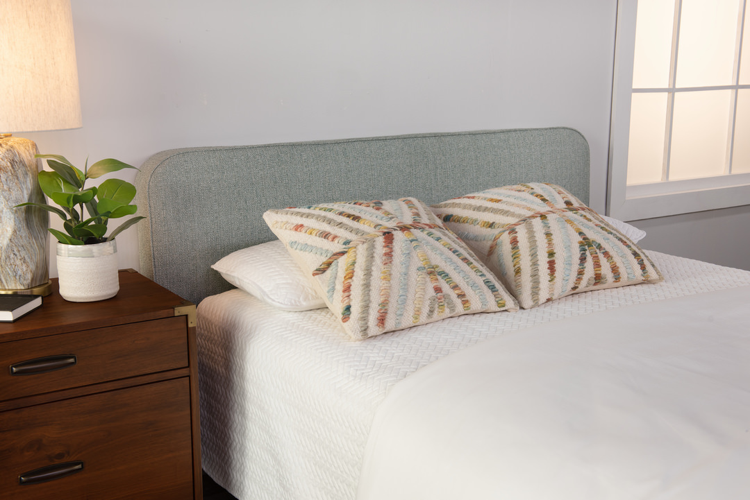
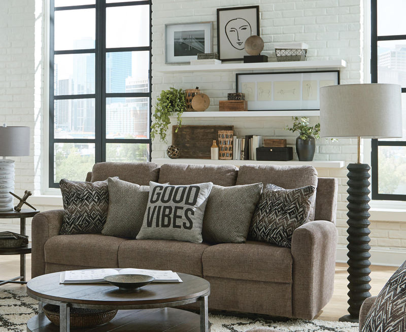
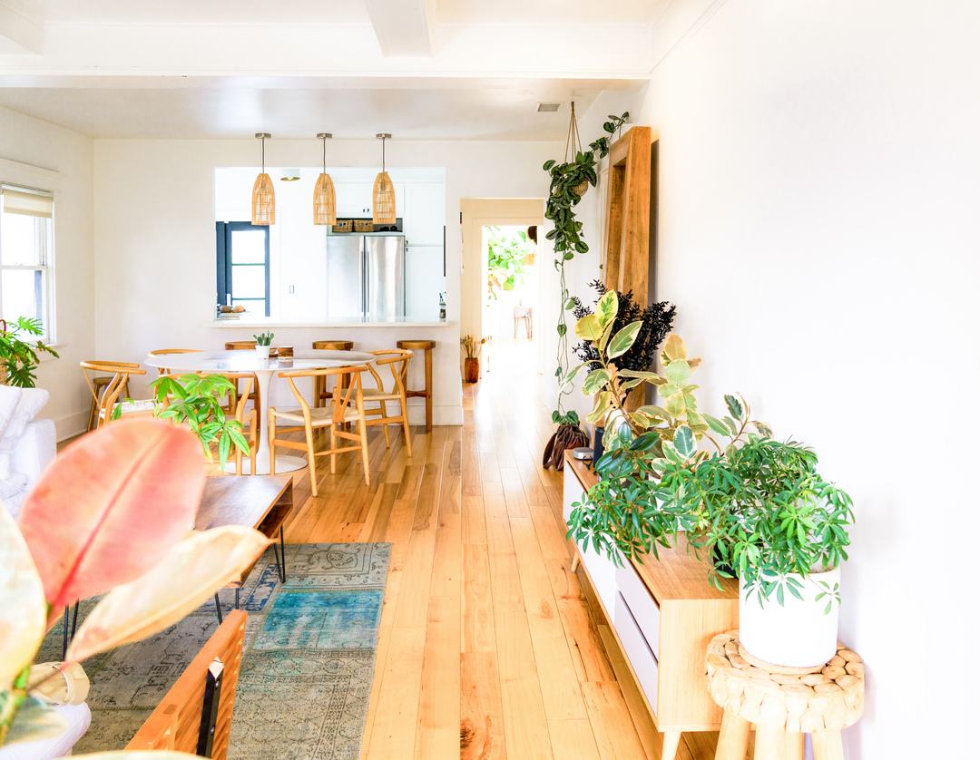
Just because a room uses the same color or shades of that color doesn’t mean it has to be boring. Make sure that you play with pattern to create interest in the space for your eye to follow. Try mixing different pattern styles together. Patterns that feature your main color while still using other colors can work really nicely to continue your theme while mixing it up a bit.
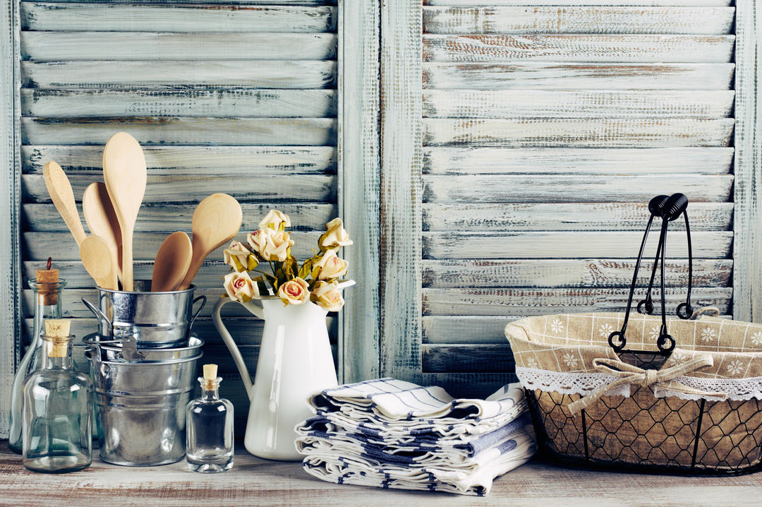
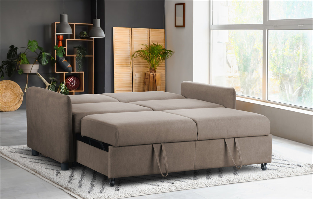
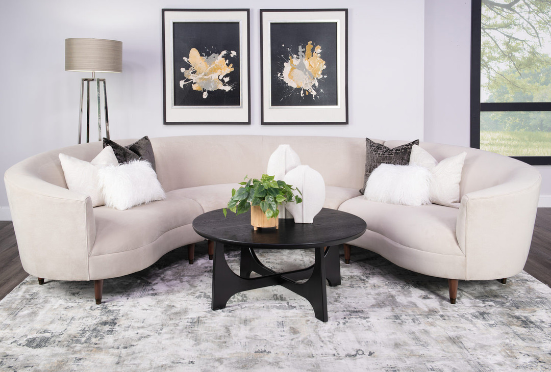
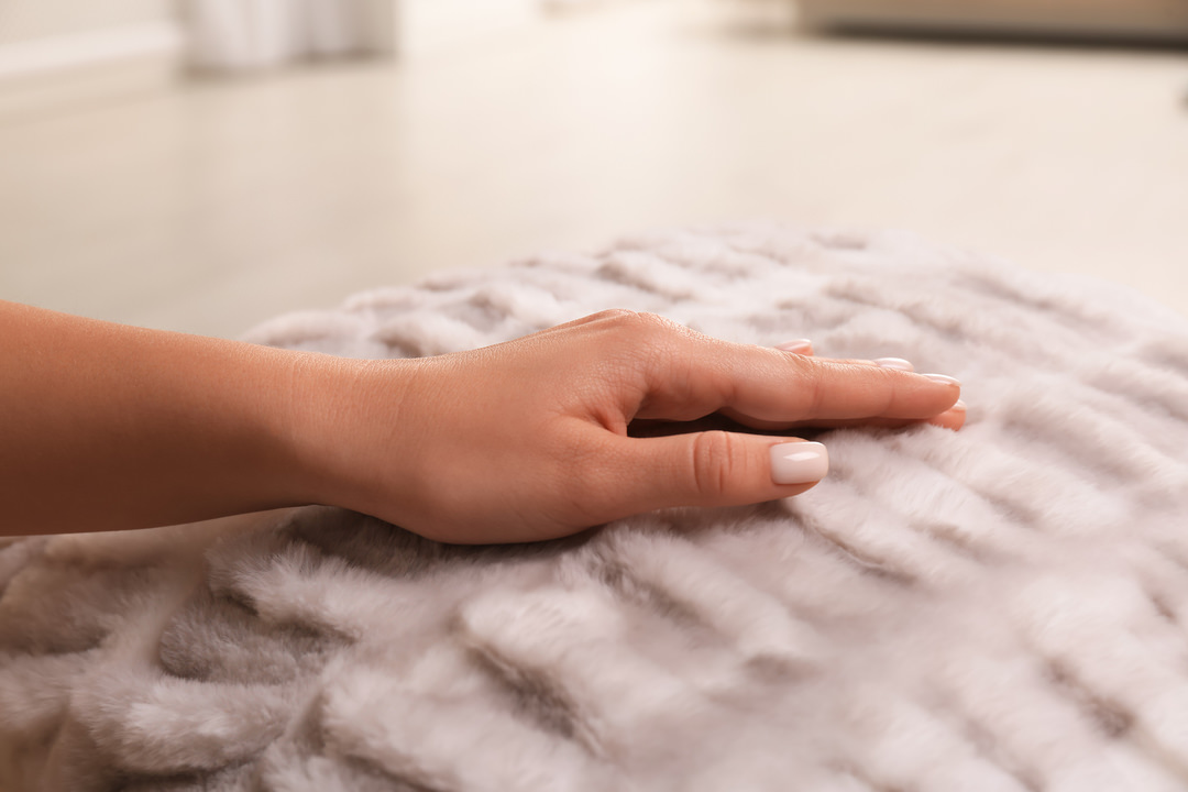
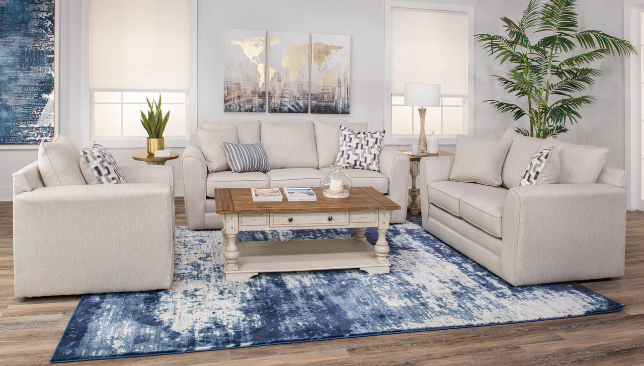
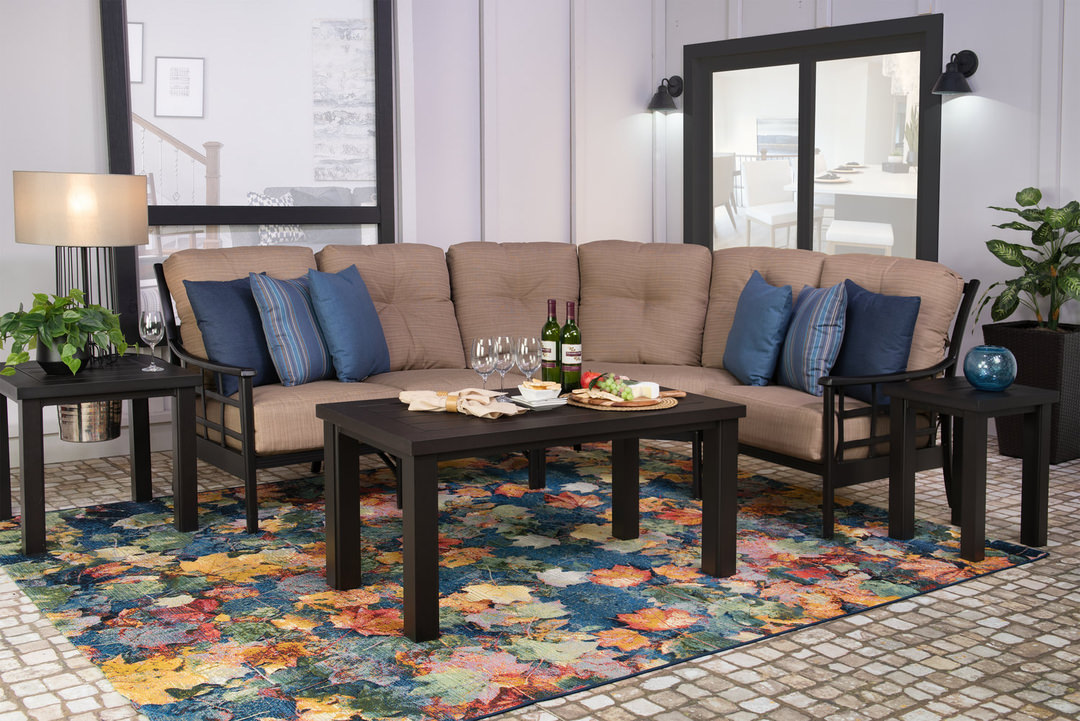
One of your greatest tools is variance in texture. By mixing and matching different textural elements, you get a more subtle interest that may not be as overwhelming as patterns. Mixing a vibrant shag rug, an upholstered sofa, soft curtains and velvet pillows all in the same color can help you create your tone-on-tone design while creating distinct visual differences between the pieces.
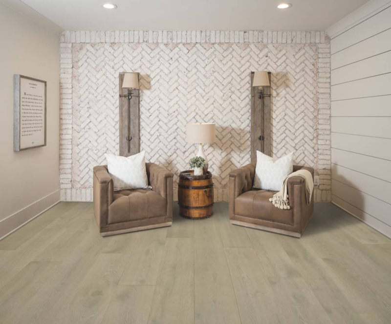
Sometimes, It Is Black and White
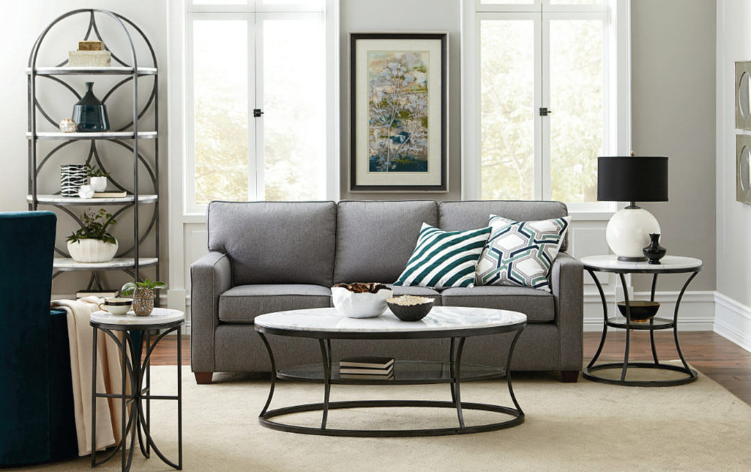
Black and white are your best friends in this case (although we may recommend picking one of the two, rather than both). By having one, more neutral color to establish as your foundation, the pieces that do follow your theme will seem more balanced. The neutrals won’t draw the focus away from a tone-on-tone space but will help you from becoming overwhelmed with color if that is something you’re worried about.
Tone-on-tone looks aren’t just trendy; they’re a classic way to add interest to a room that can withstand the test of time. Look for easy ways to start incorporating it into your home and maybe you’ll find that all your rooms needed was a little color cohesion.


2025
April


March

February

January


2024


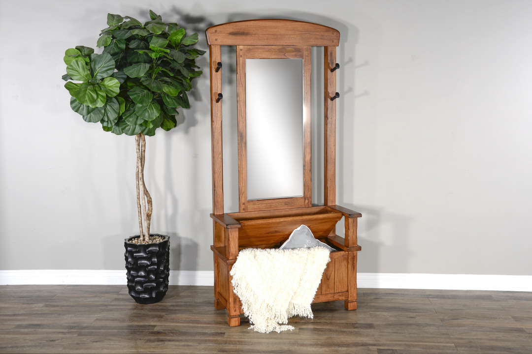

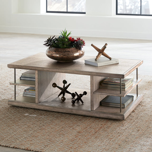


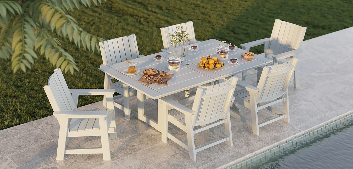
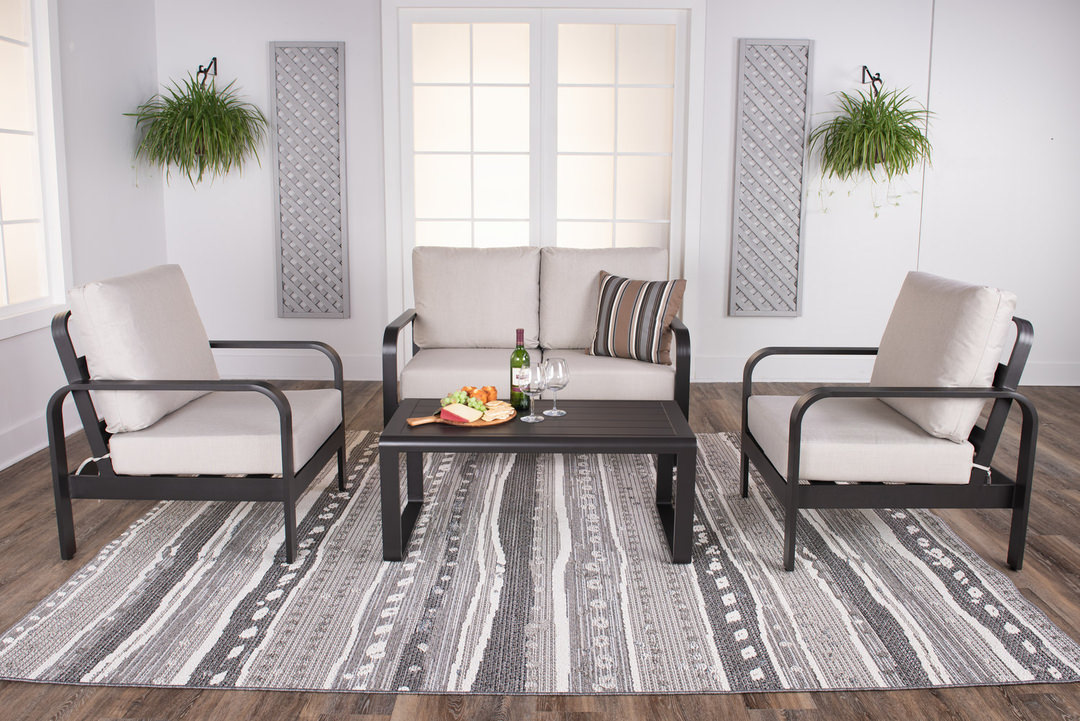


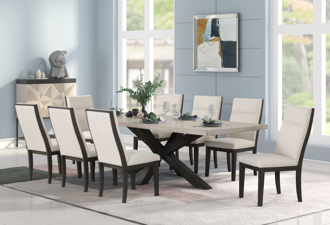
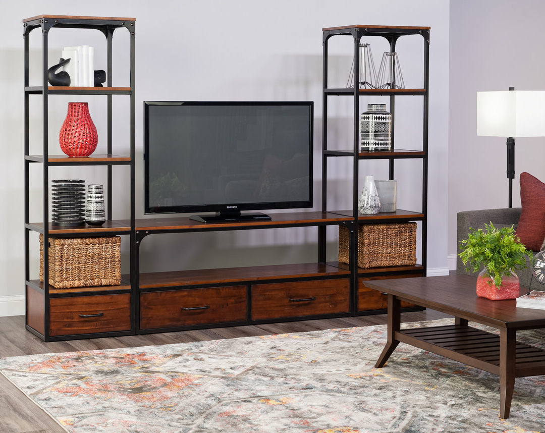
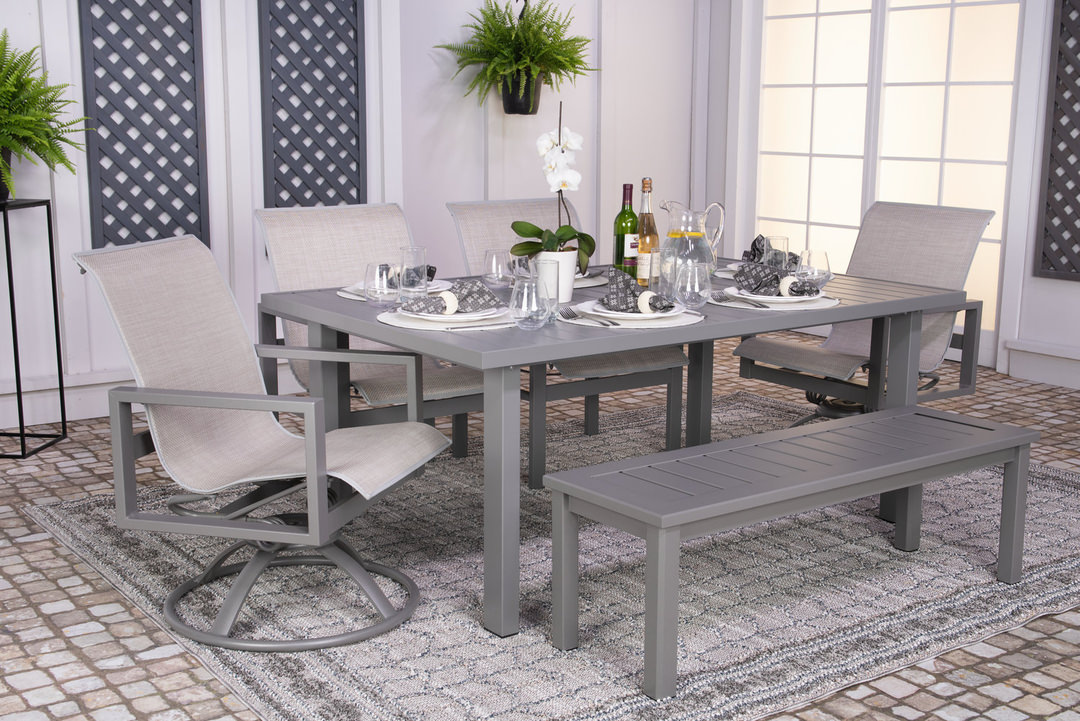
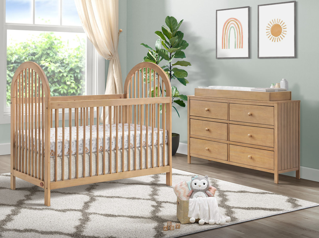
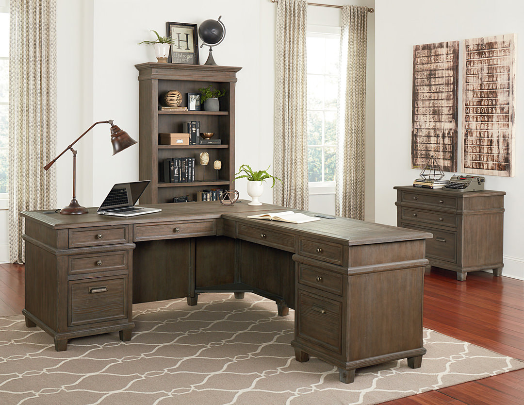
Related Products