Pantone 2019 Color of the Year
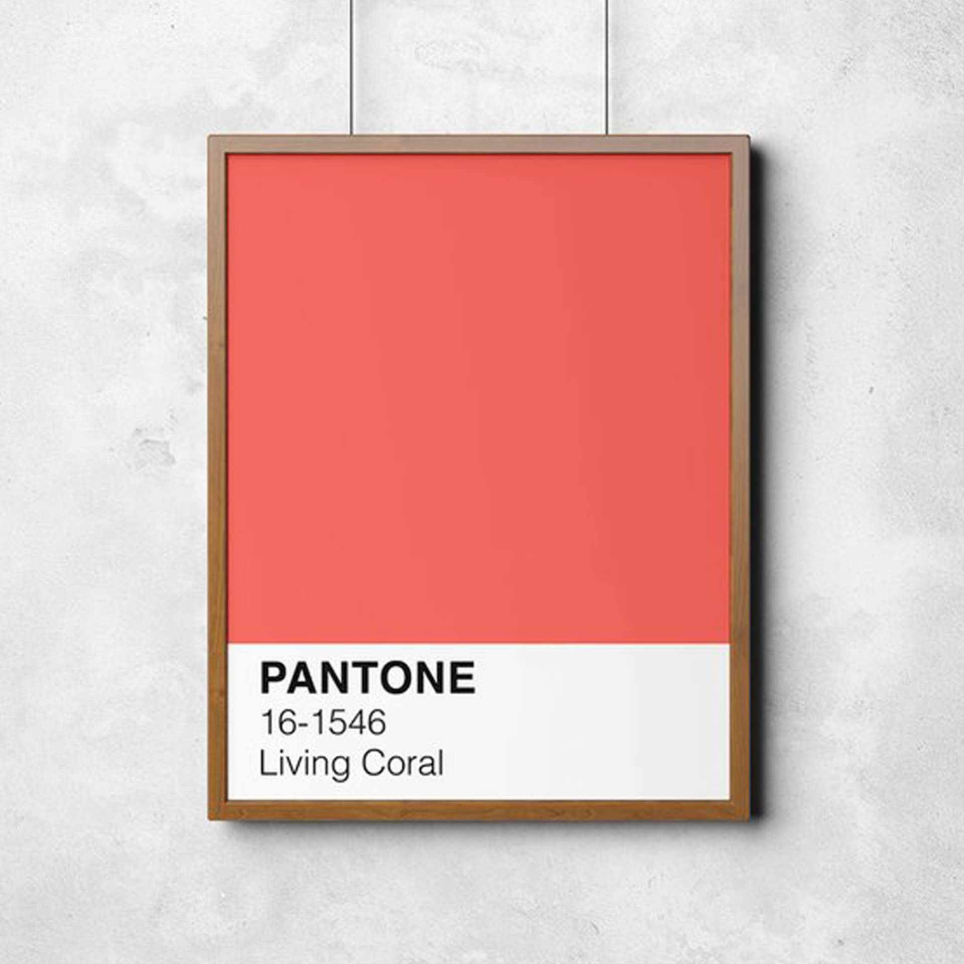
“Living Coral” is a vibrant, nature-based color, with a warm, golden undertone.

With 2018 coming to a fast close, it’s time to start looking forward to the trends and happenings of 2019. Leading the way in world of color trends, Pantone named it’s 2019 color of the year: Pantone 16-1546 Living Coral. Pantone, a consulting service that forecasts global color trends, chose this pink-orange, nature-inspired color, as a vibrant reaction, and perhaps antidote, to today’s ultra-plugged-in world. Living Coral is authentic, without taking itself too seriously.
“In reaction to the onslaught of digital technology and social media increasingly embedding into daily life, we are seeking authentic and immersive experiences that enable connection and intimacy,” Pantone stated in a press release.
Living Coral is an obvious reference to the color and wonder of the sea and, in particular, coral reefs—which house a large range of life and vivid colors. However, it’s also a statement about today’s life above sea level, including our need for a connection with nature.
“Color is an equalizing lens through which we experience our natural and digital realities and this is particularly true for Living Coral. With consumers craving human interaction and social connection, the humanizing and heartening qualities displayed by the convivial Pantone Living Coral hit a responsive chord,” said Leatrice Eiseman, Executive Director of the Pantone Color Institute.
Color Trends and Home Design
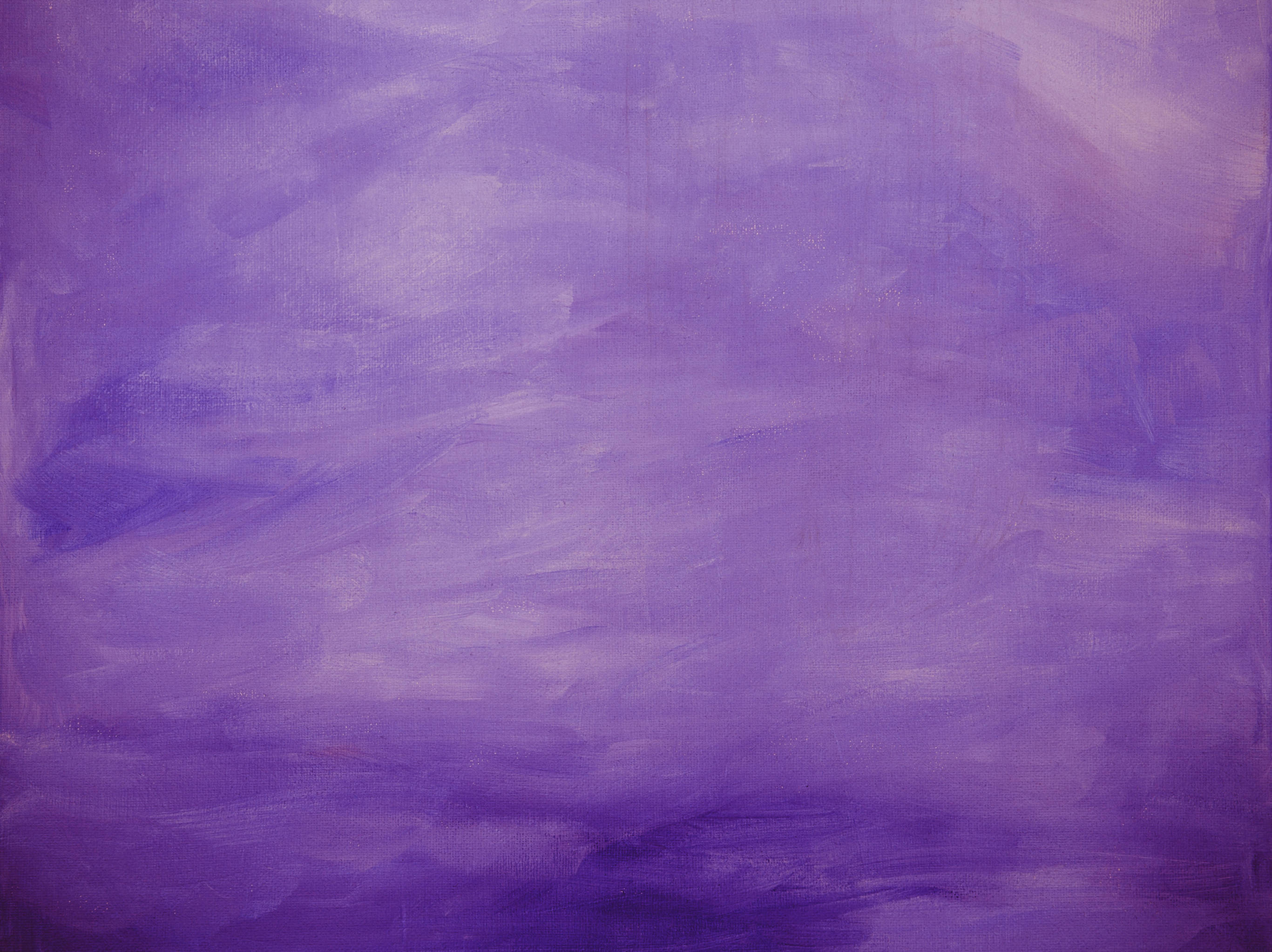
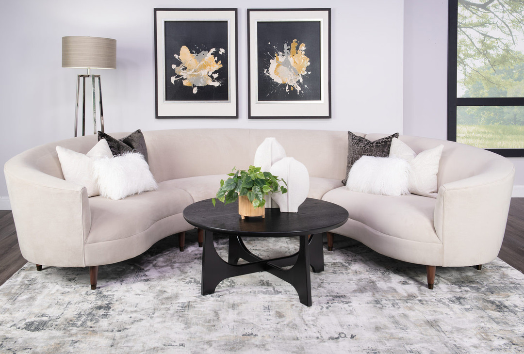
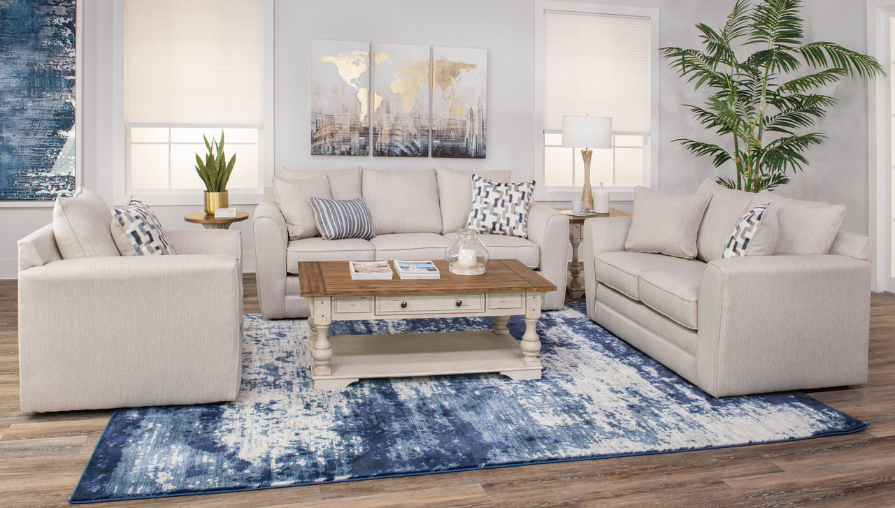
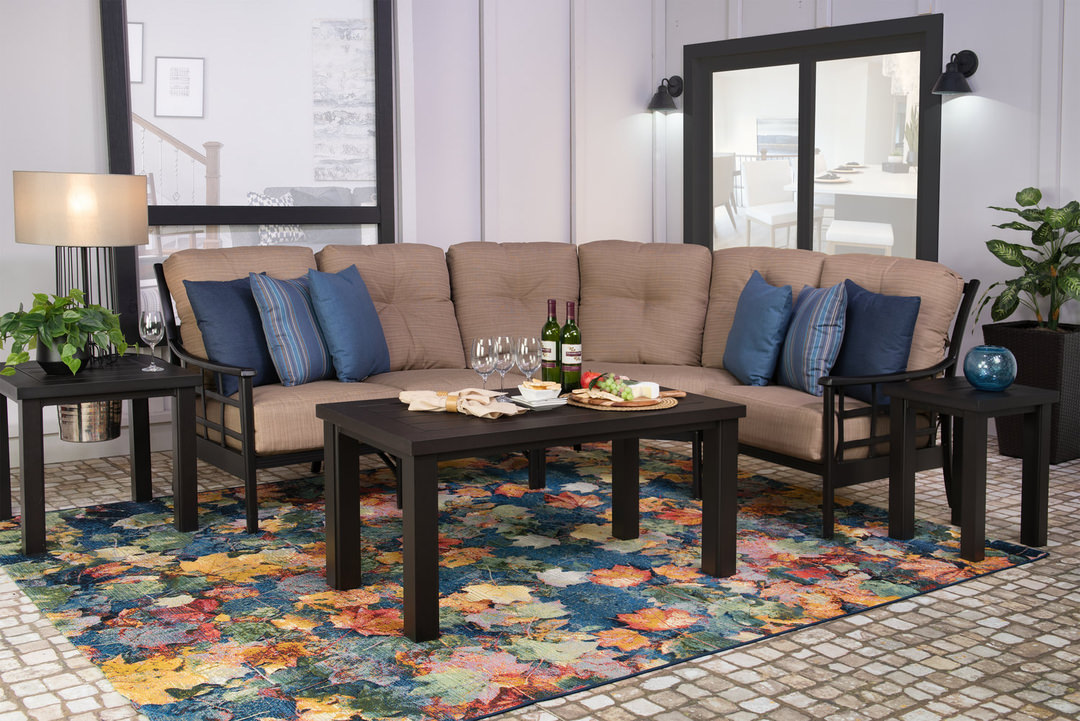
While you may start seeing vivid coral shades popping up on the runway, the home design world is often slower to jump on the hot “new” color shade bandwagons. For instance, trend colors typically don’t make it to mainstream area rugs, unless they become an established color trend and not just a fad. And at that—it takes some time to see these colors appear. Pantone’s pick for 2018, Ultra-Violet, is just now popping up as an accent color in rugs, and 2017’s Greenery didn’t become an established color in mainstream area rugs.
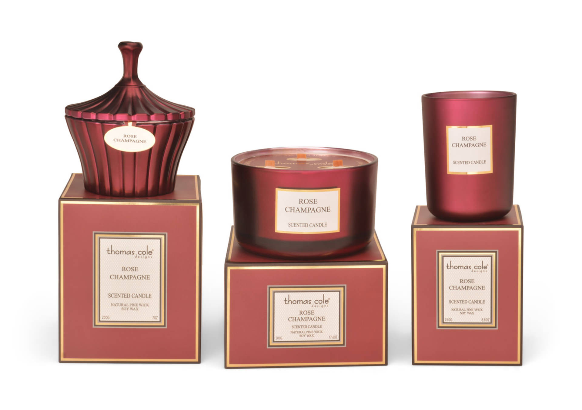
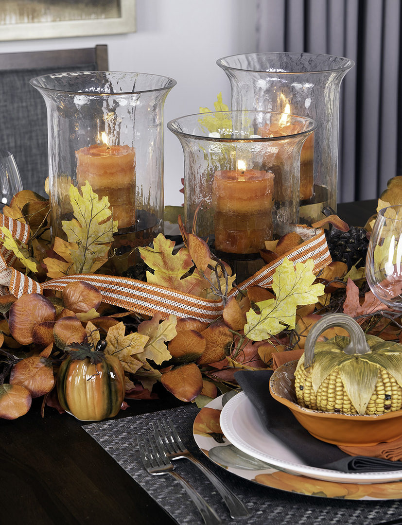
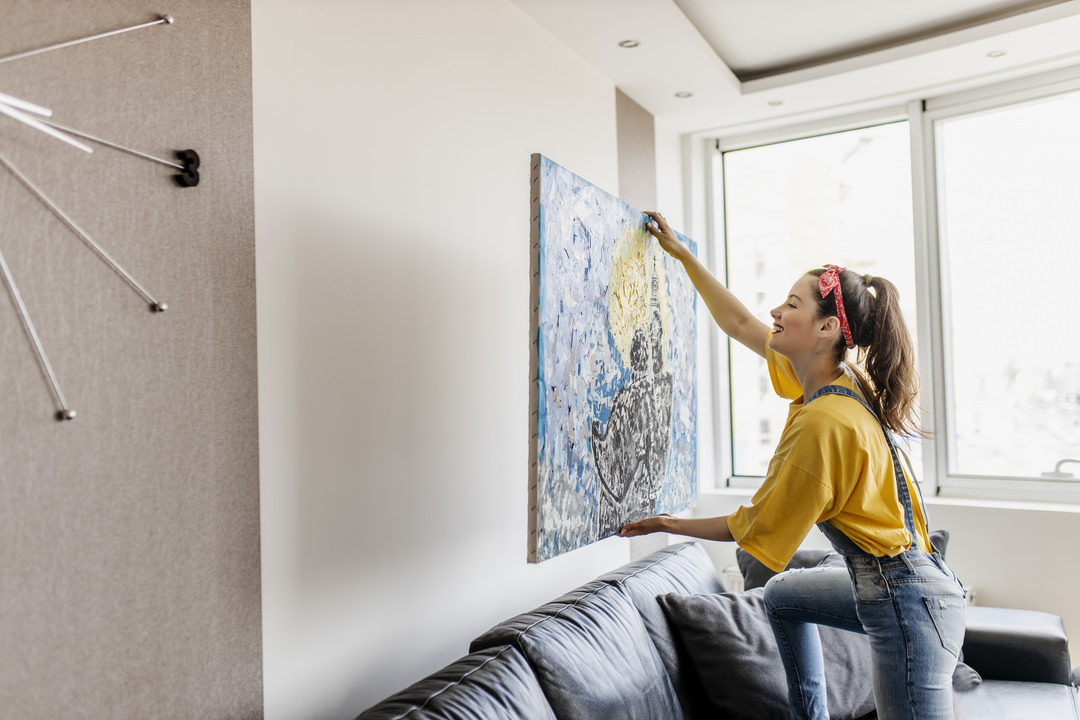
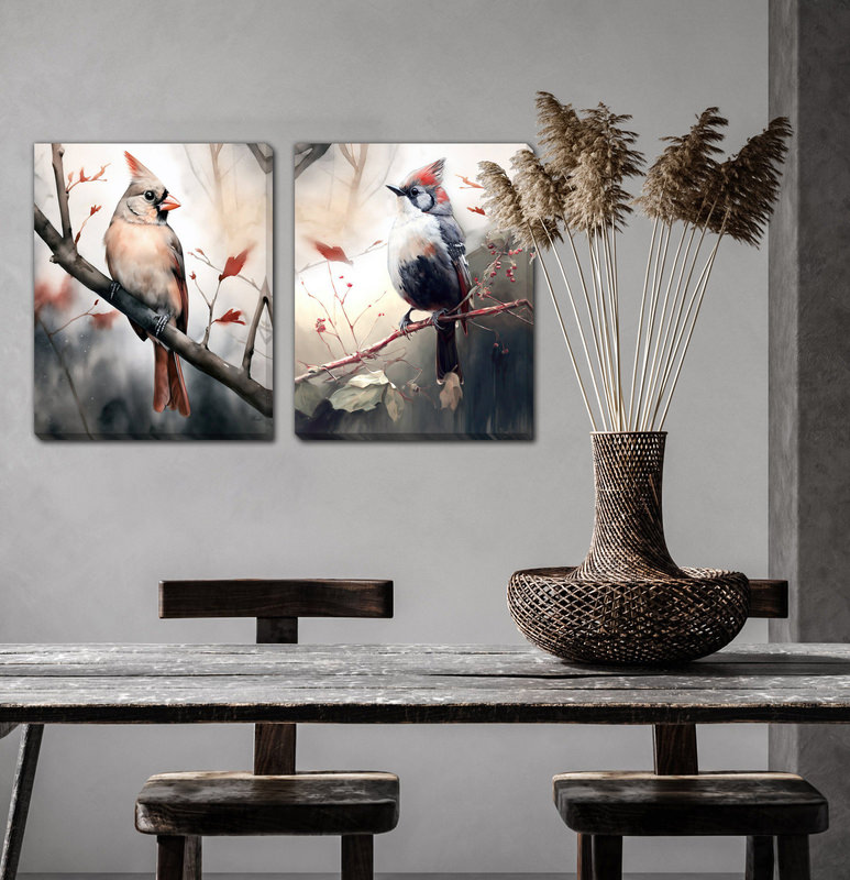
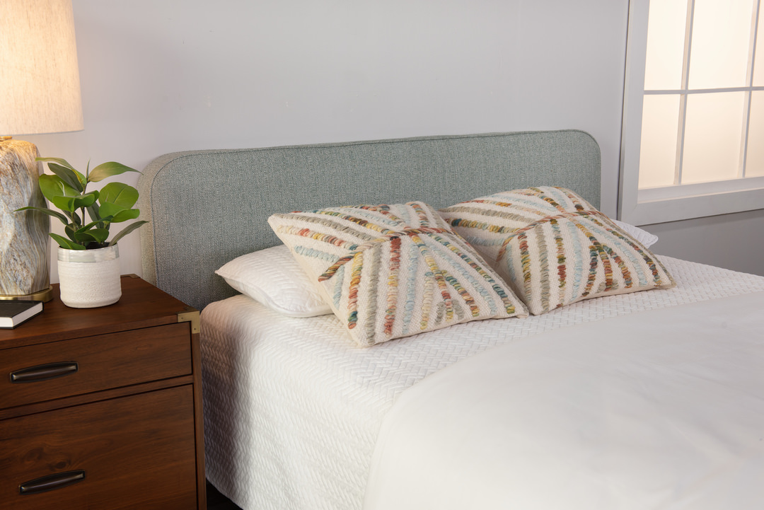
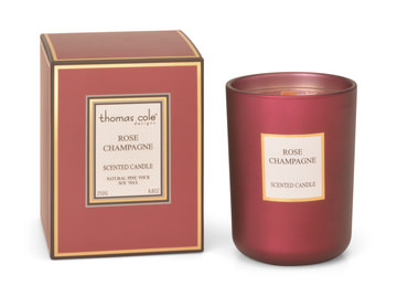
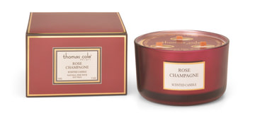
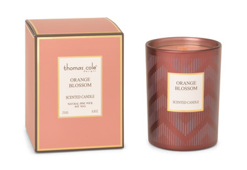
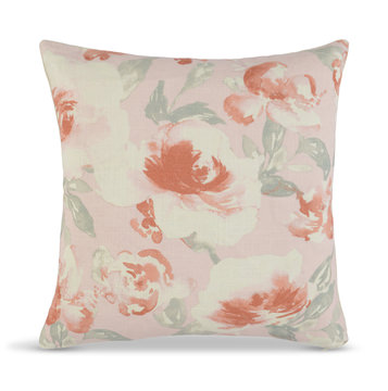
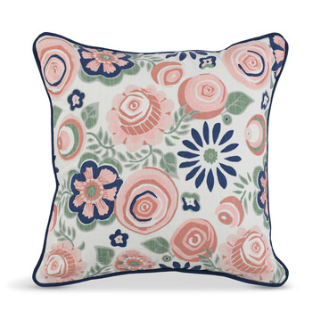
However, just because you don’t see bright coral as a primary color on area rugs or large furniture items, like sofas, doesn’t mean that you won’t see the color’s influence in interior design. Look for the bold and bright hue to pop up on accent pillows and throws, as well as artwork and other home accessories that can be incorporated into your living space to create a trendy and fresh feel. Coral pillows, bedding and accessories such as candles, in Living Coral or a similar shade, can also be added to your bedroom and throughout your home.
If you are totally on board with Pantone’s pick for 2019, consider adding a big pop of coral color to your space by painting an accent wall in the bright shade. It’s an easy way to make a dramatic change to your room, and is relatively affordable and easy to accomplish. Plus, paint is easy to switch out when the color-tide changes—or at least when you feel like you need an updated look.
About Pantone Color of the Year
For 20 years, Pantone’s Color of the Year has influenced product development and purchasing decisions in multiple industries, including fashion, home furnishings, and industrial design, as well as product, packaging, and graphic design.
