Creative Color Combinations
Choose a unique interior design color scheme, inspired by today's color trends.
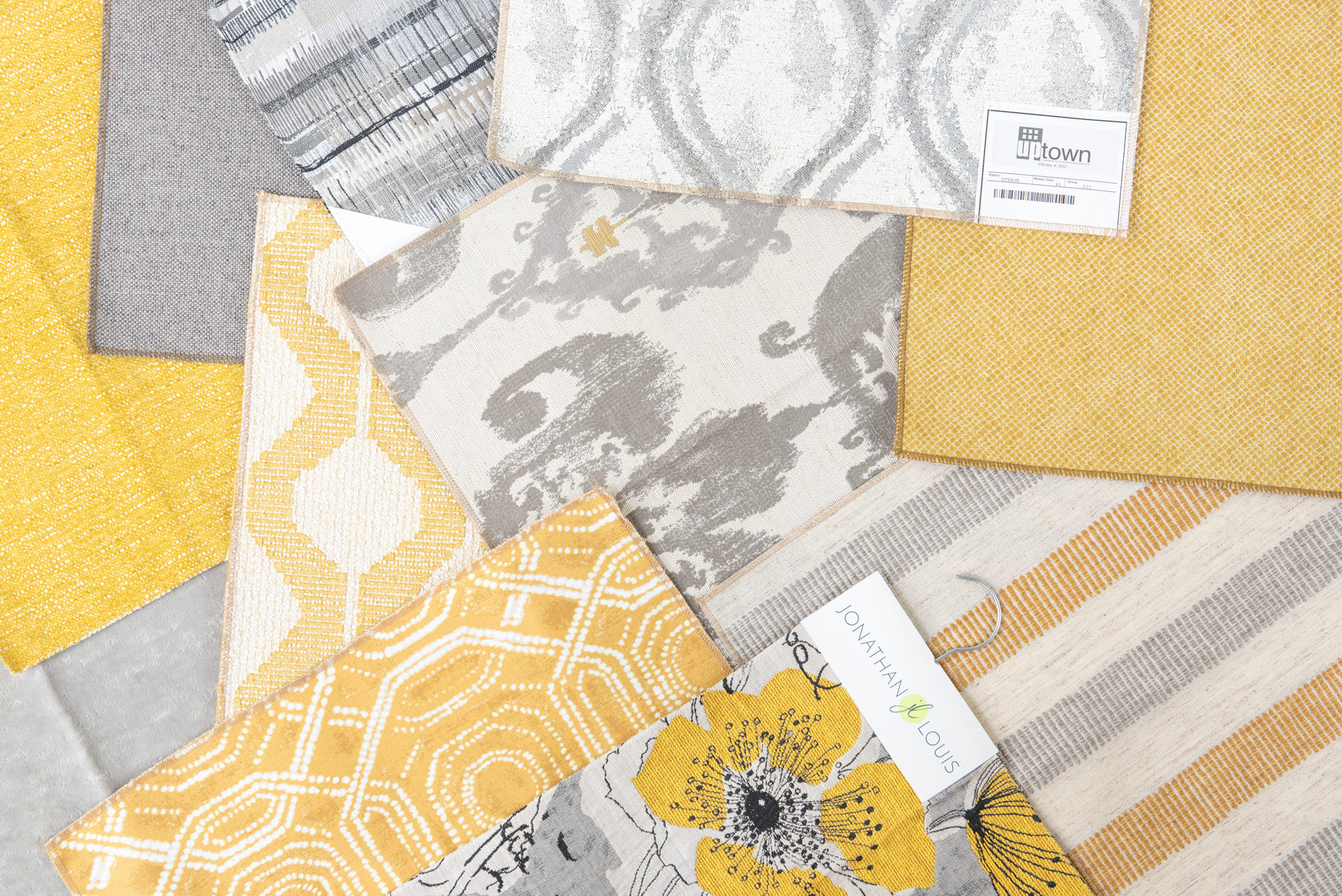
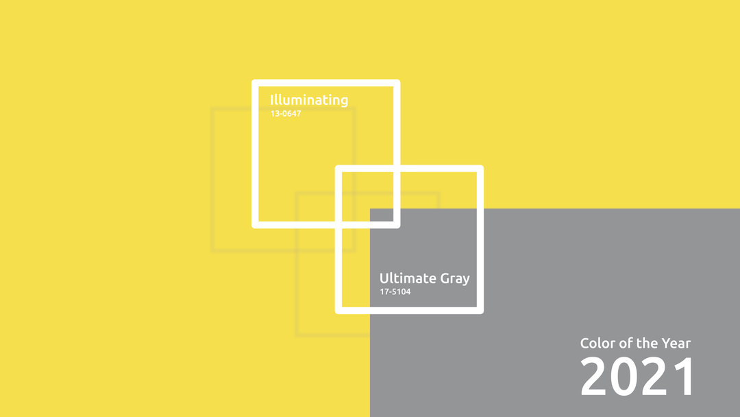
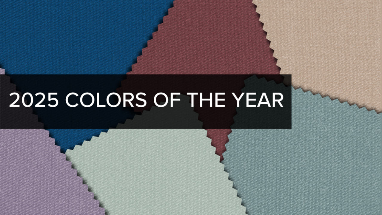
Every year the fashion color company Pantone names its Color of the Year. In 2021, they threw a curve ball. They named two colors . More than that, they chose a pair many people don’t immediately think of as partners. They’re Ultimate Gray and a yellow color called Illuminating.
The gray is slate-like and no-nonsense, and the yellow is bold and vibrant. Interestingly, the two do more together than they could apart. They express two personalities in one room. One’s calm and serious, and the other’s warm and optimistic.
Interior designers are finding ways to use these Pantone colors together, which brings to mind further questions. If yellow and gray work together, what are some other unexpected but pleasing color combinations? What else will we see in interior color trends 2021? Here are some thoughts on how you might use new color elements in your interior decorating schemes.
The 60-30-10 Rule
Before you change all your colors, be aware of some principles designers have long used to create an interior design color scheme that works. Even if you decide to break the rules, you should know what they are and why they exist.
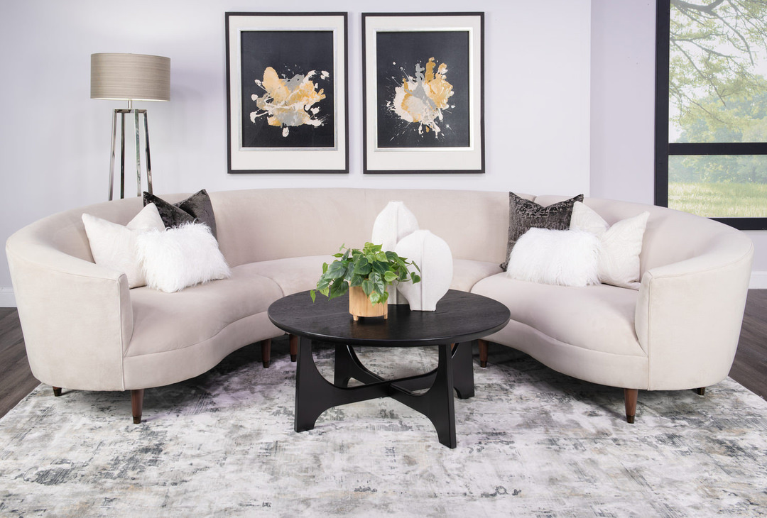
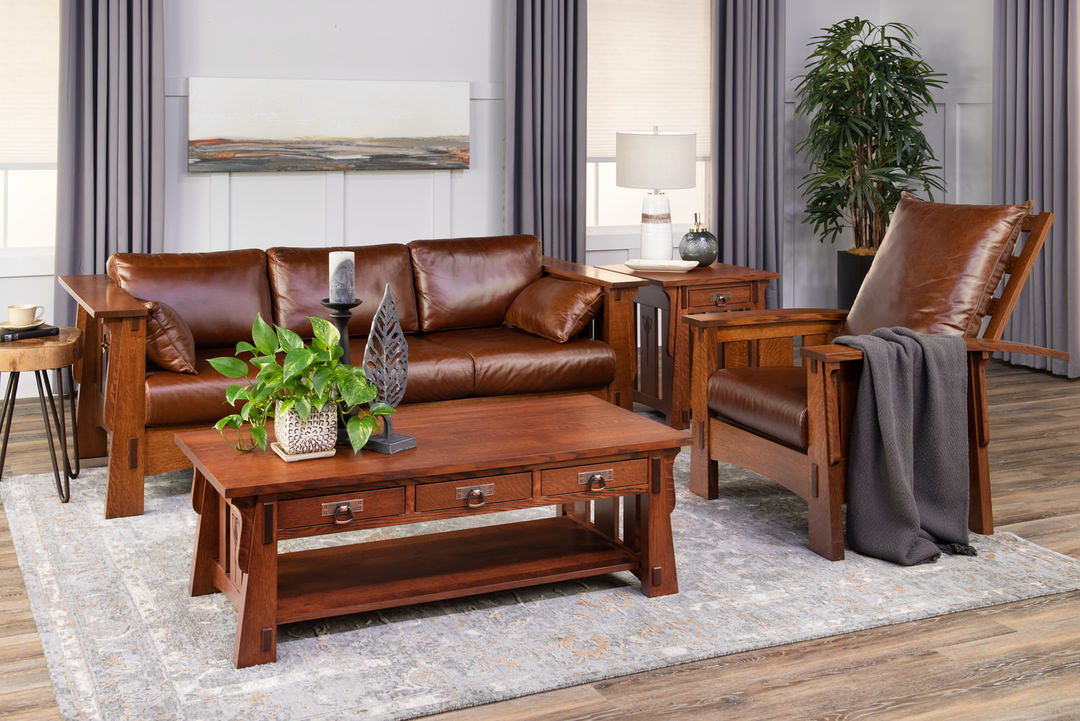
The 60-30-10 rule is this: 60 percent of your room should be the primary color, 30 percent a complementary or contrasting color, and 10 percent an accent color.
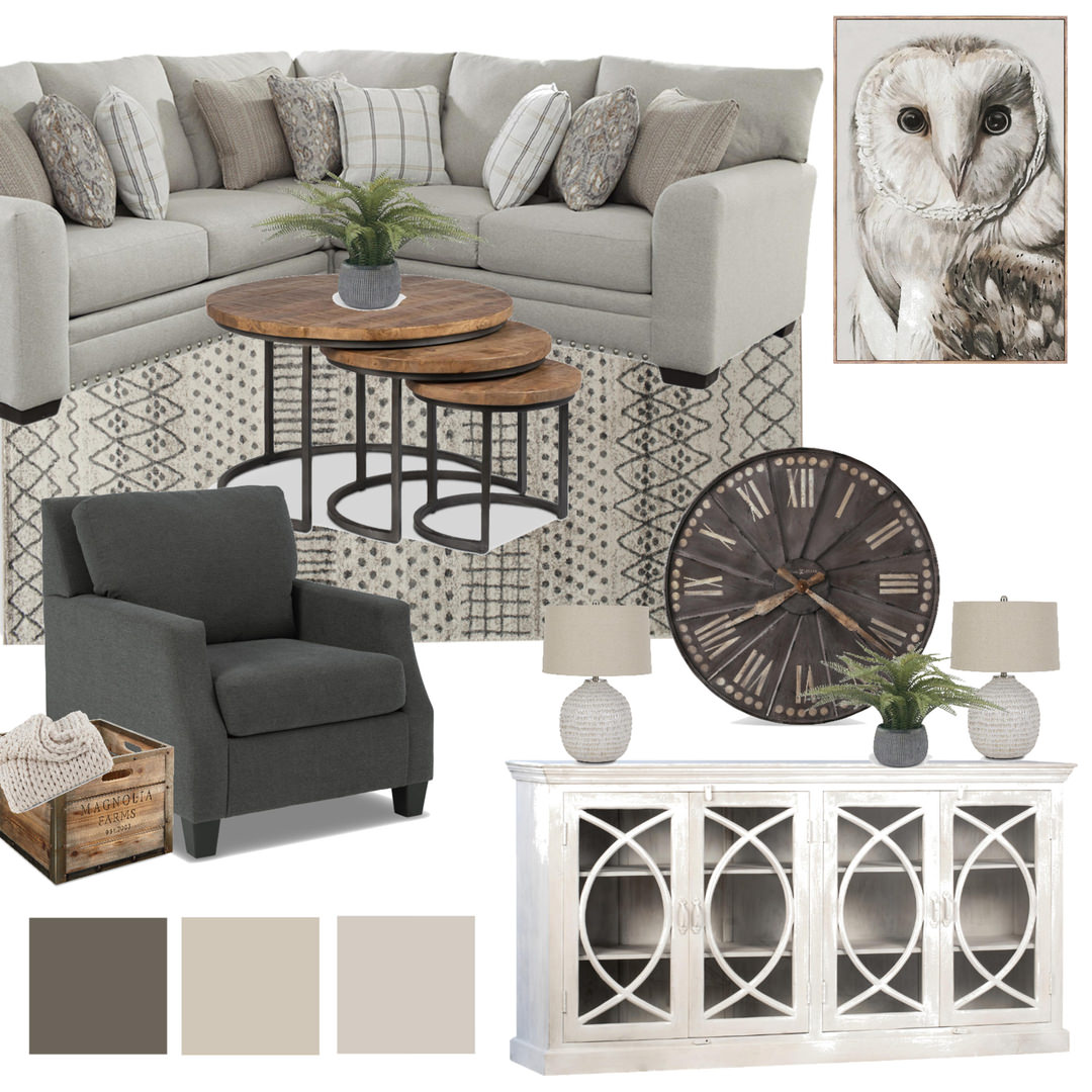
The 60 percent would likely include your walls, perhaps a rug or carpet, and possibly some major pieces such as sofas and chairs. It makes the initial statement about what the room will be. The 30 percent color might be used for drapes, some furniture, linens in a bedroom and area rugs. It can be similar to the main color but must be different enough to create interest.
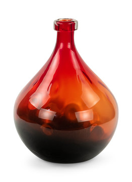
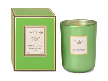
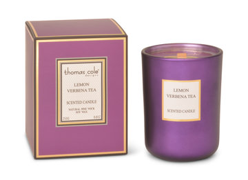
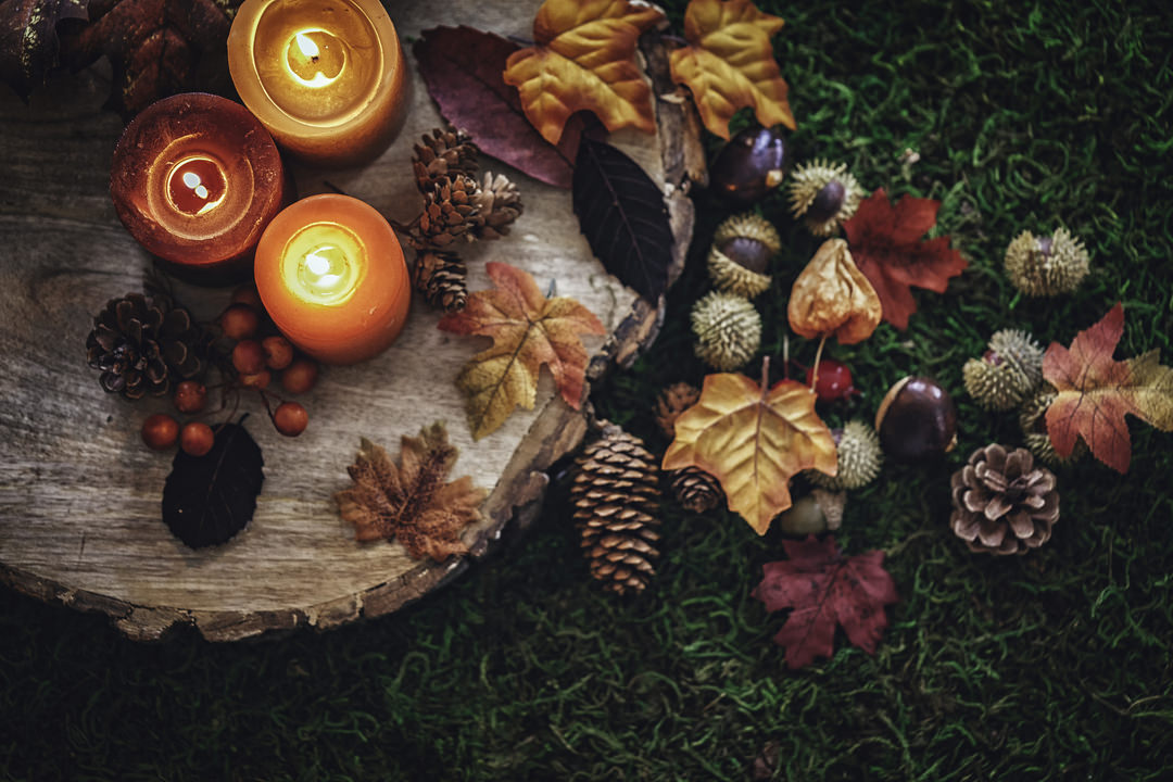
The 10 percent is where the fun lies. Here you can use something that pops, such as a red or yellow or an unexpected blue. You might use this in throw pillows, artwork, lampshades, candles and miscellaneous decor.
As with most rules, there are variations and exceptions:
- Monochromatic color scheme. Here’s where the 60/30/10 are various shades of a single color. For example, a neutral blue primary, a dark blue secondary and a jewel blue accent color. Monochromatic schemes are relaxing.
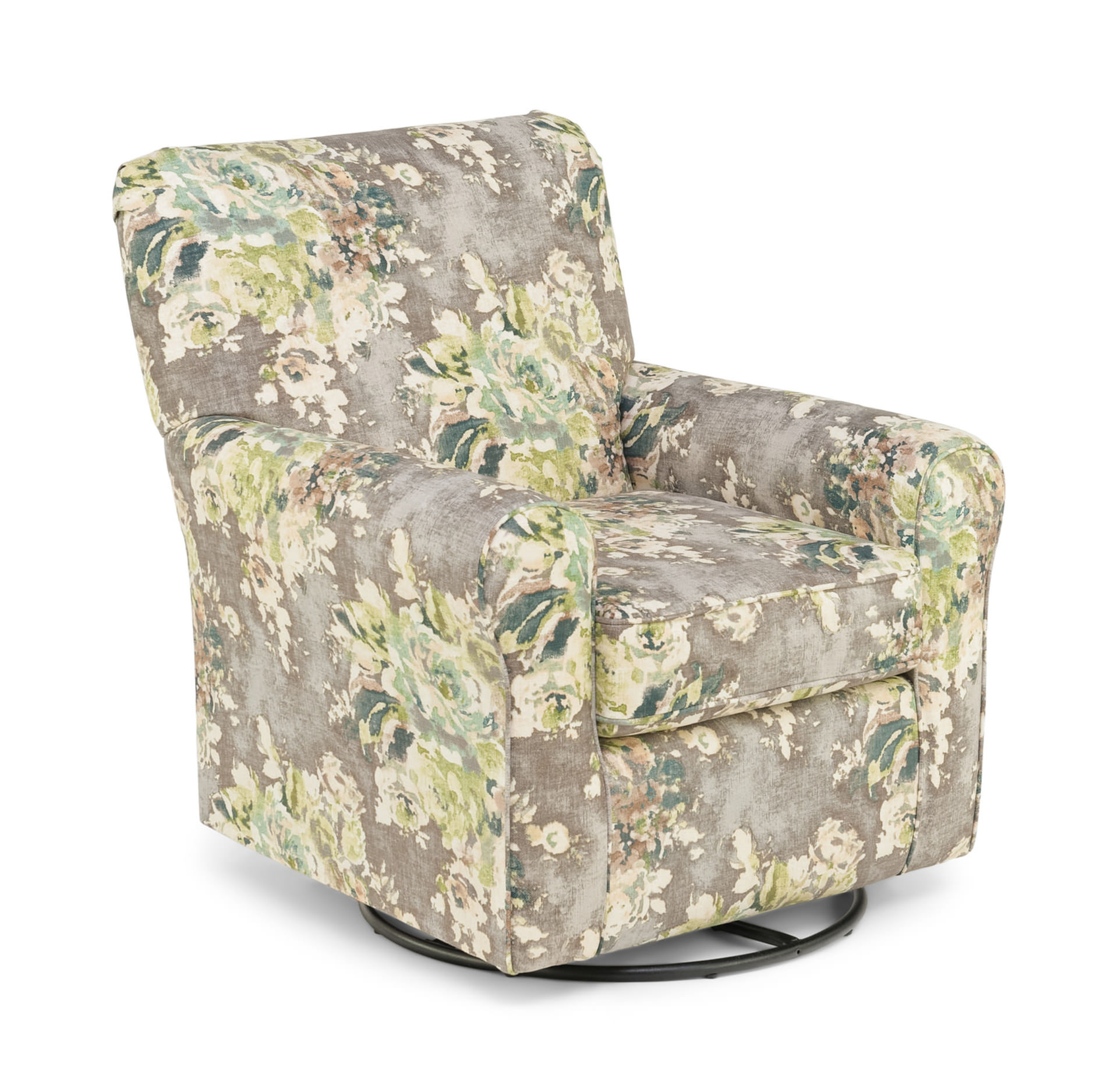
- Analogous color scheme. This uses colors from the same group. For example, yellow, yellow-green and green. Or blue, indigo and purple. These are daring and unexpected and often work surprisingly well.
- “110 percent” scheme. This uses two 10 percent accent colors. They can be analogous or contrasting.
- Varied percentages. Maybe 45/45/10 or 60/20/20. The further from 60/30/10, which is tried and true, the riskier.
How to Use Gray and Yellow
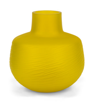
If you adopt the 2021 Pantone gray and yellow idea, there are a few options. The safe and cautious choice is 60 percent basic gray, 30 percent another gray and 10 percent yellow. But if you’re feeling adventurous, make the yellow the 30 percent and pick a different accent color.
In the latter case, the third color completely changes the personality of the scheme. Blue is calm and mellows out the two other colors. Red is assertive and says you’re open to new horizons. Green, being related to yellow, gives the scheme a twist. Expressive accent colors such as aqua and purple are playful.
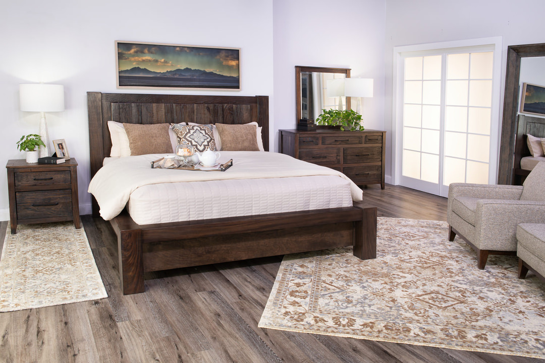
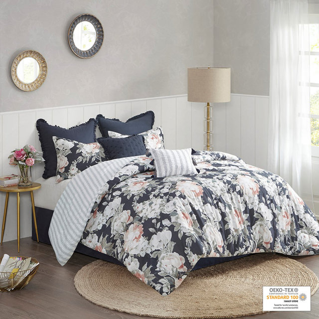
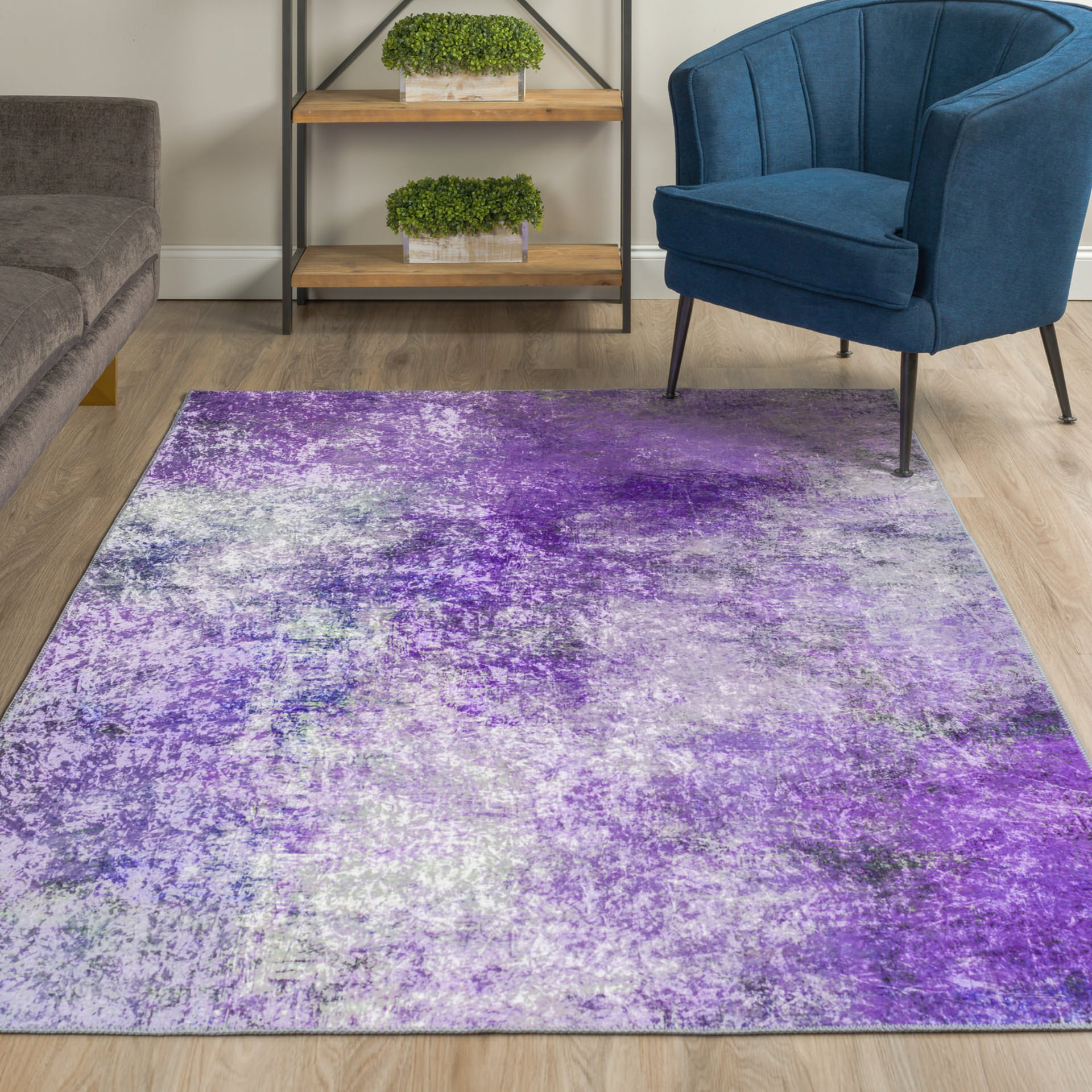
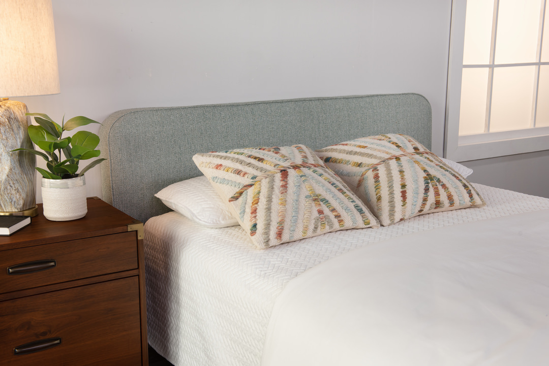
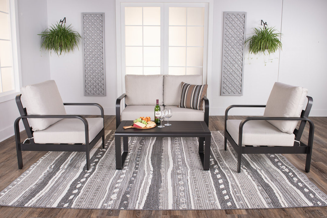
Where should you use yellow in a room? That depends largely on whether it will be an accent or a more prominent color. Living room options are curtains, area rugs and trim on your walls. Yellow chairs and a yellow backsplash can work in the kitchen. In a rec room, a yellow rug under a metal table is a gray and yellow exhibit all by itself. Bedspread and pillows work in a bedroom. And of course, decor such as candles, wall art and lampshades give yellow its voice in any room.
Other Creative Color Combos
Why stop at gray and yellow? Here are some more modern interior design color schemes to shake up your visual world.
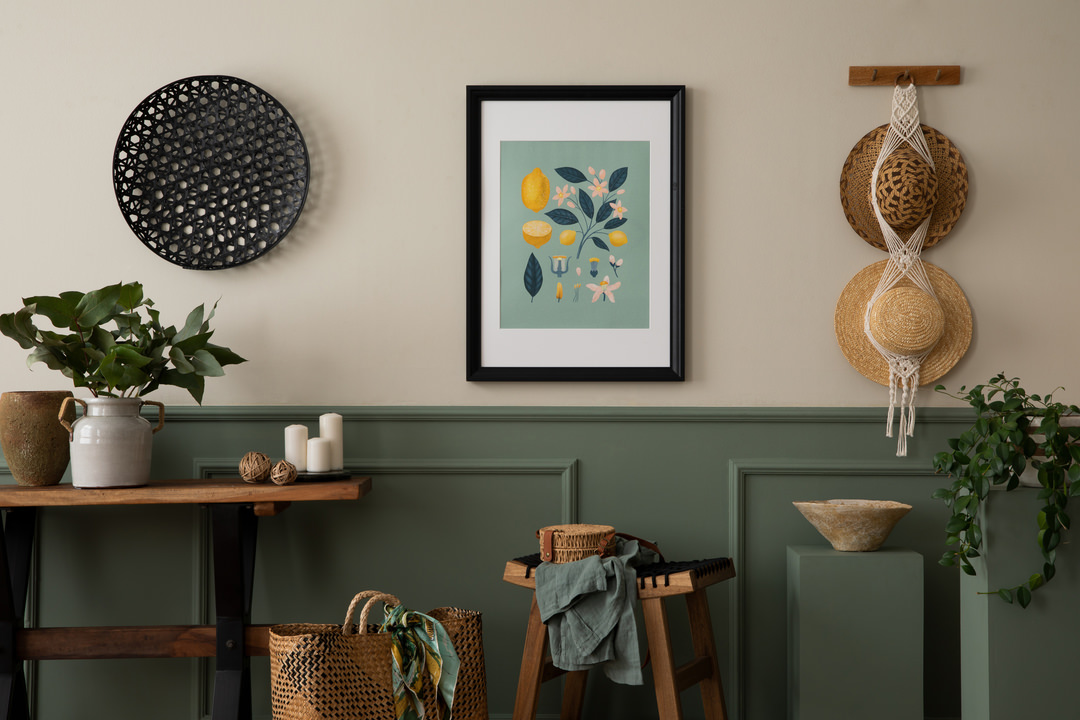
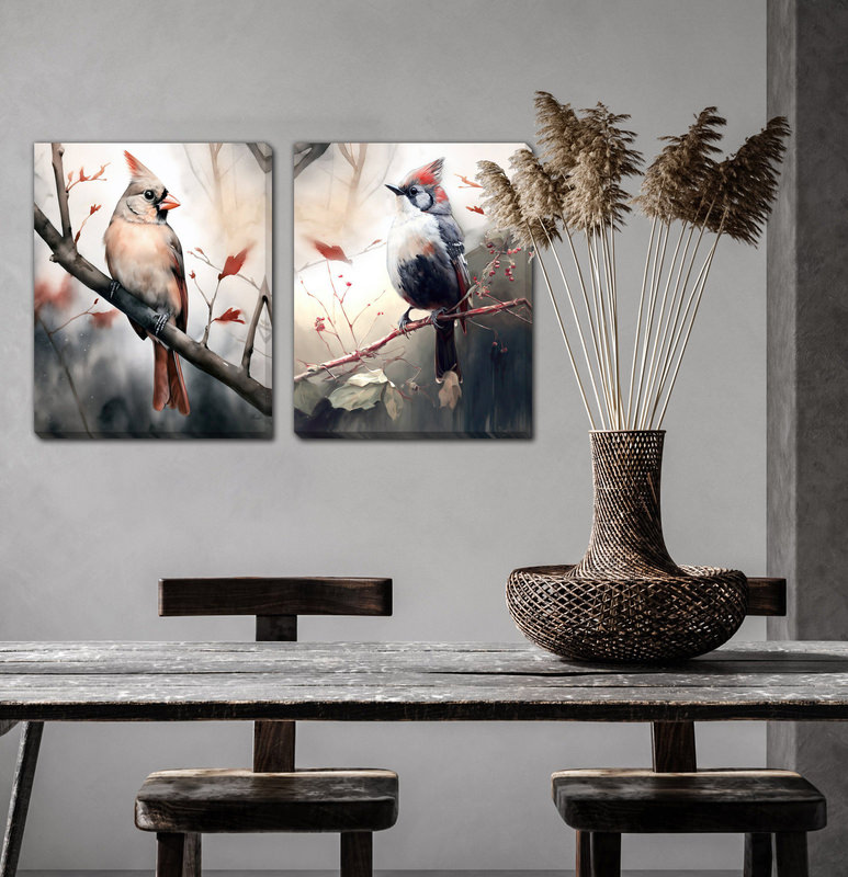
Black and white and something unexpected. A black and white room is stylish and modern, but it can be boring. Add an unusual accent color such as chartreuse, aqua, lavender or tangerine and see what new spirit emerges.
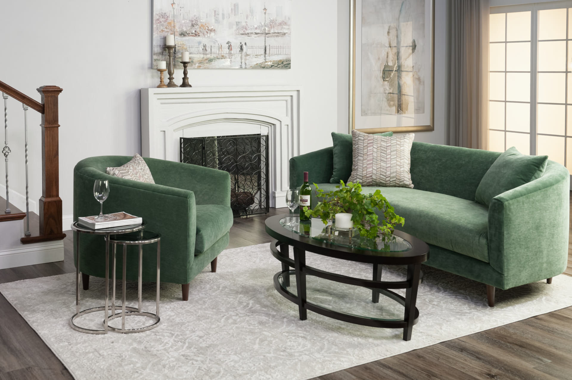
Blues and greens. Some say that they clash, but there are so many variations within each that it’s hard to make generalizations. How about a sage green and a steely blue? Or olive and light denim? For a more daring variation, check out a green with a purple. Try them as your secondary and accent in a neutral background.
Pink and teal. If it sounds like an odd choice, set them side by side and soon you’ll see the possibilities.
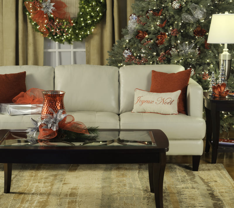
A heavy color and pink. Navy blue is masculine but pink balances it. Brown or beige can be somber, but pink softens it so it won’t take itself so seriously.
The possibilities are endless. Consider blue and orange, turquoise and tangerine, coral and emerald, aqua and red, or a threesome such as olive, brown and red.
Intrigued but Apprehensive? Start Small!
You may not be ready to put a yellow rug in your gray living room, but you can experiment with color creativity in a less risky setting. Redo a den, a room where playfulness fits the area’s purpose. Experiment in a bedroom, where coverings and pillow can easily be changed. Try a fun and quirky accent color with the decor in any room; candles and throws can go elsewhere if you don’t like what you see. There’s little risk but a chance for reward in brightening a bathroom with new towels, shower curtain and bath mat.
Don’t forget the opportunity to paint. Not just walls, but also repainting bookshelves, chests and dressers for children’s rooms or playrooms.
There’s a world of opportunity in the color trends 2021 will bring. Get on board, and you might be surprised how much you like the results.


2025
April
March
February

January


2024


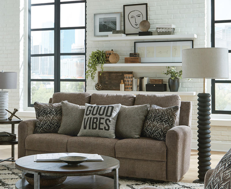
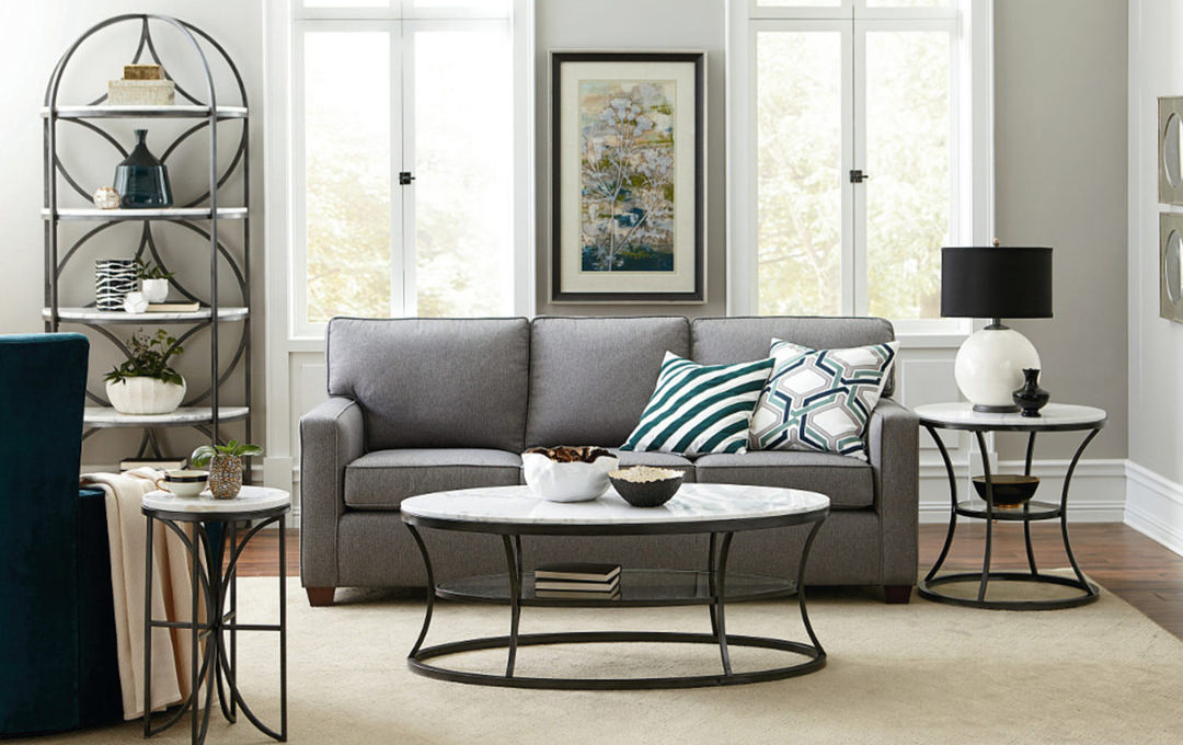


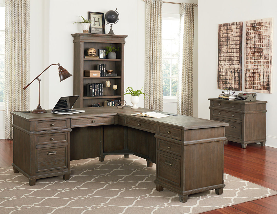
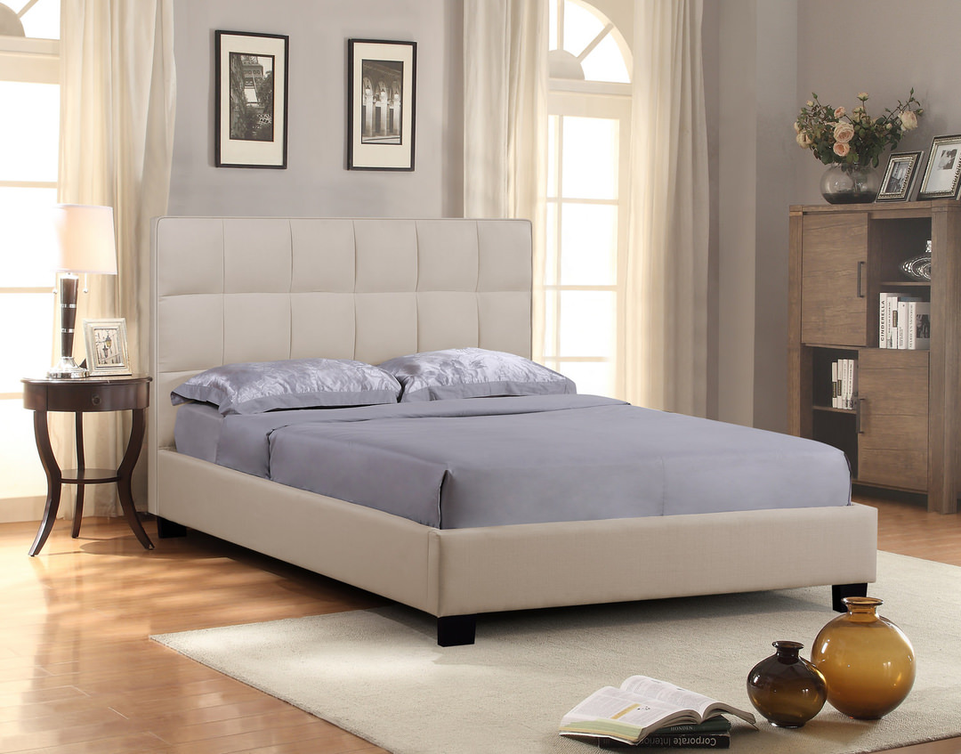
Related Products