Sherwin Williams Color of the Year 2023
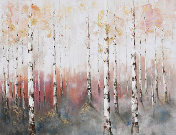
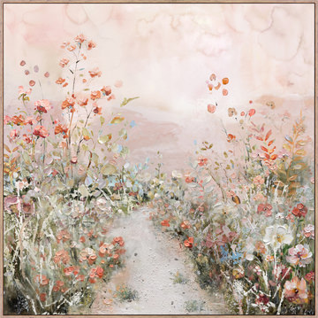
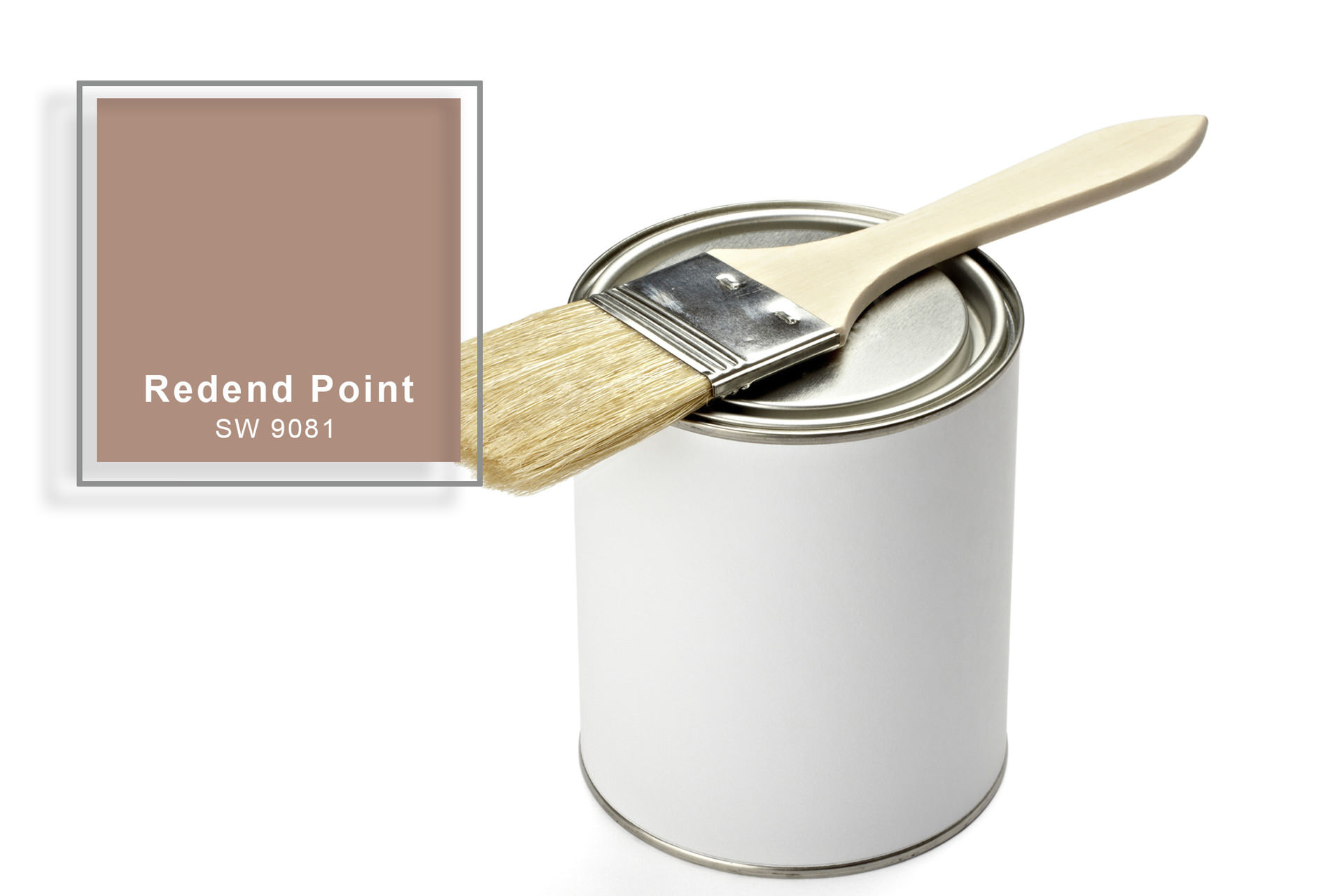
Redend Point is a warm and earthy hue.
If you’re looking to upgrade a room, you can hardly make a better start than a fresh coat of paint! Maybe your new color will be the backdrop for an extensive remodel or possibly it’s meant to coordinate with the furnishings you already have. In either case, there are so many color possibilities that it’s hard to make a choice!
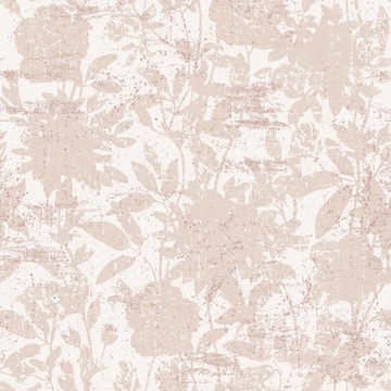
For you undecideds, Sherwin-Williams has a suggestion. It’s their 2023 Color of the Year, and it’s called Redend Point. It’s a beige-like neutral with subtle and surprising blush overtones, and it blends well with a mix of shades, especially those that evoke nature. Redend Point is calming and reassuring yet carries enough intrigue to continuously engage your interest!
What Is Redend Point?
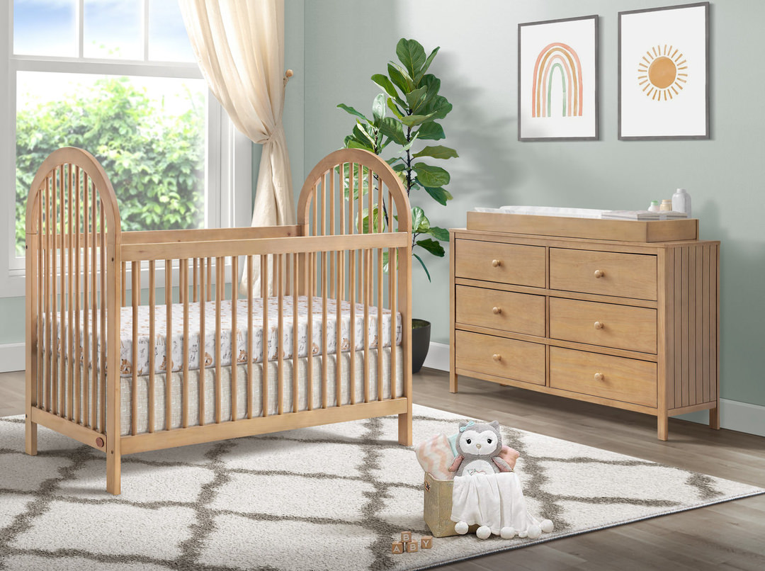
Redend Point is a neutral, but what a neutral it is! It’s a little bit of beige and a little bit of blush. It could even be classified as a mauve. There’s certainly an aspect of pink to it.
This inventive pink-meets-greige is confident without being showy. It’s a major shift from 2022 colors of the year, when most of the big names were embracing blue-green tones. Sherwin-Williams’ own Evergreen Fog was a gray-green 2022 example of the trend. However, in the coming year the paint maker is heeding the call of romance with this new pinkish neutral!
A Calming Yet Intriguing Color
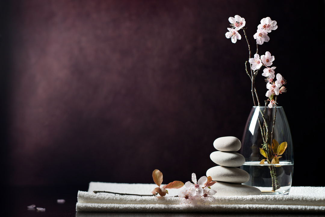
Redend Point was designed to encourage rest and relaxation. It’s inspired by the natural world where health and wellness are key. We already see tinted variations of beige online in meditation and mental health apps, and it’s a logical next step to extend those benefits to our living spaces.
White and eggshell are popular choices for wall colors, but Redend Point has a welcoming coziness that those more traditional standbys can’t match. It’s just as familiar and reassuring while offering an extra measure of grounding and nurture.
Even though it’s warm and comforting, it’s far from boring. The pinkness subtly hints at love and romance. A room painted in Redend Point is a soft and soothing space but at the same time has just enough mystique to bring a detectable liveliness to the environment.
Why Redend Point Now?
Neutrals have always had an important place in interior design, but people are ready for a fresh twist and moving away from the popular gray tones and neutrals with cool undertones. Beiges, creams and other warm neutrals are gaining steam—in paint colors, flooring, furnishings and décor.
There’s a bit or empathy and humanity in the color psychology of Redend Point, and Sherwin-Williams wanted a shade that reflects an attitude of people in harmony with one another. There has been and still is plenty of tension in the world outside our doors, and this color offers the possibility of coming home to a calming visual embrace.
Mixing and Matching with Redend Point
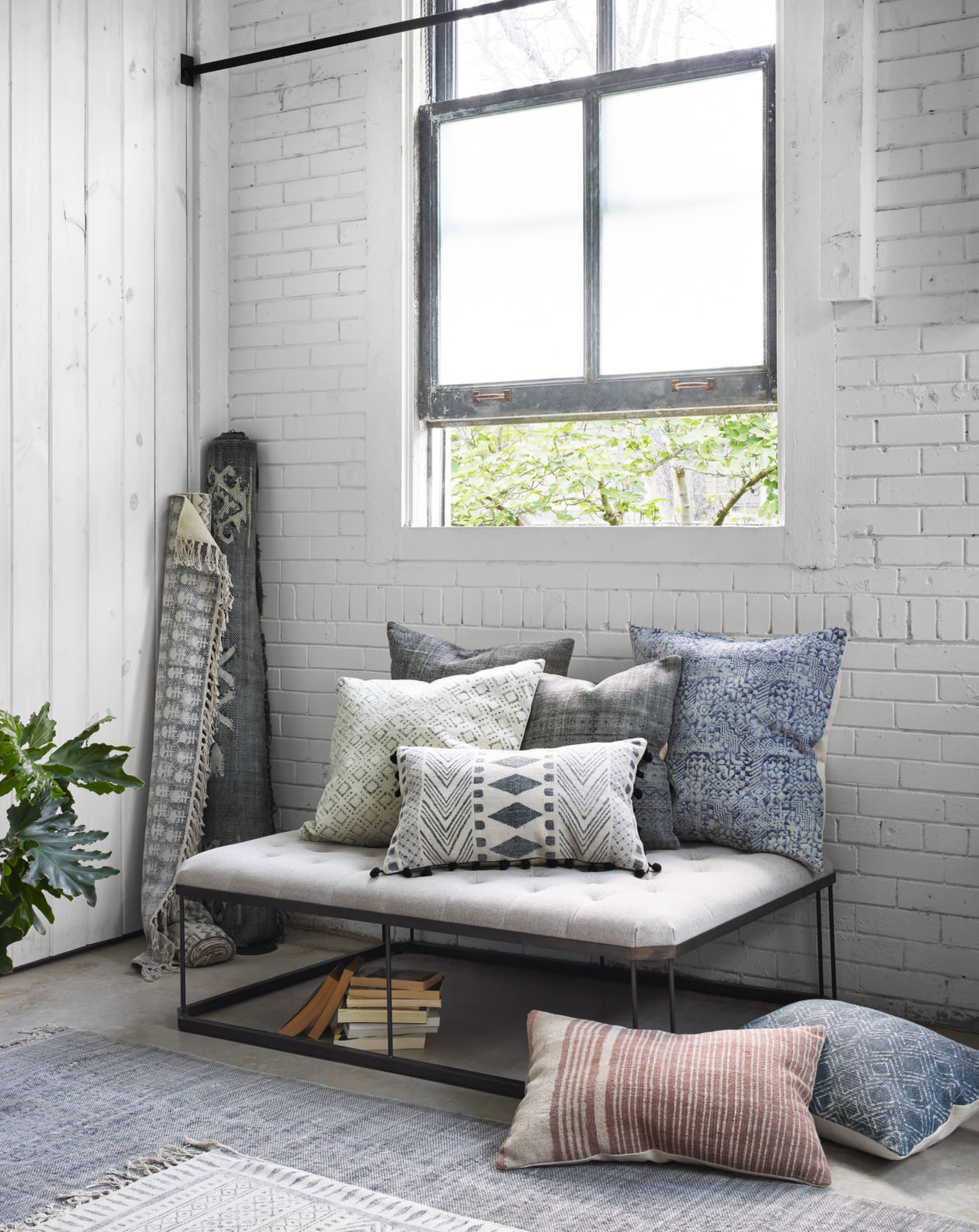
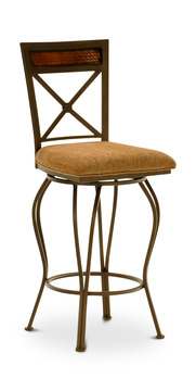
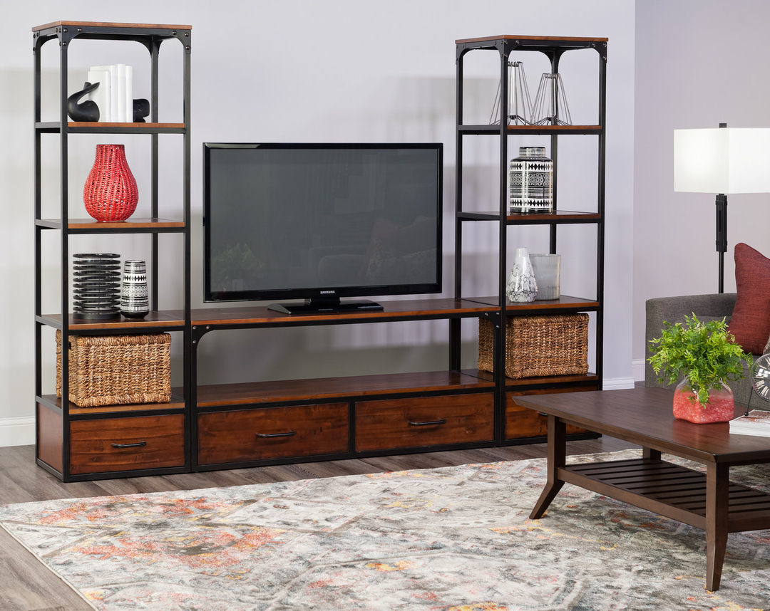
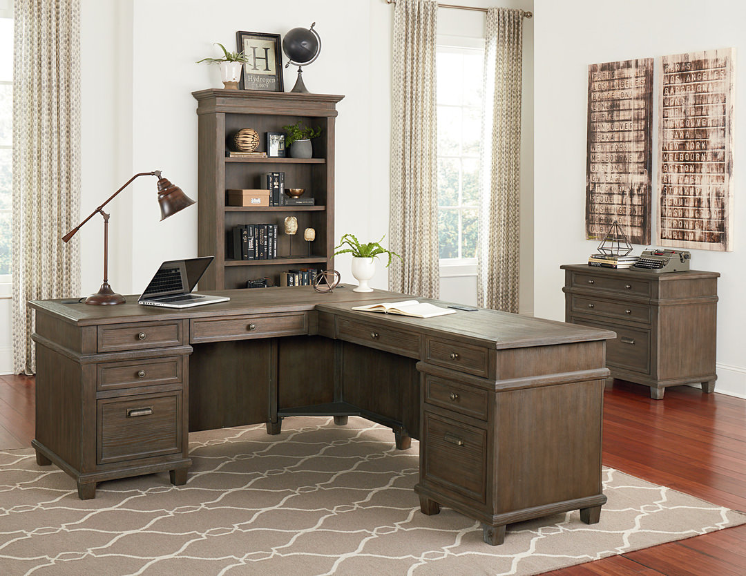
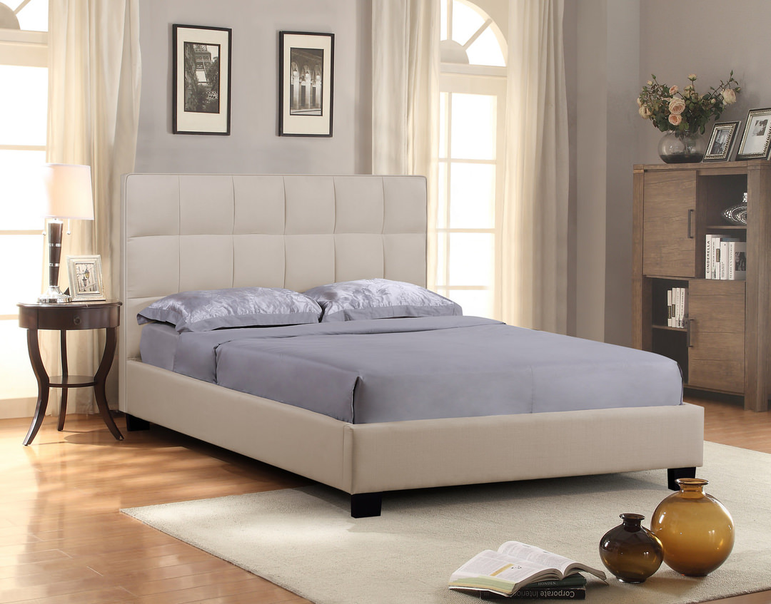
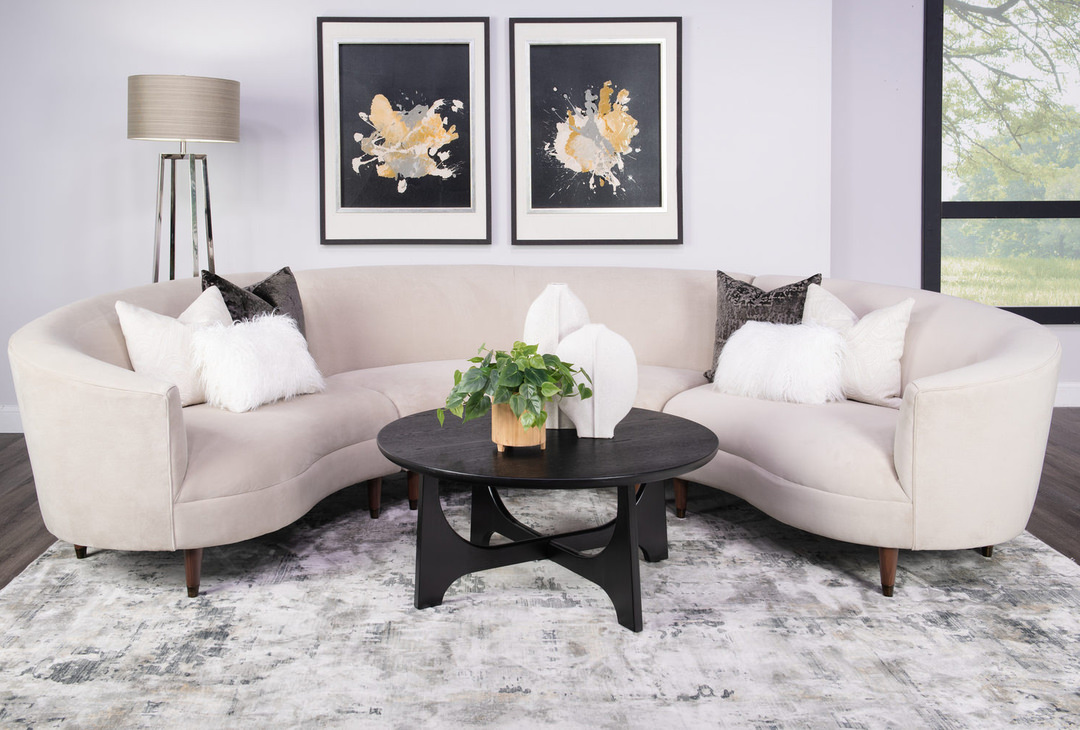
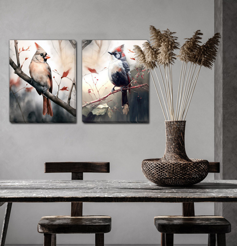
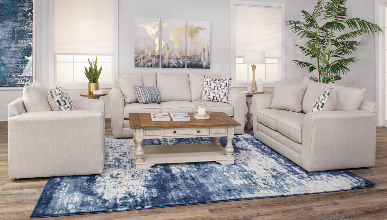
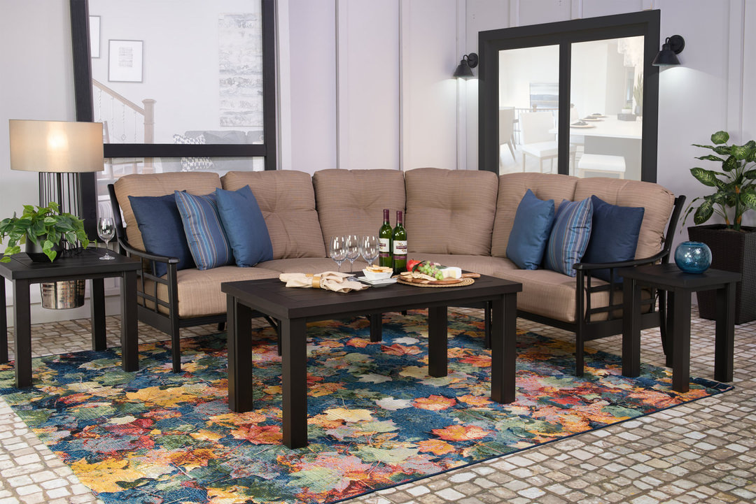
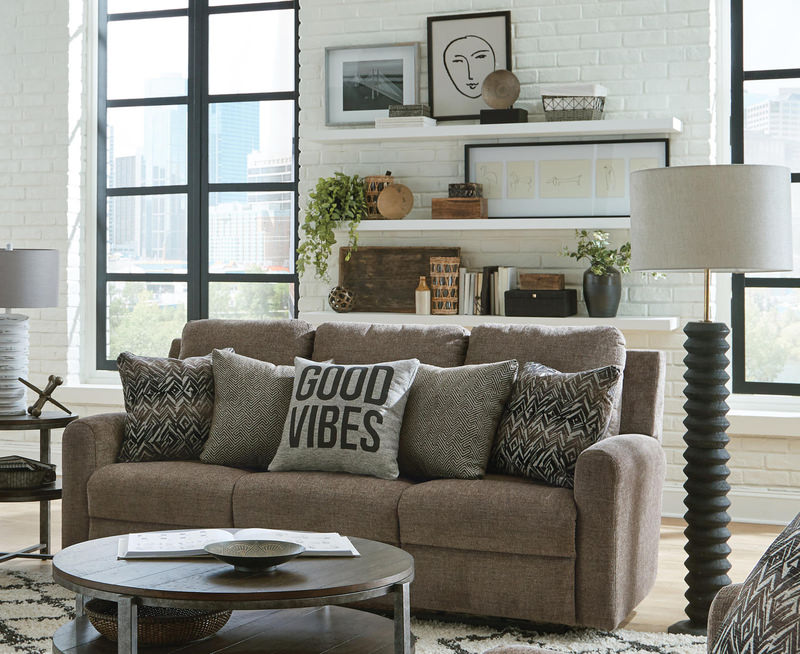
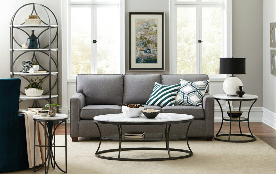
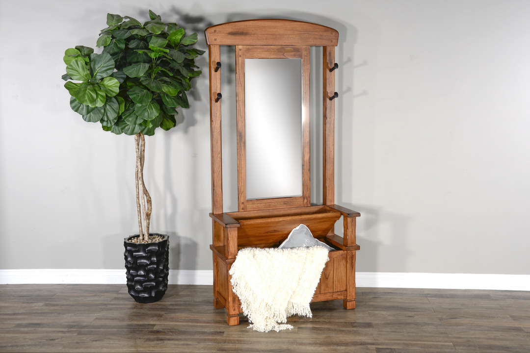
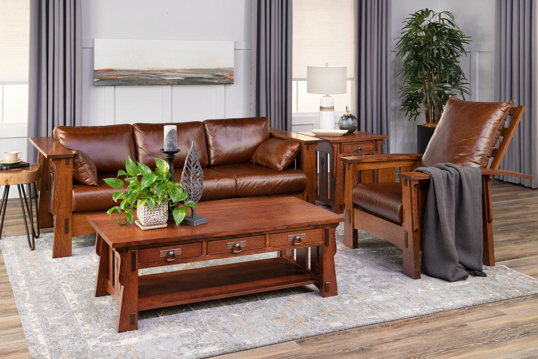
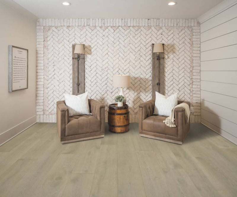
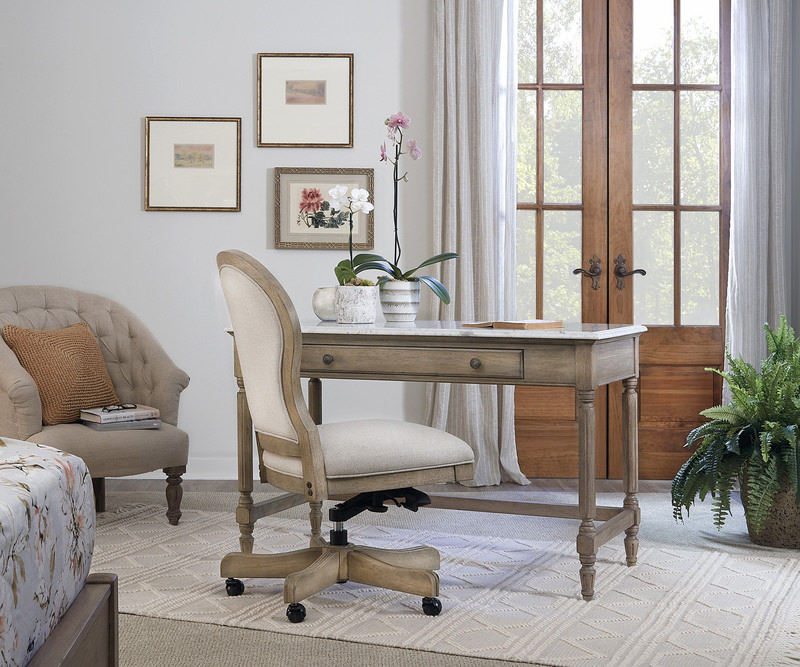
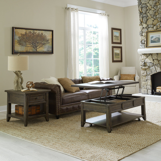
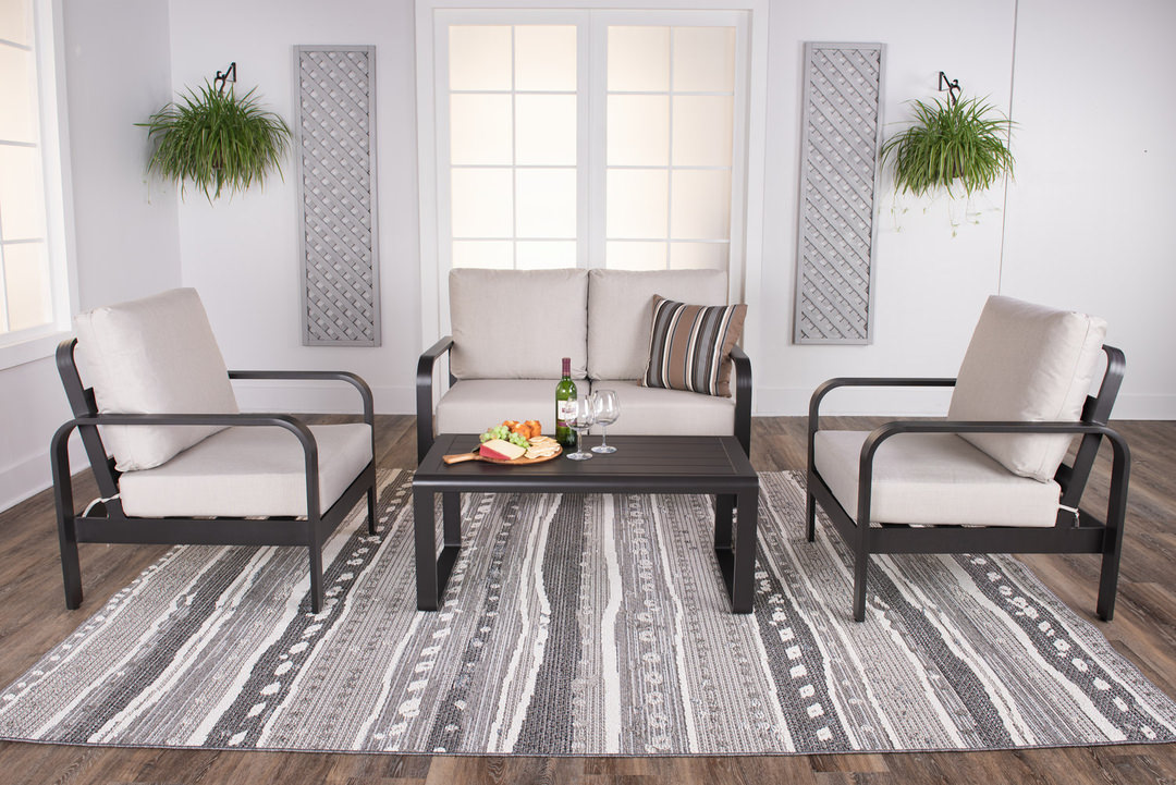
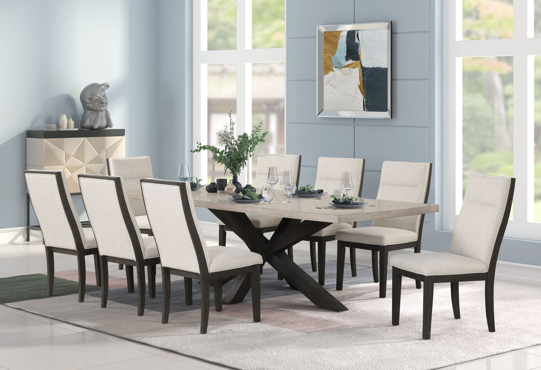
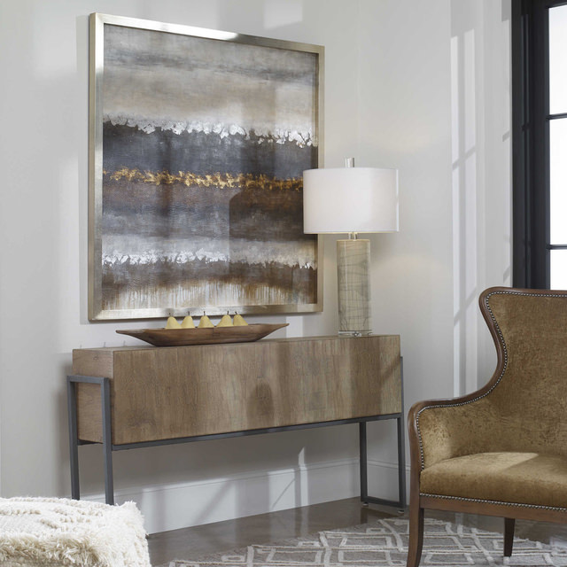
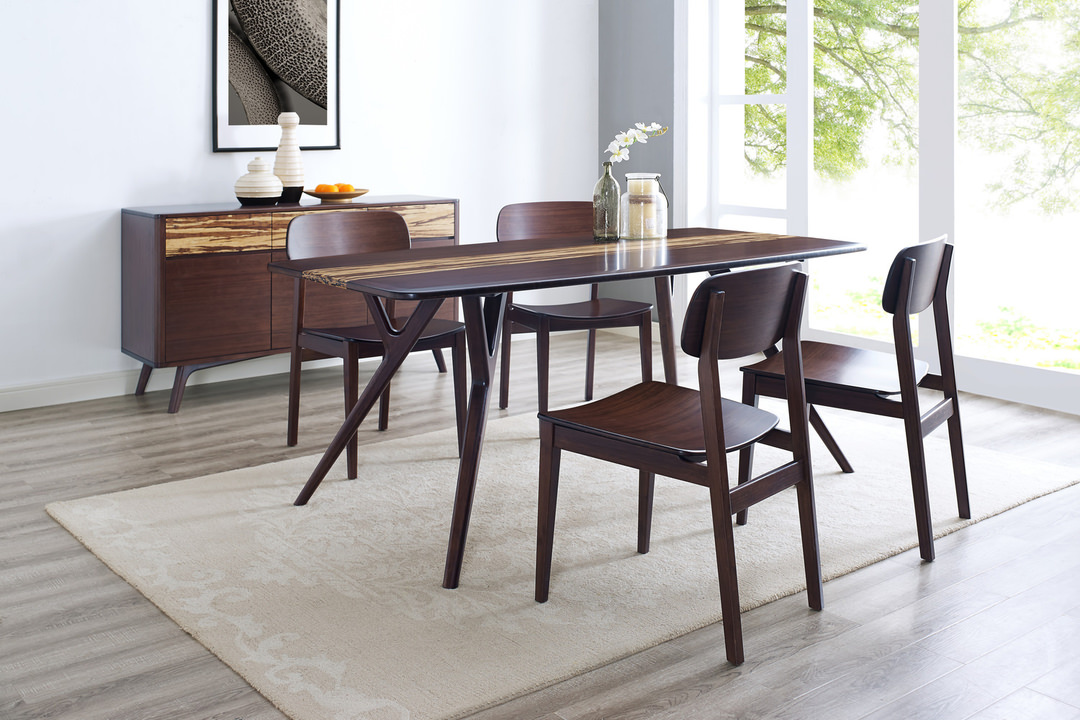
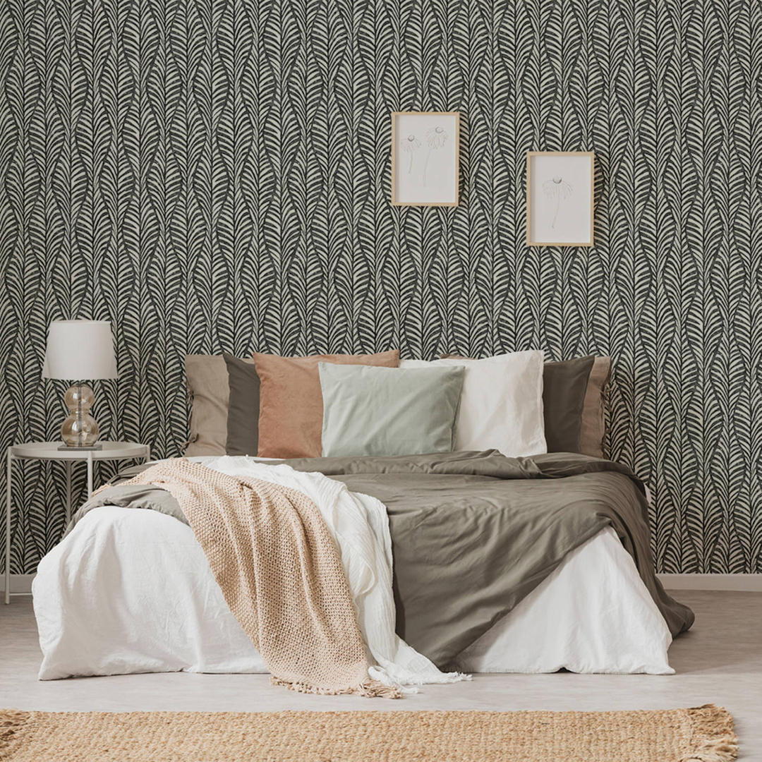
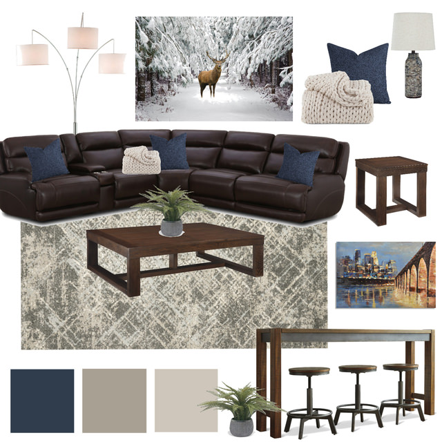
Redend Point is a versatile color, and it accommodates a wide range of interior design color schemes. However, it’s especially adept in interacting with shades that have the feel of nature. Perhaps its most frequent pairing will be with browns and creams. You might find it is a living room with a cream sofa and chairs along with some darker wooden accents. A Redend Point kitchen wall could team up with dark brown barstools or chairs and a lighter countertop. In the dining room, the color handsomely sets off a two-toned brown and cream dining set.
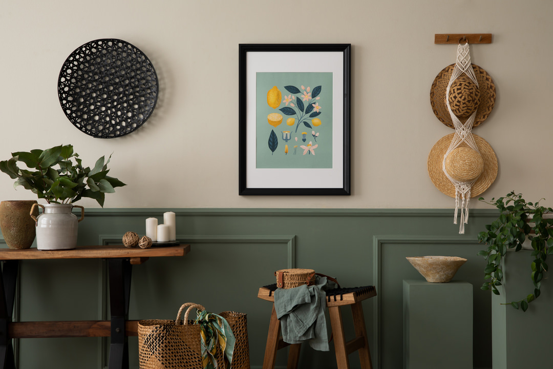
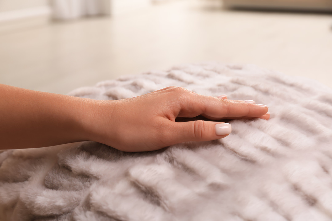
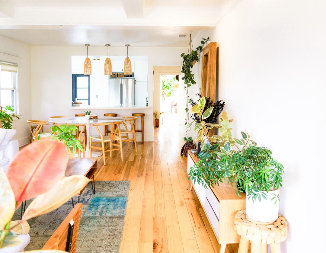
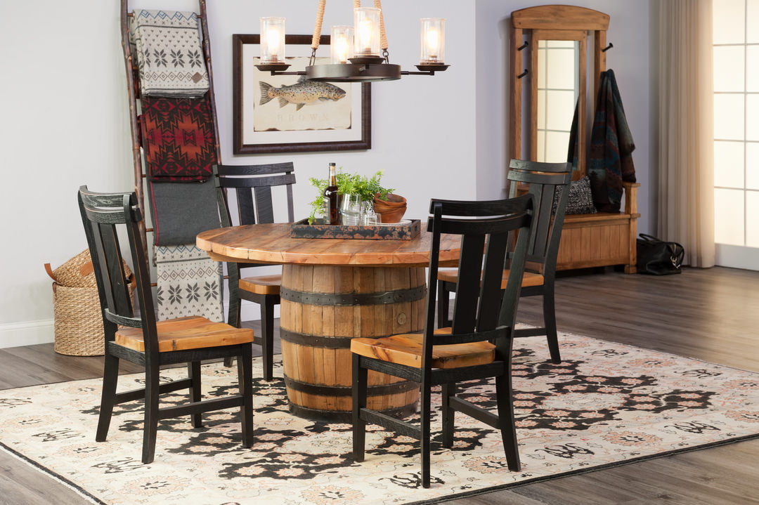
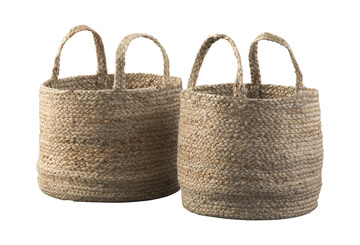
Nature is a splendid match with Redend Point. Wicker, whether in a chair or just in the form of a basket on a shelf, plays agreeably with this Color of the Year. Textiles, stone and vintage-inspired accessories all can work well in a room this hue.
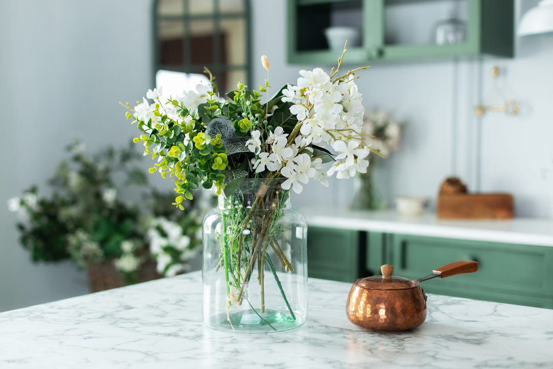
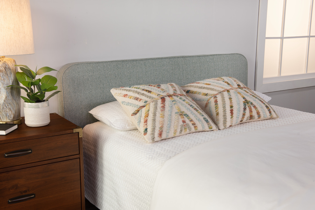
Don’t think you have to limit yourself to the brown family, though! More assertive colors garner a little extra pizzazz with Redend Point in the background. Think greens, either bright or gentle, along with multiple shades of blue and even rich reds. You can also pair this neutral with floral patterns for a farmhouse ambiance.
Redend Point sets a calm and relaxing tone as the basis of your room. It’s the kind of neutral that’s sometimes described as minimal, but it’s maximal in what you can do with it! When you choose your furniture and decor, you can blend in related shades to extend the natural peacefulness. You may also decide to feature contrasting colors to make your furnishings stand out on a background of natural harmony.

