Sherwin Williams 2024 Color of the Year: Persimmon
HGTV Home by Sherwin-Williams unveiled its 2024 Color and Collection of the Year

Paint is every DIYer’s favorite go-to for refreshing a space and updating a room. A fresh coat of paint can transform an area and set the tone for new decor and furnishings. Or, it can help incorporate already owned decor into a new space. Even if nothing else changes, a new coat of paint feels clean and gives the sense of a fresh start!
While selecting a color palette for your room, including paint and furniture colors, can be intimidating, many homeowners turn to color collections for inspiration and Sherwin-Williams has you covered. The HGTV Home 2024 Color Collection of the Year by Sherwin-Williams features calm and comforting tones, none more so than the 2024 Color of the Year: Persimmon, HGSW6339.
What Is Persimmon?
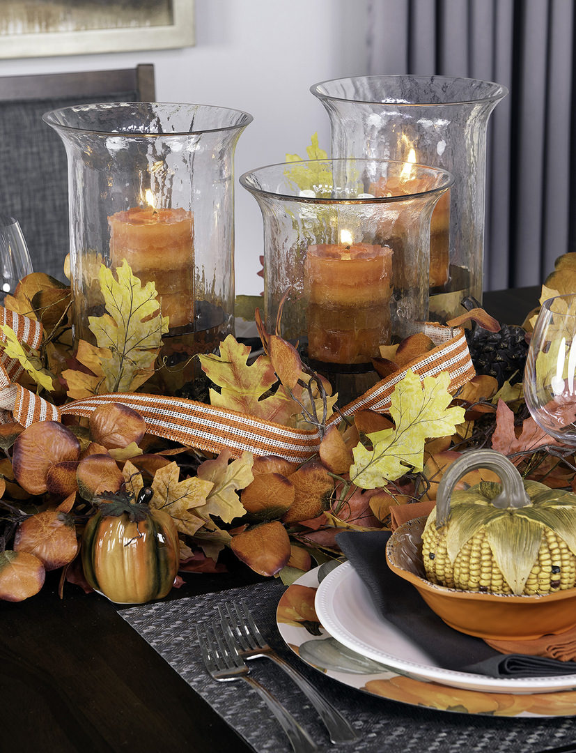
Persimmon features natural hues of cream, pink and orange. Persimmon is based in terracotta earth tones with hints of refreshing tangerine. Persimmon is grounded and warm while creating a unique and personal touch to gathering spaces both indoor and out.
Persimmon is a continuation of Sherwin-Williams trend toward warm colors, following 2023’s Color of the Year, Redend Point. Redend Point marked a massive shift away from cool tones previously highlighted and embraced a warmer, more romantic home styling. While Redend Point could be called a pinkish neutral founded in greige, Persimmon is more bold and confident as an earth tone and will definitely define a space.
Read our blog about how to decorate with Redend Point.
Cozy, Yet Energetic
Persimmon’s apricot tone encourages inhabitants to rest and rejuvenate, but perhaps not for too long. Persimmon is warm and earthy but also energizing, as you’d expect from a color found frequently in desert areas and canyons.
Persimmon’s base in terracotta is a nice shift away from the cool whites and grays of recent years. People are looking for something new and fresh, and persimmon most certainly fulfills the need. Persimmon is welcome as a wall color or as an accent color throughout a space, perhaps brought in through furnishings, wall art and home decor. The color is familiar, yet unexpected, bringing a unique sense of style to any home.
Mixing and Matching with Persimmon
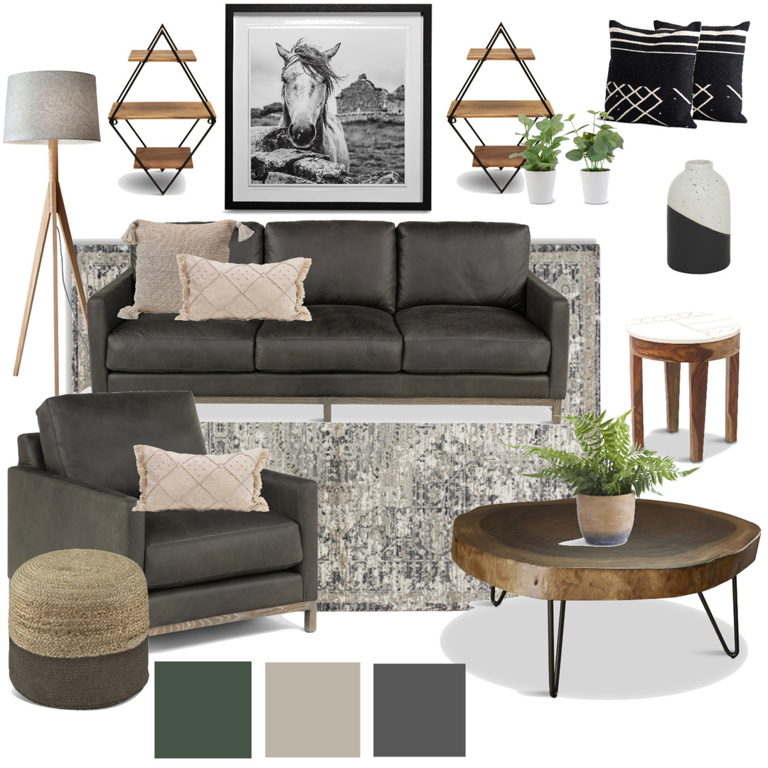
Persimmon is a versatile color and accommodates a wide variety of interior design color schemes. Sherwin Williams gives us some ideas with the Renewed Comfort Color Collection. It includes light tones such as creamy yellows, light blues, and warm whites or tans. It strikes a brilliant contrast with dark greens, blues, and even deep auburns or grays.
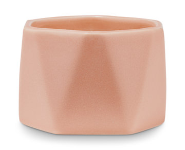
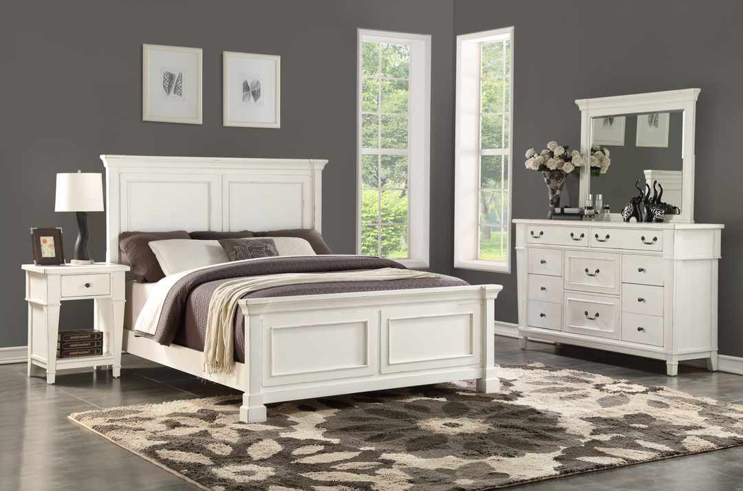
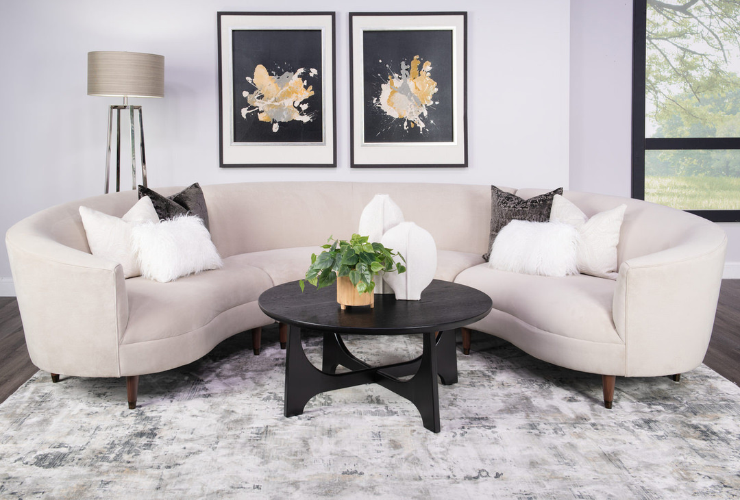
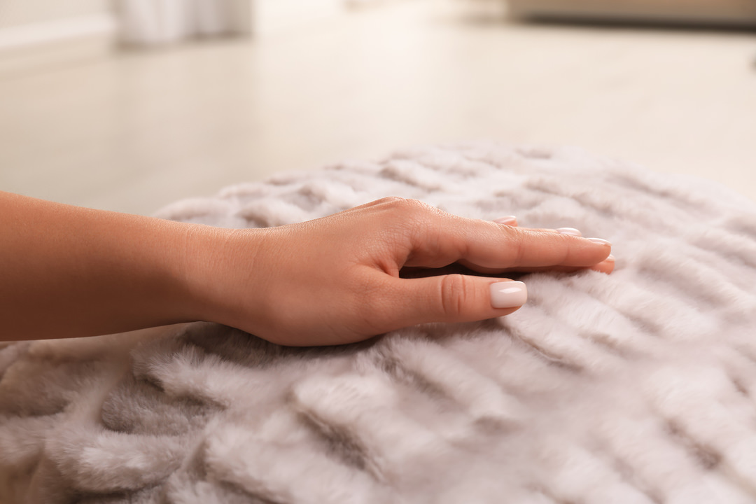
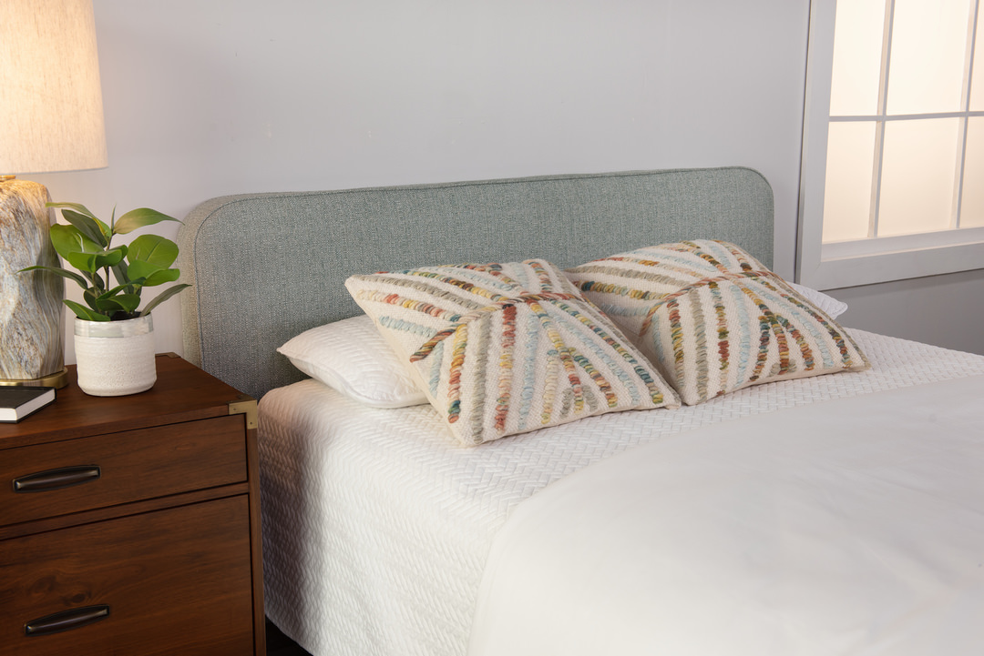
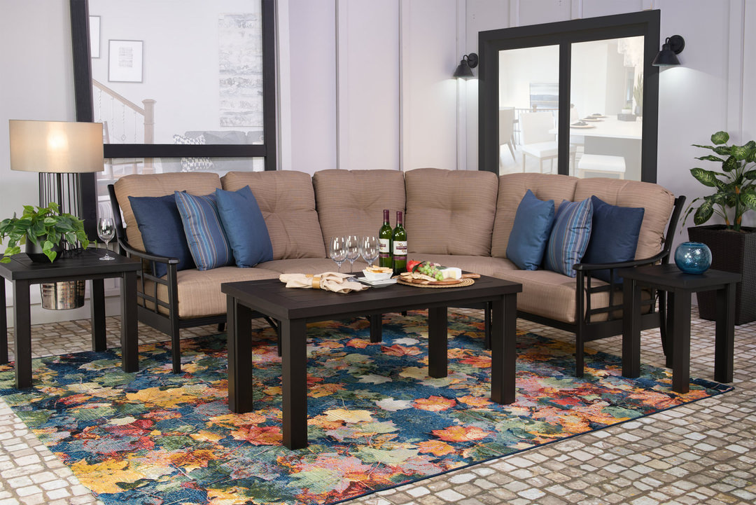
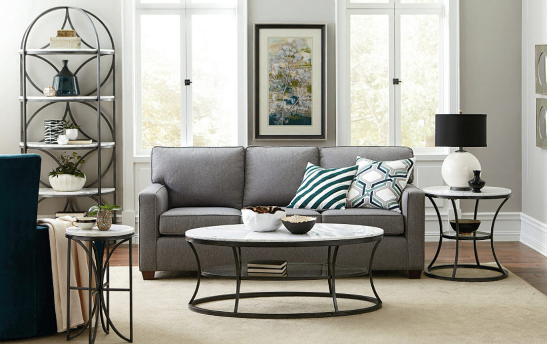
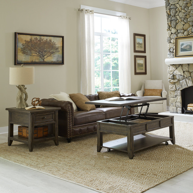
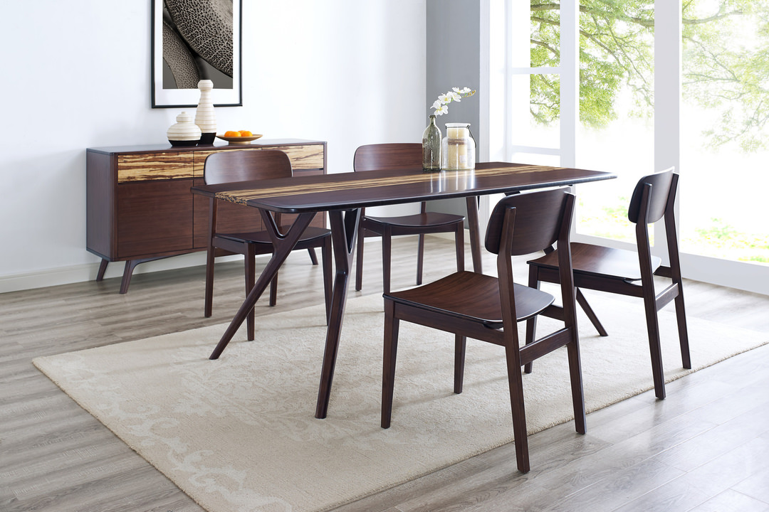
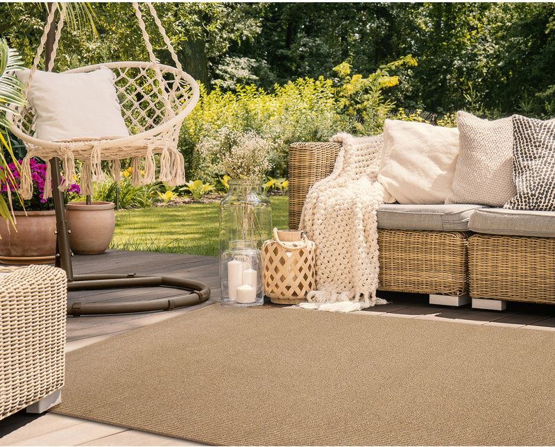
Encompassing a room with walls of Persimmon lends itself well to furnishings of deep greens and blues, along with warm whites and tans. Layer colors and textures to continue a sense of warmth and comfort. Scatter the area with white and black accents to create a bit of contrast. Pair gold with Persimmon to invoke an updated bougie feel.
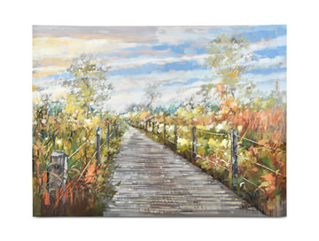
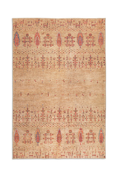
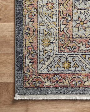
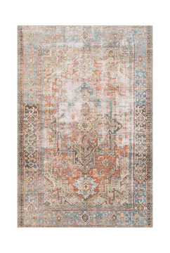
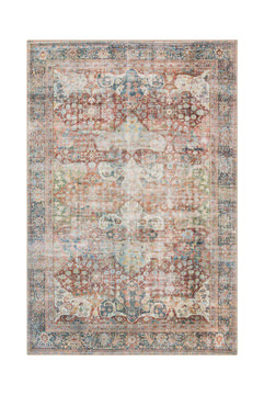
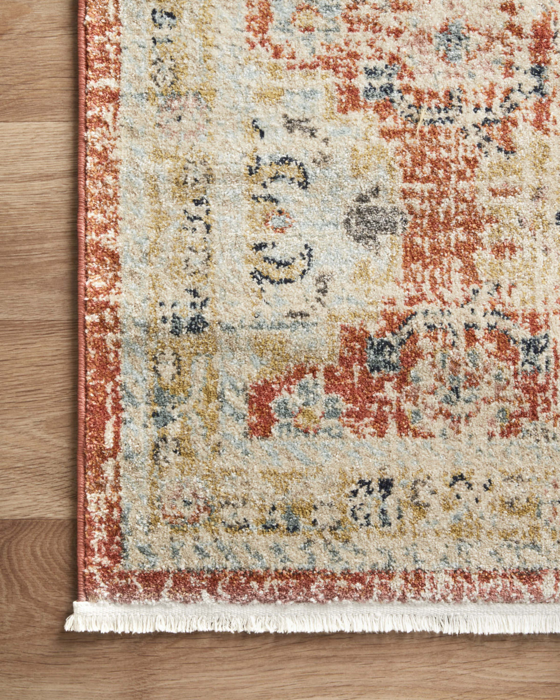
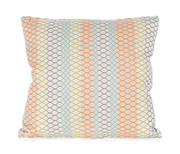
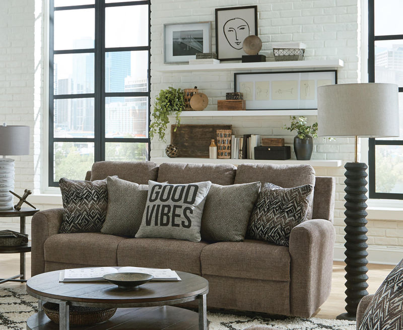
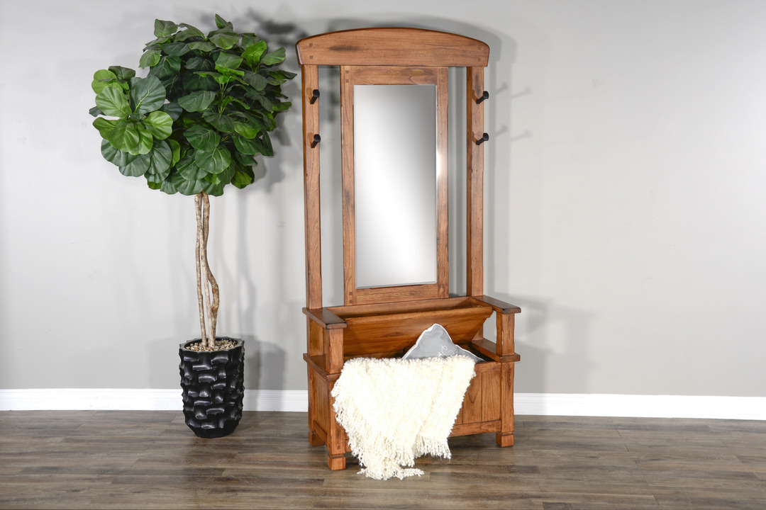
If you’re not ready to fully surround yourself in Persimmon, use it as a striking accent throughout your home. Dual toned kitchens will have a hay-day with Persimmon as a fun island color against darker surrounding cabinets. Paint your front door in persimmon to make a splash, both inside and out. You can ground an area with a Persimmon area rug. An orange sofa featuring persimmon creates a beautiful focal point in your living room. You can also layer a more neutral colored sofa with a throw blanket or accent pillow in persimmon for a gentle introduction to this warm earth tone.
Getting ready to embrace fall and all the orange home decor you can find? Look to incorporate a little (or a lot) of persimmon in your life. Persimmon dabbles into the orange family without being overbearing and is versatile to all the seasons, not just fall.
Get ready for warmth with this great tone from Sherwin-Williams, and see what you can do with Persimmon!


2025
March
February

January


2024


Related Products